The Sec Steps module helps you add clear, numbered steps for website visitors to follow. Choose from numbers, icons, images, or text-only layouts, and add buttons to create actionable links.

TABLE OF CONTENTS
Page Speed Impact
Module Options
Page Speed Impact
How does the Sec Values module affect page speed?
-
Low impact:
- Images are lazy loaded by default
- Module has minimal impact on page speed with optimized content
-
Medium impact:
- Module placed above the fold (visible in viewport)
- Unoptimized images increase page load time
- Lottie animations can increase load times
Performance Tips:
- Convert images to WebP format for next-gen image optimization
- Compress images using TinyPNG before uploading (supports JPG, PNG, WebP)
- Use appropriate file sizes for icons and images
- Consider performance impact before using Lottie animations above the fold
Note: For more detailed performance advice, review the POWER Performance Guide!
Intro to Title
The smaller text displayed above the main title. Leave blank to hide this field on the page.
Title
The main heading for the section. This field is optional and can be left blank.
Title - Header Type
Choice of H1, H2, H3, or H4. This is how Google will determine the heading type. This does not control the formatting of the font, there is a separate setting under Style → Title Size to determine how the heading will display.
Choose the HTML heading level for SEO purposes:
- H1: Page title (use once per page)
- H2: Major sections
- H3: Subsections
- H4: Minor subsections
Important: This setting controls the HTML heading type for Google indexing, not the visual font size. To adjust font appearance, use Style → Title Size.
Description
Add any amount of body text to describe the steps section. Leave blank if no description is needed.
How do I add and edit steps?
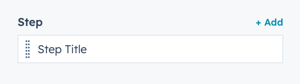
Step
Edit, clone, or add steps to your module. You must include at least one step. Edit the default step to get started.
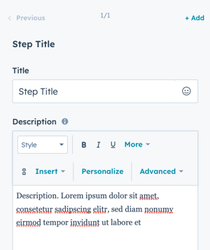
Step → Title
Add a title for each step. Leave blank if you don't want a step title displayed.
Step → Description
Add a description for each step using the text editor. Leave blank if you don't want a step description.
Tip: Keep step titles concise (3-7 words) and descriptions focused on a single action or concept.
How do I add icons to steps?
Step -> Icon
The default setting for the Steps module is Step Counter (numbered steps). To configure an icon or other option, you must update Layout settings first.
The default setting for the Steps module is Step Counter, to configure an Icon (or other option) the Layout↓ must be updated first.
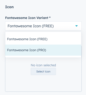
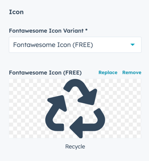
To select an icon from the included icon library, set the Fontawesome Icon Variant to Fontawesome Icon (FREE).
If you have a Font Awesome Pro account and would like to use a custom icon library, select Fontawesome Icon (PRO).
Step -> Icon -> Fontawesome Icon (FREE)
- Set the Fontawesome Icon Variant to Fontawesome Icon (FREE)
- Click Select icon to open the included library (v 5.0.10)
- Browse and select your desired icon
- Once selected, you can Replace or Remove the icon
Step -> Icon -> Fontawesome Icon (PRO)
- Set the Fontawesome Icon Variant to Fontawesome Icon (PRO)
- Paste the icon class from your Font Awesome Pro library
- Ensure you've completed the initial FontAwesome Pro configuration, f you limit the URL to your website will cause the icons to not display in the page editor.
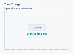
Step -> Icon Image
Upload a custom image to use as an icon.
Recommended format: SVG for crisp, scalable icons at any size.
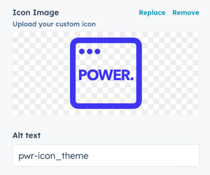
Once uploaded, you have the option to Replace or Remove the Icon:
Step → Image → Alt text
Modify the alt text for your image. The default will be the file name.
Best practice: Use descriptive alt text like "step one - create account" instead of "icon1.svg"
Step → Image → Width + Height
Set custom dimensions for the width and height of your icon image in pixels.
Tip: Use consistent dimensions across all step icons for a uniform appearance.
How do I add Lottie animations to steps?
Step > Lottie File
Configure settings for animated icons using Lottie files.
Note: Using Lottie animations can increase page load times. Use sparingly for best performance.
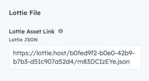
Step > Lottie File > Lottie Asset Link
Add the JSON link from your Lottie account. (how to get the Lottie File link):
Important: When the Lottie file is added to the page, it will show a blank space in the editor. The animation is only visible on the preview page or live page.
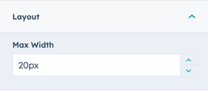
Step > Lottie File > Layout > Max Width
The default max width is set to 20px. Adjust this accordingly to work with your layout.
Step > Lottie File > Lottie Player Settings
The animation is set to Autoplay and Loop by default.
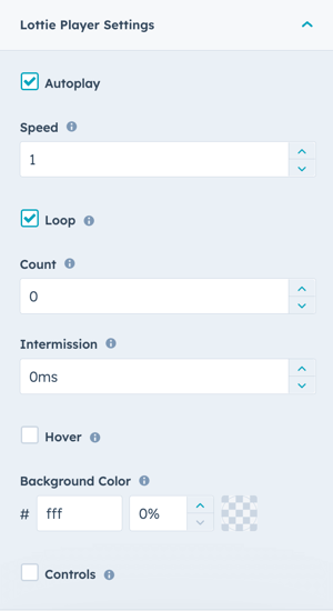
Autoplay
- Checked (default): Animation starts automatically
- Unchecked: Requires click interaction to start animation
Speed
- Default is 1
- Less than 1 = slower animation
- Greater than 1 = faster animation
Loop
- Checked (default): Animation loops indefinitely
- Unchecked: Animation plays only once
Count
- Defines the number of times to loop the animation
- Setting count to 0 with Loop checked = infinite loop
Intermission
- Duration to pause before playing each cycle in a looped animation
- Set to 0 for no pause, or any positive number in milliseconds
Hover
- Checked: Animation plays when user hovers mouse over icon
- Unchecked (default): Animation plays based on other settings
Background Color
- Default is transparent (inherits background from module/section)
- Select hex value to change background color
- Set transparency percentage greater than 0% to make visible
Controls
- Checked: Displays player controls for user interaction
- Unchecked (default): No controls shown
How do I add buttons to steps?
Step → Button Type
Choose from three button options:
- None: No button displayed
- Button: Standard button with custom settings
- CTA: HubSpot CTA (Call-to-Action)
Step → Button Type → CTA
When CTA is selected:
- Click Choose CTA to open the HubSpot CTA sidebar
- Select an existing CTA or create a new one
- CTA analytics will be tracked in HubSpot
Step → Button Type → Button
When Button is selected, configure these settings:
Step → Button Type → Button → Button Title
- The text that appears on the button
- Keep concise (1-4 words recommended)
Step → Button Type → Button → Button Link
- Choose link type: External, Content, File, Email Address, or Blog
- Enter URL/email or select from HubSpot content based on type
Step → Button Type → Button → Open in New Window
- Toggle on: Opens link in new window/tab
- Toggle off (default): Opens in same window/tab
Tip: If your link is leaving your website, it is recommended to open it in a new window.
Step → Button Type → Button → Link Type
- Check "No Follow" to indicate the link is not associated with your website
- Has SEO implications if used incorrectly
How do I set animations for individual steps?
Step → Animation
Change the Animation Type and Delay for each individual step independently.
This allows you to:
- Create staggered animation effects
- Disable animation for specific steps
- Control the timing of each step's appearance
Tip: Add 100-200ms delays between consecutive steps for a cascading reveal effect.
What layout options are available?
Layout → Choose Layout
Five layout options determine how steps are displayed:
- Step Counter (default): Numbered steps
- Icon: Font Awesome or Font Awesome Pro icons
- Image: Custom uploaded images (preferably SVG)
- Lottie Files: Animated icons (requires Lottie account)
- Text Only: No visual elements, just text
Important: You must set the layout choice first before configuring the corresponding step settings.
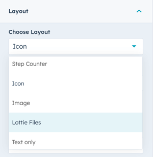
To use FontAwesome or FontAwesome Pro icons, select Icon. If you want to upload a custom icon (preferably SVG) change to Image. For animated icons, set to Lottie File (requires account).
Layout → Intro Width
Control the width of section text:
- Narrow (default): Limits the width of intro title, title, and description text
- Default: Text fills available module width based on Full Width/Content Width settings

Layout → Centered
Enable to center-align section text (intro title, title, and description). Default is left-aligned.
Layout → Padding & Margin Top and Bottom
Select spacing options:
- Standard: Default theme spacing
- None: No spacing
- Small: Minimal spacing
- Medium: Moderate spacing
- Large: Maximum spacing
- First Section with Header: Special spacing for first page section
Refer to your theme settings for these for more information on this sizing.
How do I use the Show More feature?
Layout → Show More
Enable to hide content behind a "Show More" button. Useful for long step lists that might overwhelm users.

Layout → Show More Options
Configure the collapsed height for different devices:
Collapsed Height
- Set the initial visible height before the "Show More" button
- Configure separately for Desktop, Tablet, and Mobile screen widths
- Any content above this height is initially visible
You can also customise your button style based on the standard theme button styles, or use any of your custom button styles.
How do I style the module?
Style → Color Scheme
Choose the base color scheme:
- Light: Light background with dark text
- Dark: Dark background with light text
Important: When you change the module background color, toggle the color scheme to ensure text remains legible.
Style → Intro Title Style - Text
Control intro title text appearance:
- Default: Inherits from Theme Settings based on color scheme
- Color: Override with custom color
- Gradient: Override with gradient effect
Style → Intro Title Style - Background
Set background behind intro text:
- Default: Transparent (text displays directly on module background)
- Color: Apply solid background color for highlight effect
- Gradient: Apply gradient background for highlight effect
Style → Intro Title Style - Border Radius
Configure rounded corners for the background highlight (in pixels). If not set, defaults to your Theme Settings.
Style → Title Style
Control main title appearance:
- Default: Inherits from Theme Settings based on color scheme
- Color: Override with custom color
- Gradient: Override with gradient effect
Style → Title Size
Choose visual size for the title:
- Default: Matches Title Header Type (H1-H4)
- Override: Select H1, H2, H3, H4, H5, or H6 for styling based on Theme Settings
Important: This changes visual appearance only, not the SEO heading type.
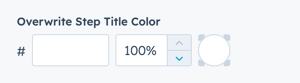
Style → Overwrite Step Title Color
Enable to change the color of individual step titles independent of the main section title.
This allows you to:
- Create visual hierarchy within steps
- Emphasize step numbers or titles
- Match step titles to your brand colors
Style → Step CTA/Button Style
Choose from button styles configured in your theme settings:
- Solid Primary
- Solid Regular
- Solid Regular for Primary Background
- Border Primary
- Border Regular
- Link
- Link Back
- Custom 01
- Custom 02
- Custom 03
- Custom 04
Style → Step CTA/Button Size
Override the default button size:
- Regular: Standard button size
- Long: Extended width button
- Full Width: Button spans full container width
- Small: Compact button
- Large: Oversized button
Style → Background
Choose from multiple background types:
- Background Color: Solid color fill
- Background Image/Video: Media background
- Background Gradient: Color gradient effect
- Transparent: No background
Style → Shape Divider
Add optional shape dividers to the top or bottom of the module for visual separation between sections.
Refer to Settings for configuring Shape Dividers for more details about these choices.
How do I enable the slider functionality?
Slider
The Slider settings are located above the Layout section, when clicked it will open these settings to activate the slider.
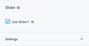
Slider → Use Slider?
Check this box to activate slider functionality for your steps. This is useful when you have many steps and want to display them in a carousel format.
Slider → Number of visible items
Set how many steps display at once:
- Default is 2
- Minimum is 1
- Maximum is unlimited (though higher numbers affect layout)
Tip: Choose based on available space and step content density.
Slider → Number of items to slide
Set how many steps advance with each transition:
- Default is 1
- Don't set higher than the number of visible items
This provides flexibility to slide single or multiple steps with each transition.
Slider → Transition Option
Choose how users navigate the slider:
Manual (default for keyboard/click)
- Users click arrows or bullet points
- Users press arrow keys on keyboard
- No automatic advancement
Autoplay
- Slides advance automatically at set intervals
- User can still manually navigate
Continuous
- Slides advance continuously without pause
- Creates seamless, constant motion
Slider → Transition Time
Set the duration of the slide transition in milliseconds. Applies to Autoplay or Continuous options.
Recommended: 300-800ms for smooth, natural transitions
Slider → Transition Effect
The effect is set to Slide for smooth horizontal transitions.
Slider → Autoplay - Interval Timeout
Set the pause duration between automatic slides in milliseconds. Applies to Autoplay or Continuous options.
Recommended: 3000-5000ms (3-5 seconds) for users to read content
Slider → Loop
Enable the constant loop of content:
- Enabled: Slider loops and starts again after the last slide
- Disabled: Slider stops at the last slide
Important: Enabling loop creates multiple versions of your content in the HTML, which might be flagged by some SEO tools.
Slider → Navigation - Arrows
Check to activate left and right arrows on the slider for navigation.
Recommended: Always enable for clear user control.
Slider → Navigation - Bullets
Check to activate bullet points below the slider for navigation.
Recommended: Enable for users to see how many slides exist and their current position.
Slider → Keyboard Control
Check to activate slider control via arrow keys on the keyboard.
Important: Only works when the slider is visible in the browser viewport. This setting is recommended for accessibility.
How do I add animations to the module?
Animation
Enable or disable Animate on Scroll for the entire module. Turning off here applies only to this section.
Note: To turn animation off globally for all modules, refer to Theme Options for Animations.
Animation → Section
Set animation type and delay for the entire section container.
Animation → Intro to Title
Set animation type and delay specifically for the intro title text.
Animation → Title
Set animation type and delay specifically for the main title.
Animation → Description
Set animation type and delay specifically for the description text.
Tip: Use progressive delays (e.g., intro: 0ms, title: 100ms, description: 200ms) for a cascading reveal effect.
How do I control module visibility?
Visibility
Choose to hide your module on specific screen sizes:
- Hide on desktop only
- Hide on tablet only
- Hide on mobile only
- Show on all devices (default)
Use case: Create device-specific experiences without duplicating content.
For more information see common module information.How do I set up anchor links?
Anchor Link ID
Set an anchor link identifier for the module. Use anchor links to:
- Create direct links to specific sections
- Build on-page navigation menus (like Sticky Sub-Menu)
- Allow users to jump to sections without scrolling
Example: Set Anchor Link ID as "how-it-works" to create links like yoursite.com/product#how-it-works
For full instructions refer to Setting up Anchor Links.
How do I add custom CSS classes?
Custom Class
Add a Custom Class identifier to use in the child.css file for individual customizations.
This allows you to:
- Apply unique styling to specific step modules
- Override theme styles for particular instances
- Create reusable custom styles
See full instructions for setting a Custom Class for Section Modules.
What is the "Is in Viewport" setting?
Is in Viewport?
This performance setting determines how CSS is loaded for the module.
When to check this box:
- Module is at the top of the page
- Module is located within the browser viewport on page load
- Ensures CSS loads immediately on page load
When to uncheck this box:
- Module is outside of the initial viewport
- Module is below the fold, especially on mobile
- Allows CSS to load asynchronously for better performance
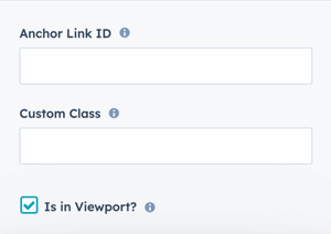
Important: This setting impacts Page Speed and Core Web Vitals scores.
Learn more about this setting as it relates to Page Speed and Core Vitals.