What does the Sub Steps Module do?
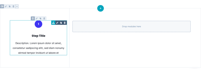
This module helps you break down processes or instructions into visual steps.
Each step can include a title, description, and optional visual elements like icons or animations.
Common use cases include:
-
Highlighting process steps (e.g., “How it works”)
-
Showing service workflows or tutorial stages
-
Building numbered, icon-based, or animated feature lists
TABLE OF CONTENTS
Page Speed Impact
Module Options
Page Speed Impact
How does the Sub Steps Module affect page speed?
-
Low impact: Minimal effect on page load since all images are lazy-loaded by default.
-
Medium impact: If used above the fold (visible on initial load), images may slightly affect load speed.
Performance Tips
-
Convert images to WebP format for next-gen optimization.
-
Use TinyPNG
-
Use SVGs for icons and logos to keep file sizes low.
Note: For more detailed performance advice, review the POWER Performance Guide!
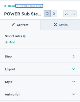
Where can I find related settings?
Refer to:
-
Theme Settings → Sub Modules
-
Theme Settings → Theme Styles
These control shared settings across all POWER Sub Modules.
Step
How do I configure a Step?
Step → Title
Add a Step Title. Leave blank to omit a title.
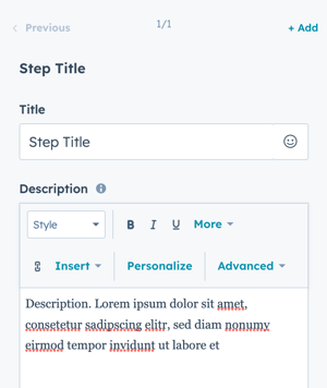
Step → Description
Add a Step Description for supporting text. Leave blank to display no description.
Step → Step Value
Defines the value shown in Step Counter layout.
-
Can be a number, letter, or character (up to 3 visible inside the circle).
How do I use Icons in Steps?
Step → Icon
The default layout uses Step Counter. To display an icon, change the Layout setting first.
Then choose an icon source:
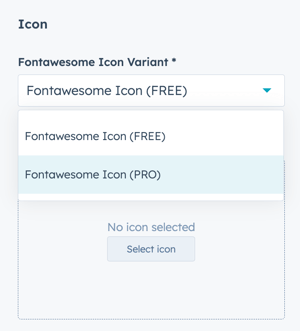
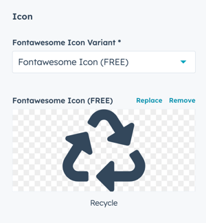
Option 1: Font Awesome Free
-
Set Fontawesome Icon Variant → Fontawesome Icon (FREE).
-
Click Select Icon to open the built-in library (v5.0.10).
-
After selection, you can Replace or Remove the icon.
Step 2 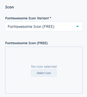
Step 3
Option 2: Font Awesome Pro
-
Set Fontawesome Icon Variant → Fontawesome Icon (PRO).
-
Paste your Font Awesome Pro icon class (e.g.,
fa-solid fa-user). -
Make sure your Font Awesome Pro configuration is complete; restricted URLs can prevent icons from displaying in the editor.
Make sure you've completed the initial configuration for FontAwesome Pro, if you limit the URL to your website will cause the icons to not display in the page editor.
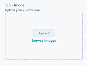
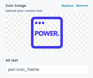
Option 3: Custom Image Icon
-
Upload a custom image (preferably SVG).
-
After upload, you can Replace or Remove it.
Step → Image → Alt text
You can also modify the Alt Text for your image; the default will be the file name.
Step → Image → Width + Height
Set the dimensions for the width and height of your image.
Step > Lottie File
Configure the settings for the animation.
Step -> Lottie File -> Lottie Asset Link
Add the JSON link from your Lottie Account (how to get the Lottie File link):
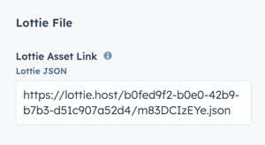
⚠️ When the Lottie File is added to the page, it will show a blank space. The animation is only visible on the preview page or live page.
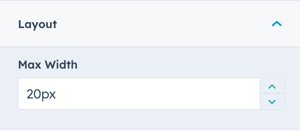
Step -> Lottie File -> Layout -> Max Width
The default Max Width is set to 20px, adjust this accordingly to work with your layout:
Step -> Lottie File -> Lottie Player Settings
The animation is set to Autoplay and Loop by default.
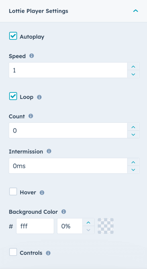
Lottie Player Settings
-
Autoplay: Enabled by default. Uncheck to start only on click.
-
Loop: Enabled by default. Uncheck to play once.
-
Speed: Default = 1. (Use <1 for slow, >1 for fast.)
-
Count: Number of loops (0 = infinite).
-
Intermission: Pause duration between loops.
-
Hover: Play animation on hover.
-
Background Color: Transparent by default; can be customized.
-
Controls: Toggle visible controls for playback.
How do I add Buttons or CTAs to a Step?
Step → Button Type
Choose from:
-
None
-
Button
-
CTA
Option 1: CTA
-
Select Choose CTA to open HubSpot’s CTA sidebar.
-
Create or select an existing CTA.
Option 2: Button
Additional fields will appear:
-
Button Title: Text displayed on the button.
-
Button Link: Choose from External, Content, File, Email, or Blog.
-
Open in New Window: Recommended for external links.
-
Link Type (No Follow): Use only if link shouldn’t pass SEO authority.
Tip: External links should open in a new window.
How do I choose a layout?
Layout → Choose Layout
Select one of five options:
-
Step Counter (default)
-
Icon
-
Image
-
Lottie Files
-
Text Only
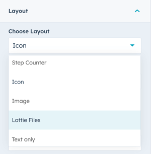
To use FontAwesome or FontAwesome Pro icons, select Icon. If you want to upload a custom icon (preferably SVG) change to Image. For animated icons, set to Lottie File (requires account).
Layout → Centered
Enable Centered Alignment to center section text instead of left-aligning.
How do I style the module?
Style → Color Scheme
Choose between:
-
Light: Light background with dark text.
-
Dark: Dark background with light text.
Tip: Match color scheme to your background for legibility.
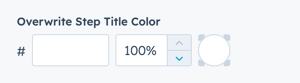
Style → Overwrite Title Color
Manually set a custom color for step titles.
Style → Icon Size
Adjust the icon size, or leave blank for default.
Style → Step CTA/Button Style
Choose from your theme’s pre-configured button styles:
-
Solid Primary
-
Solid Regular
-
Border Primary
-
Link
-
Custom 01–04
Style → Step CTA/Button Size
Select button size: Regular, Long, Full Width, Small, or Large.
How can I add animations and anchors?
Animation
-
Enable or disable Animate on Scroll for this module.
-
You can also adjust Animation Type and Delay.
-
To disable animations globally, go to Theme Options → Animations.
Anchor Link ID
Set a custom anchor link for direct navigation (e.g., #our-process).
This allows sticky menus or jump links to scroll directly to the section.
Anchor Link ID
Set an anchor link for the module. Can be used to create a link directly to that section on the page and/or to include in an on-page menu (like Sticky Sub-Menu) to allow users to jump to that section without scrolling.
Easily add an anchor link to this section, for full instructions refer to Setting up Anchor Links.
How do I manage performance and custom CSS?
Custom Class
Add a custom CSS class for targeted styling in your child.css file.
Is in Viewport?
This controls when the CSS loads for optimal performance.
-
Checked: Loads CSS immediately (recommended for elements visible on page load).
-
Unchecked: Loads CSS asynchronously (better for below-the-fold sections).
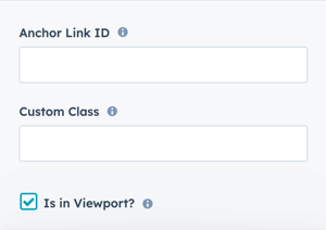
If the module is at the top of the page and located within the viewport of the browser, check this option to ensure the CSS loads on page load.
If the module is outside of the viewport, especially on mobile, uncheck this box so the CSS loads asynchronously.
Learn more about this setting as it relates to Page Speed and Core Vitals.