Icon
Configure the Icon settings here, the Layout setting for Icon Type ↓ has to match the settings configured.
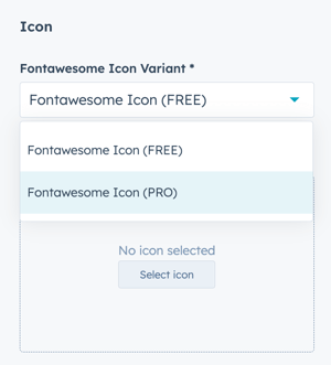
Icon > Icon
To select an icon from the included icon library, set the Fontawesome Icon Variant to Fontawesome Icon (FREE).
If you have a Font Awesome Pro account and would like to use a custom icon library, select Fontawesome Icon (PRO).
Icon > Icon > Fontawesome Icon (FREE)
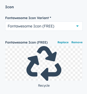
Click Select icon to open the included library (v 5.0.10):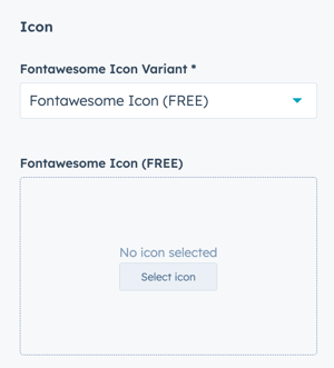
Once selected, you have the option to Replace or Remove the Icon:
Icon > Icon > Fontawesome Icon (PRO)
Paste the icon class from your Font Awesome Pro library:
Make sure you've completed the initial configuration for FontAwesome Pro, if you limit the URL to your website will cause the icons to not display in the page editor.
Icon > Icon Image
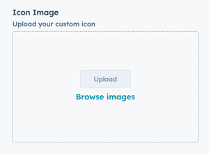
Upload a custom image to use as an Icon.
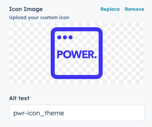
Once uploaded, you have the option to Replace or Remove the Icon:
You can also modify the Alt Text for your image; the default will be the file name.
Icon > Lottie File
Configure the settings for the animation.
Icon > Lottie File > Lottie Asset Link
Add the JSON link from your Lottie Account (how to get the Lottie File link):
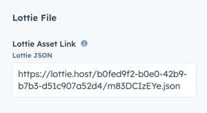
⚠️ When the Lottie File is added to the page, it will show a blank space. The animation is only visible on the preview page or live page.
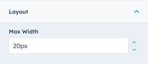
Icon > Lottie File > Layout > Max Width
The default Max Width is set to 20px, adjust this accordingly to work with your layout:
Icon > Lottie File > Lottie Player Settings
The animation is set to Autoplay and Loop by default.
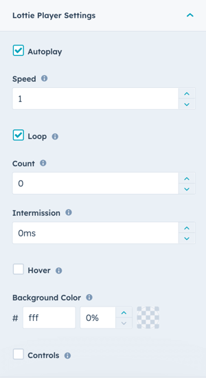
Autoplay: uncheck the box to require click interaction to start the animation.
Speed: the default is 1, setting speed to less than 1 will make it slower and greater than 1 will make it faster.
Loop: uncheck the box to play the animation only once, otherwise the animation will loop. The default is to loop indefinitely.
Count: defines the number of times to loop the animation. Setting the count property to 0 and keeping Loop checked, loops the animation indefinitely.
Intermission: the duration to pause before playing each cycle in a looped animation. Set this parameter to 0 (no pause) or any positive number.
Hover: check the box to play the animation when the user hovers the mouse over the icon.
Background Color: the default setting is set to transparent so the animation inherits the background from the module or section. Select a hex value to change the background color and set the transparency percentage to greater than 0% to make it visible.
Controls: displays player controls.
Layout > Icon Type
Choice of Icon, Image, or Lottie File, this must match what you've configured in the Icon setting to work properly.
To use FontAwesome or FontAwesome Pro icons, select Icon. If you want to upload a custom icon (preferably SVG) change to Image. For animated icons, set to Lottie File (requires account).
Layout > Alignment
Specify the alignment of the icon within the section and/or column. Choices are Left (default), Center, and Right.
Layout > Margin Top, Margin Bottom, Margin Right, Margin Left
Individual settings for margin can be set in pixels, the default is 0px. Refer to Settings that apply to all Mini Modules for more details about using margin and padding to style a section and/or column.
Style > Icon Style
Choice of Circle (default), Square, or No Background. Only works for icons from the icon library, not custom images.
Style > Color Scheme
Choice of Light, Dark, or Primary.
Primary uses the primary color as defined in your theme settings.
Tip: If you change the background color for the module, the definition of Light Color scheme is a light background with dark text and Dark Color scheme is a dark background with light text.
Style > Background Color
Ability to define a custom background color using a Hex code or the Color Picker tool.
If you are using a custom background, Color Scheme must be set to Light or Dark, this option will not override Primary.
Style > Icon Size
Ability to set the size of the icon from 0 - 100 pixels.
Tip: It is generally not recommended to set this lower than 16 px to ensure the icon remains legible.
Style > Icon Color
Ability to define a custom icon color using a Hex code or the Color Picker tool. Can be used in combination with any Icon Style or Background Color.
Style > Padding Top/Bottom and Padding Left/Right
Ability to define padding in pixels equally to the top and bottom and/or left and right of the icon.
Animation
Checkbox to turn on/off Animate on Scroll. Turning off here will only apply to this module, to turn animation off globally refer to Theme Options for Animations.
Ability to change the Animation Type and Delay for the Icon.
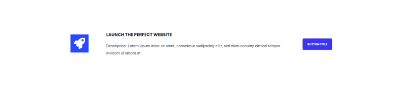
Icon > Icon
Rocket icon from Icon Library
Style > Icon Style
Circle
Style > Color Scheme
Primary
Icon > Icon
Rocket icon from Icon Library
Style > Icon Style
Square
Style > Color Scheme
Primary
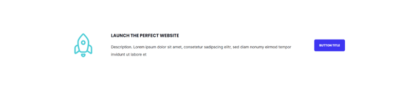
Icon > Icon
Rocket icon from Icon Library
Style > Icon Style
No Background
Style > Color Scheme
Light
Style > Icon Color
Custom (to match Primary)
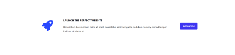
Icon > Icon Image
Custom Rocket added as SVG
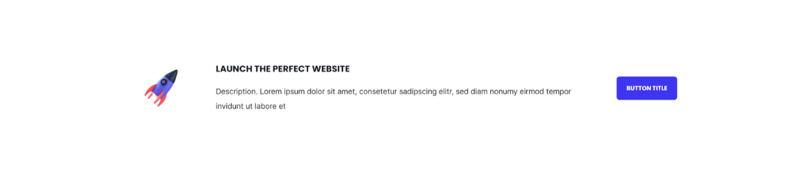
Icon > Icon Image
Custom Image added as WebP
Layout > Lottie File
Lottie JSON
Icon > Lottie File > Layout > Max Width
200px
Icon > Lottie File > Lottie Player Settings
Autoplay checked
Speed = 1
Loop checked
Count = 0
Intermission = 0ms
Hover unchecked
Background Color = transparent (#fff with 0%)
Controls unchecked