


_enhanced.jpg?width=300&name=pwr-entry__hero-bg-(1)_enhanced.jpg)


Intro to Title
The smaller text above the title; can be left blank to hide on the page.
Title
The main heading for the section; can be left blank to hide on the page.
Title - Header Type
Choice of H1, H2, H3, or H4. This is how Google will determine the heading type. This does not control the formatting of the font, there is a separate setting under Style → Title Size to determine how the heading will display.
Description
You can add any amount of body text here or it can be left blank to hide on the page.
Release Date & Time
Set the Date and Time that you would like to countdown to.
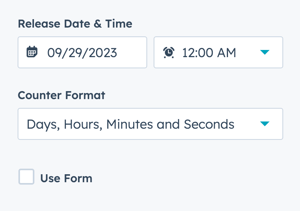
Counter Format
Choice of:
- Days, Hours, Minutes and Seconds
- Days, Hours and Minutes
- Days and Hours
- Days Only
Use Form
Add a form below the countdown in the module.
This option allows you to configure a form in the same section so that the countdown and form can share the same background style.
Form → Form Title
Add a title above the form or leave blank.
Form → Choose a Form
You can choose a form that you've already set up or create a new form.
Form Content → Form Fields
Edit the form fields or open the form using the Form Editor.
Form Content → Button Text
Text to display for the form button (required).
Form Content → GDPR Options
Dropdown with GDPR options to include in your form.
Form Content → CAPTCHA
Toggle to activate CAPTCHA for SPAM prevention.
Thank You → What will a visitor see when submitting your form?
Decide what happens on form submission. Choice of redirecting to another page or displaying an inline thank you message.
This setting applies only to this page, not all locations the form is used.
Form Automation → Always create new contact for email address
Toggle to determine whether a new contact will be created.
Form Automation → Simple workflows
Shows whether the form is included in any simple workflows.
Form Automation → Workflows
Option to add form to a Workflow or manage workflows.
Form → Send a follow-up email
You can choose an email that you've already set up or create a new email.
Layout → Centered
By default, the section content is centered. If you want the module to be left-aligned, you can uncheck this box.
Layout → Padding Top and Padding Bottom
Choice of Standard, None, Small, Medium, Large, or First Section with Header. Refer to Settings that apply to all Section Modules for more details about these choices.
Style → Color Scheme
Choice of Light or Dark.
Tip: If you change the background color for the module, the definition of Light Color scheme is a light background with dark text and Dark Color scheme is a dark background with light text. Based on your background color, you would need to toggle the color scheme to ensure the text color displays properly and is legible.
Style → Form Button Style
Option to choose any of the button styles configured in your theme settings including:
- Solid Primary
- Solid Regular
- Solid Regular for Primary Background
- Border Primary
- Border Regular
- Link
- Link Back
- Custom 01
- Custom 02
- Custom 03
- Custom 04
Style → Background
Choice of Background Color, Background Image/Video, Background Gradient, or Transparent. Refer to Settings that apply to all Section Modules for more details about these choices.
Standard Text/Translations → Countdown Text "Days"
Option to change or translate the default countdown text for Days.
Standard Text/Translations → Countdown Text "Hours"
Option to change or translate the default countdown text for Hours.
Standard Text/Translations → Countdown Text "Minutes"
Option to change or translate the default countdown text for Minutes.
Standard Text/Translations → Countdown Text "Seconds"
Option to change or translate the default countdown text for Seconds.
Anchor Link ID
Set an anchor link for the module. Can be used to create a link directly to that section on the page and/or to include in an on-page menu (like Sticky Sub-Menu) to allow users to jump to that section without scrolling.
Easily add an anchor link to this section, for full instructions refer to Setting up Anchor Links.
Custom Class
Ability to add a Custom Class to use in the child.css for individual customizations.
See full instructions for setting a Custom Class for Section Modules.
Is in Viewport?
Performance setting to determine how the CSS is loaded for the module.
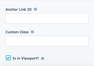
If the module is at the top of the page and located within the viewport of the browser, check this option to ensure the CSS loads on page load.
If the module is outside of the viewport, especially on mobile, uncheck this box so the CSS loads asynchronously.
Learn more about this setting as it relates to Page Speed and Core Vitals.
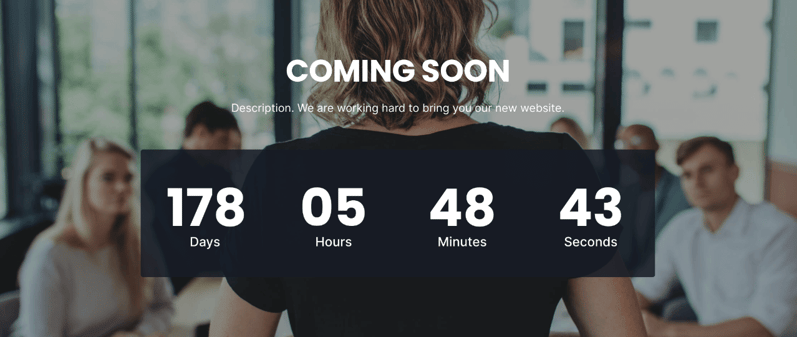
Counter Format
Days, Hours, Minutes and Seconds
Layout → Centered
Checked
Layout → Padding Top
First Section With Header
Layout → Padding Bottom
Standard
Style → Color Scheme
Dark
Style → Background
Image