The Sec Breadcrumbs module displays a navigational trail showing the user's location within your site hierarchy. Common use cases include:
- Website navigation trails
- Product category paths (e.g., Home > Products > Category > Item)
- Blog post hierarchy (e.g., Home > Blog > Category > Post)
- Service page navigation
- Knowledge base article paths
- E-commerce product pages
- Documentation hierarchies
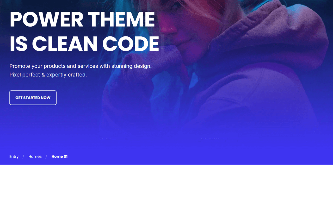
TABLE OF CONTENTS
Page Speed Impact
Module Options
Page Speed Impact
Low Impact
- Very minimal impact to page load speed
- The code for this module is highly optimized
- Limited resources needed on page load
- Lightweight module by design
Performance Tips:
- Place breadcrumbs in the same location across all pages for consistency
- Add breadcrumbs to all pages within the same navigation path
- Avoid unnecessary styling or complex backgrounds
- Keep breadcrumb text concise
Note: For more detailed performance advice, review the POWER Performance Guide!
How do I add breadcrumb items?
Breadcrumb
This is where you add the items that appear in the breadcrumbs navigation trail.
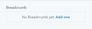
There are no breadcrumbs added by default, you'll need to click "Add one" to create the first link.
Once you have added your first breadcrumb, there will be a "+Add" link to create additional links.
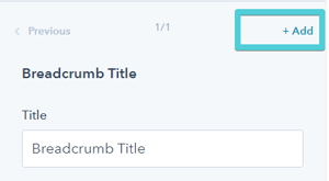
Breadcrumb Item(s) → Title
Add the title/text you want to display for each breadcrumb link.
Best practices:
- Keep titles short (1-3 words)
- Use clear, descriptive labels
- Match actual page titles when possible
- Maintain consistent naming conventions
Breadcrumb Item(s) → Link
The Link dropdown allows you to choose the link type:
- External: Link to external websites
- Content: Link to HubSpot pages
- Blog: Link to blog posts or blog homepage
Based on your selection, you can either add the URL or choose the page or blog post from HubSpot.
Tip: The last breadcrumb item (current page) typically doesn't need a link since users are already on that page.
Breadcrumb Item(s) → Link → Open in New Window
Toggle to open links in a new window/tab.
Default: Opens in the same window/tab.
Important: Since breadcrumbs are used to show the user's path to the page, it is recommended to open in the same window/tab for consistent navigation experience.
Breadcrumb Item(s) → Link → Link Type
Check "No Follow" to indicate the link is not associated with your website.
Important: This setting has SEO implications if used incorrectly. Do not use "No Follow" for internal breadcrumb navigation as it can hurt your SEO.
Best practice: Leave "No Follow" unchecked for all internal breadcrumb links to maintain proper SEO link equity.
How do I set animations for breadcrumb items?
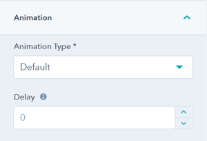
Breadcrumb Item(s) → Animation
Override the default animation settings at the individual breadcrumb item level.
This allows you to:
- Create staggered animation effects
- Disable animation for specific items
- Control timing of each breadcrumb's appearance
Tip: Add 50-100ms delays between consecutive breadcrumb items for a subtle cascading effect.
How do I adjust layout settings?
Layout → Padding & Margin
Top and Bottom Select spacing options:
- Standard: Default theme spacing
- None: No spacing
- Small: Minimal spacing
- Medium: Moderate spacing
- Large: Maximum spacing
- First Section with Header: Special spacing for first page section
Recommended: Use "Small" or "None" for breadcrumbs to keep them compact and close to the main content.
Refer to your theme settings for these for more information on this sizing.
How do I style the module?
Style → Color Scheme
Choose the base color scheme:
- Light: Light background with dark text
- Dark: Dark background with light text
Important: When you change the module background color, toggle the color scheme to ensure text remains legible.
What background options are available?
Style → Background
Choose from multiple background types:
- Background Color: Solid color fill
- Primary Background Color: Uses your theme's primary color
- Background Image/Video: Media background
- Background Gradient: Color gradient effect
- Transparent: No background (most common for breadcrumbs)
Recommended: Use Transparent or a very subtle background color so breadcrumbs don't distract from main content.
Refer to Settings that apply to all Section Modules for more details about these choices.
How do I add animations to the module?
Animation
Enable or disable Animate on Scroll for the entire breadcrumbs module. Turning off here applies only to this section.
Note: To turn animation off globally for all modules, refer to Theme Options for Animations.
Animation → Section Set animation type and delay for the entire breadcrumbs container.
Recommended animation settings:
- Fade in from top
- Slide in from left
- Very short delay (0-200ms)
- Subtle, quick animations
Tip: Keep breadcrumb animations subtle and fast. Users need to access navigation quickly without waiting for long animations.
To turn animation off globally refer to Theme Options for Animations.
Animation → Section
Ability to change the Animation Type and Delay for the Section.
How do I control module visibility?
Visibility
Choose to hide your module on specific screen sizes:
- Hide on desktop only
- Hide on tablet only
- Hide on mobile only
- Show on all devices (default)
Use cases:
- Hide breadcrumbs on mobile to save space
- Show only on desktop for complex site structures
- Display simplified navigation on smaller screens
Tip: Consider hiding breadcrumbs on mobile if space is limited, but ensure alternative navigation is available.
For more information see common module information.
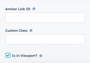
How do I set up anchor links?
Anchor Link ID
How do I set up anchor links?
Anchor Link ID Set an anchor link identifier for the module. Use anchor links to:
- Create direct links to specific sections
- Build on-page navigation menus (like Sticky Sub-Menu)
- Allow users to jump to sections without scrolling
Example: Set Anchor Link ID as "breadcrumbs" to create links like yoursite.com/page#breadcrumbs
Note: This is rarely needed for breadcrumb modules as they're typically static navigation elements.
For full instructions refer to Setting up Anchor Links.
How do I add custom CSS classes?
Custom Class
Add a Custom Class identifier to use in the child.css file for individual customizations.
This allows you to:
- Apply unique styling to specific breadcrumb modules
- Override theme styles for particular pages
- Create reusable custom styles
- Implement custom separators or icons
Example use cases:
- Custom breadcrumb separators (> / | →)
- Different styles for specific page types
- Brand-specific color schemes
- Unique hover effects
See full instructions for setting a Custom Class for Section Modules.
What is the "Is in Viewport" setting?
Is in Viewport?
This performance setting determines how CSS is loaded for the module.
When to check this box:
- Module is at the top of the page
- Module is located within the browser viewport on page load
- Ensures CSS loads immediately on page load
When to uncheck this box:
- Module is outside of the initial viewport
- Module is below the fold, especially on mobile
- Allows CSS to load asynchronously for better performance
Important: Breadcrumbs are typically at the top of the page, so this should usually be checked for optimal rendering.
Learn more about this setting as it relates to Page Speed and Core Vitals.
