The Sec Map module displays interactive maps alongside your content to help visitors find your locations. Common use cases include:
- Contact page location displays
- Store locator pages
- Office location showcases
- Service area maps
- Event venue directions
- Multi-location business pages
- Franchise location pages
- Real estate property maps
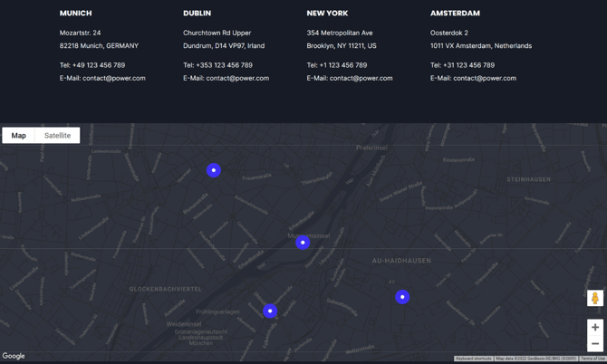
TABLE OF CONTENTS
Page Speed Impact
Module Options
Page Speed Impact
Low impact
- Map uses lazy loading in the iframe
- Module placed below the fold
- Optimized embed code with proper sizing
- Google Maps or Snazzy Maps code loads additional resources
- Map placed within browser viewport on page load
- Map included in footer (always visible)
- Embed size doesn't match actual display size
Performance Tips:
- Always use lazy loading in the iframe code
- Match embed size to actual map display size on your page
- Place maps below the fold when possible
- Use Snazzy Maps for better customization and performance control
- Avoid loading unnecessary map resources
Note: For more detailed performance advice, review the POWER Performance Guide!
How do I add a map to the module?
Map Embed Code
Add the embed code for your map in this field. You have several options for creating your map embed code.
What is the recommended way to create a map?
We highly recommend using Snazzy Maps to create and customize your map:
- Easy-to-use interface for map styling
- Better performance control
- Professional custom map designs
- Built-in lazy loading support
We highly recommend registering and creating a map with Snazzy Maps, where you can easily customize the style of your map. See FAQ for step-by-step instructions to create your Snazzy Map embed code.
Alternatively, you can also copy the embed code from Google Maps or construct your own with Google Maps Embed Guide, where you will need to create an API key.
We highly recommend verifying the embed code includes lazy loading in the iframe for improved performance.
Here is an example of a Snazzy Map embed code with the lazyloading class:
| <iframe class="lazyload" data-src="https://snazzymaps.com/embed/132230" width="100%" height="600px" style="border:none;"></iframe> |
Accesssibility
Make sure to add a proper ARIA label to the snazzy maps embed code above like: aria-label="map"
Intro to Title
The smaller text displayed above the main title. Leave blank to hide this field on the page.
Title
The main heading for the section. This field is optional and can be left blank.
Title - Header Type
Choose the HTML heading level for SEO purposes:
- H1: Page title (use once per page)
- H2: Major sections
- H3: Subsections
- H4: Minor subsections
Important: This setting controls the HTML heading type for Google indexing, not the visual font size. To adjust font appearance, use Style → Title Size
Description
Add any amount of body text to introduce your location or provide directions. Leave blank if no description is needed.
Contact Info
Enable this checkbox to include optional contact information following the description. Contact info displays with corresponding icons.
Contact Info → Address
Add your physical address here. Automatically displays with a map pin icon.
Contact Info → Email
Add your email address here. Automatically displays with an email icon.
Contact Info → Phone
Add your phone number here for display. Automatically displays with a phone icon.
Contact Info → Phone Link
Add the dialable phone number format for mobile devices.
Format: Use international format with country code
How do I add a button or CTA?
Button Type Choose between two options:
- CTA: HubSpot Call-to-Action with tracking
- Button: Standard button with custom settings
Button Type → CTA
When CTA is selected:
- Click Choose CTA to open the HubSpot CTA sidebar
- Select an existing CTA or create a new one
- CTA analytics will be tracked in HubSpot
Use case: Use CTAs for tracked actions like "Get Directions", "Schedule Visit", or "Contact This Location".
Button Type → Button
When Button is selected, configure these settings:
Button Type → Button → Button Title
- The text that appears on the button
- Examples: "Get Directions", "Contact Us", "Schedule Tour"
Button Type → Button → Button Link
- Choose link type: External, Content, File, Email Address, or Blog
- Enter URL/email or select from HubSpot content based on type
Button Type → Button → Open in New Window
- Toggle on: Opens link in new window/tab
- Toggle off (default): Opens in same window/tab
Button Type → Button → Link Type
- Check "No Follow" to indicate the link is not associated with your website
- Has SEO implications if used incorrectly
Use Form
Checkbox to include optional form.
How do I add a form to the map module?
Form
Enable this checkbox to include an optional form alongside your map. Perfect for contact forms, appointment scheduling, or location-specific inquiries.
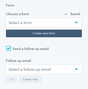
Form → Choose a Form
Select from existing HubSpot forms or create a new form directly from the module.
Tip: Click to choose a form you've already set up or create a new one on the fly.
Form Content → Form Fields
Edit form fields or open the complete form using the HubSpot Form Editor.
Options:
- Edit: Quick field modifications
- Open Form Editor: Advanced customization
Form Content → Button Text
Add text to display on the form submit button (required).
Examples:
- "Send Message"
- "Request Information"
- "Schedule Visit"
- "Get in Touch"
Form Content → GDPR Options
Dropdown with GDPR options to include in your form.
Form Content → CAPTCHA
Toggle to activate CAPTCHA for SPAM prevention.
Thank You → What will a visitor see when submitting your form?
Decide what happens after form submission. Choose between two options:
Redirect to another page
- Sends users to a dedicated thank you page
- Allows for conversion tracking
- Professional, dedicated response
Form Automation → Always create new contact for email address
Toggle to determine whether a new contact will be created for each submission.
Form Automation → Simple workflows
View whether the form is included in any HubSpot simple workflows.
Form Automation → Workflows
Add the form to a workflow or manage existing workflow connections.
Form → Send a follow-up email
Choose an existing email template or create a new follow-up email to send after form submission.
What layout options are available?
Layout → Choose Layout
There are five layout options available: Map Left, Map Right, Map Only, Content-Box Left, and Content-Box Right.
Layout → Full Width
Enable to make the map display at full browser width.
- When checked: Map spans edge-to-edge
- When unchecked: Map respects content width settings
Layout → Intro Width
Control the width of section text:
- Narrow (default): Limits the width of intro title, title, and description text
- Default: Text fills available module width based on Full Width/Content Width settings

Layout → Section Height (px)
Set the height of the module in pixels.
Configuration:
- Optional for desktop screens
- Otherwise scales automatically based on content
- Recommended: 400-800px for standard displays
Tip: Test different heights on actual devices to ensure the map is fully visible without excessive scrolling.
How do I style the module?
Style → Color Scheme
Choose the base color scheme:
- Light: Light background with dark text
- Dark: Dark background with light text
Important: When you change the module background color, toggle the color scheme to ensure text remains legible.
Tip: Dark schemes work well with Content-Box layouts for modern, bold designs.
Style → Intro Title Style - Text
Set background behind intro text:
- Default: Transparent (text displays directly on module background)
- Color: Apply solid background color for highlight effect
- Gradient: Apply gradient background for highlight effect
Style → Intro Title Style - Background
Set background behind intro text:
- Default: Transparent (text displays directly on module background)
- Color: Apply solid background color for highlight effect
- Gradient: Apply gradient background for highlight effect
Style → Intro Title Style - Border Radius
Configure rounded corners for the background highlight (in pixels). If not set, defaults to your Theme Settings.
Style → Title Style
Control main title appearance:
- Default: Inherits from Theme Settings based on color scheme
- Color: Override with custom color
- Gradient: Override with gradient effect
Style → Title Size
Choose visual size for the title:
- Default: Matches Title Header-Type (H1-H4)
- Override: Select H1, H2, H3, H4, H5, or H6 for styling based on Theme Settings
Important: This changes visual appearance only, not the SEO heading type.
Style → CTA Style
Choose from button styles configured in your theme settings :
- Solid Primary
- Solid Regular
- Solid Regular for Primary Background
- Border Primary
- Border Regular
- Link
- Link Back
- Custom 01
- Custom 02
- Custom 03
- Custom 04
Style → CTA Size
Override the default button size:
- Regular: Standard button size
- Long: Extended width button
- Full Width: Button spans full container width
- Small: Compact button
- Large: Oversized button
Style → Form Button Style
Choose button style for form submit buttons using the same options as CTA Style listed above.
Tip: Keep form button style consistent with other CTAs on the page for visual cohesion.
Refer to the theme settings (same options as CTA Style listed above) for more details.
Style → Background
Choose from multiple background types:
- Background Color: Solid color fill
- Background Image/Video: Media background
- Background Gradient: Color gradient effect
- Transparent: No background
See also: Settings that apply to all Section Modules, Background Best Practices
Style → Shape Divider
Add optional shape dividers to the top or bottom of the module for visual separation between sections.
Refer to Settings for configuring Shape Dividers for more details about these choices.
How do I add animations to the module?
Animation
Note: To turn animation off globally for all modules, refer to Theme Options for Animations.
Animation → Section Set animation type and delay for the entire section container.
Animation → Intro to Title Set animation type and delay specifically for the intro title text.
Animation → Title Set animation type and delay specifically for the main title.
Animation → Description Set animation type and delay specifically for the description text.
Animation → Contact Information Box Set animation type and delay for the contact information section.
Animation → Button/CTA Set animation type and delay specifically for the button or CTA.
Animation → Form Set animation type and delay for the form section.
How do I set up anchor links?
Anchor Link ID Set an anchor link identifier for the module. Use anchor links to:
- Create direct links to specific sections
- Build on-page navigation menus (like Sticky Sub-Menu)
- Allow users to jump to sections without scrolling
Example: Set Anchor Link ID as "location-map" to create links like yoursite.com/contact#location-map
For full instructions refer to Setting up Anchor Links.
How do I add custom CSS classes?
Custom Class Add a Custom Class identifier to use in the child.css file for individual customizations.
This allows you to:
- Apply unique styling to specific map modules
- Override theme styles for particular instances
- Create reusable custom styles across multiple pages
See full instructions for setting a Custom Class for Section Modules.
What is the "Is in Viewport" setting?
Is in Viewport?
This performance setting determines how CSS is loaded for the module.
When to check this box:
- Module is at the top of the page
- Module is located within the browser viewport on page load
- Ensures CSS loads immediately on page load
When to uncheck this box:
- Module is outside of the initial viewport
- Module is below the fold, especially on mobile
- Allows CSS to load asynchronously for better performance
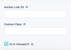
Important: This setting impacts Page Speed and Core Web Vitals scores. Maps in footers should typically have this unchecked.
Learn more about this setting as it relates to Page Speed and Core Vitals.