The Sec Stats Counter module displays animated numerical statistics that count up when they enter the viewport. Common use cases include:
- Customer satisfaction metrics
- Years in business or experience
- Number of clients served
- Projects completed
- Team size or office locations
- Revenue milestones
- User base statistics
- Awards and certifications
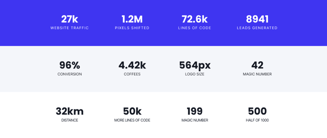
TABLE OF CONTENTS
Page Speed Impact
How does the Sec Stats module affect page speed?
-
Low impact:
- The code for this module is highly optimized
- Minimal resources needed on page load
- Very little impact to page speed with default settings
-
Medium impact:
- Using image or video backgrounds
- Multiple stats with complex animations
- Module placed above the fold with heavy media
Performance Tips:
- Convert background images to WebP format for next-gen optimization
- Compress images using TinyPNG before uploading (supports JPG, PNG, WebP)
- Avoid heavy video backgrounds on mobile devices
- Use solid colors or gradients instead of images when possible
Note: For more detailed performance advice, review the POWER Performance Guide!
Helpful Links: Settings that apply to all Section Modules and Settings for Theme Styles.
Intro to Title
The smaller text displayed above the main title. Leave blank to hide this field on the page.
Title
The main heading for the section. This field is optional and can be left blank.
Title - Header Type
Choose the HTML heading level for SEO purposes:
- H1: Page title (use once per page)
- H2: Major sections
- H3: Subsections
- H4: Minor subsections
Important: This setting controls the HTML heading type for Google indexing, not the visual font size. To adjust font appearance, use Style → Title Size
Description
Add any amount of body text to describe your statistics. Leave blank if no description is needed.
How do I add and edit stat items?
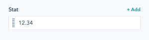
Stat
This is where you add the items that appear in the stats counter.
Managing stat items:
- Hover over an existing item to see edit and clone icons
- Edit icon: Modify the stat settings
- Clone icon: Duplicate an existing stat
- Delete icon: Appears when you have more than one item
- + Add link: Located above the first item to add more stats
The Stats Counter can contain up to four items per row (unless Stats Full Width is checked). Additional rows are automatically created when you add more than four items.
Tip: For best visual impact, use 3-4 stats per section rather than overwhelming users with too many numbers.
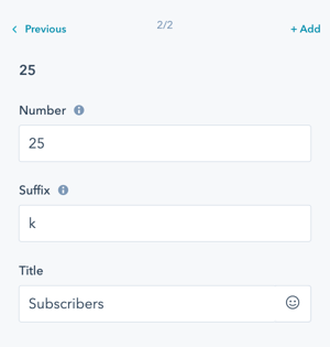
Stat(s) → Number
Enter the number to count up to from 0. You can include:
- Whole numbers (e.g., 500)
- Decimals (e.g., 4.8)
- Commas (e.g., 1,000)
Examples:
250for client count4.9for rating10,000for users
Stat(s) → Suffix
Add a suffix to quantify your number:
- M for millions (e.g., 12.34M)
- K for thousands (e.g., 12.34k)
- % for percentages (e.g., 98%)
- + for "or more" (e.g., 500+)
- x for multipliers (e.g., 10x)
Tip: To add a space between the number and suffix, use before the suffix without a space.
Example: % creates "98 %" instead of "98%"
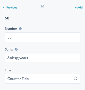
Stat(s) → Title
The title is the name or label for your statistic, displayed below the stat counter.
Stat(s) → Animation
Override the default animation settings at the individual stat level. This allows you to:
- Set different animation types for each stat
- Control animation timing independently
- Disable animation for specific stats

How do I adjust layout settings?
Layout
The Stats Counter can contain up to four items in a row (unless Stats Full Width is checked).
Additional rows will be added if more than four items are created.
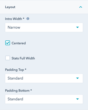
Layout → Intro Width
Control the width of section text:
- Narrow (default): Limits the width of intro title, title, and description text
- Default: Text fills available module width based on Full Width/Content Width settings

Layout → Centered
Enable to center-align all section content:
- Section text (intro title, title, description)
- Stat items
Default: Left-aligned content.
Layout → Stats Full Width
Option to set the module to span the full width of the section.
If checked, the number of stats in the row will vary based on the width of the screen.
Layout → Padding & Margin Top and Bottom
Select spacing options:
- Standard: Default theme spacing
- None: No spacing
- Small: Minimal spacing
- Medium: Moderate spacing
- Large: Maximum spacing
- First Section with Header: Special spacing for first page section
Refer to your theme settings for more information on padding details.
How do I style the module?
Style → Color Scheme
Choose the base color scheme:
- Light: Light background with dark text
- Dark: Dark background with light text
Important: When you change the module background color, toggle the color scheme to ensure text remains legible and maintains proper contrast.
Style → Intro Title Style - Text
Control intro title text appearance:
- Default: Inherits from Theme Settings based on color scheme
- Color: Override with custom color
- Gradient: Override with gradient effect
Style → Intro Title Style - Background
Set background behind intro text:
- Default: Transparent (text displays directly on module background)
- Color: Apply solid background color for highlight effect
- Gradient: Apply gradient background for highlight effect
Style → Intro Title Style - Border Radius
Configure rounded corners for the background highlight (in pixels). If not set, defaults to your Theme Settings.Style → Title Style
Control main title appearance:
- Default: Inherits from Theme Settings based on color scheme
- Color: Override with custom color
- Gradient: Override with gradient effect
Style → Title Size
Choose visual size for the title:
- Default: Matches Title Header-Type (H1-H4)
- Override: Select H1, H2, H3, H4, H5, or H6 for styling based on Theme Settings
Important: This changes visual appearance only, not the SEO heading type.
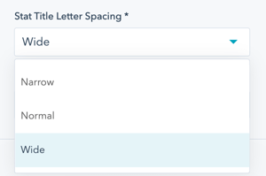
Style → Stat Title Letter Spacing
Choose the spacing between letters in stat titles:
- Narrow: Tight letter spacing (condensed appearance)
- Normal: Standard letter spacing
- Wide: Loose letter spacing (expanded appearance)
Impact on appearance:
- Narrow: More formal, compact look
- Normal: Standard readability
- Wide: Modern, spacious aesthetic
Tip: Wide letter spacing works well with uppercase stat titles for a premium look.
Style → Background
Choose from multiple background types:
- Background Color: Solid color fill
- Background Image/Video: Media background
- Background Gradient: Color gradient effect
- Transparent: No background
Performance tip: Solid colors and gradients load faster than images or videos.
Refer to Settings that apply to all Section Modules for more details about these choices.
Style → Shape Divider
Add optional shape dividers to the top or bottom of the module for visual separation between sections.
Refer to Settings for configuring Shape Dividers for more details about these choices.
How do I add animations to the module?
Animation
Enable or disable Animate on Scroll for the entire module. Turning off here applies only to this section.
Note: To turn animation off globally for all modules, refer to Theme Options for Animations.
Animation → Section
Set animation type and delay for the entire section container. This animates the whole stats module as it enters the viewport.
Animation → Intro to Title
Set animation type and delay specifically for the intro title text.
Animation → Title
Set animation type and delay specifically for the main title.
Animation → Description
Set animation type and delay specifically for the description text.
Tip: Use progressive delays (e.g., intro: 0ms, title: 100ms, description: 200ms, stats: 300ms) for a cascading reveal effect.
How do I control module visibility?
Visibility
Choose to hide your module on specific screen sizes:
- Hide on desktop only
- Hide on tablet only
- Hide on mobile only
- Show on all devices (default)
Use case: Display different stat sets for mobile vs. desktop users, or hide stat-heavy sections on mobile for better performance.
For more information see common module information.
How do I set up anchor links?
Anchor Link ID
Set an anchor link identifier for the module. Use anchor links to:
- Create direct links to specific sections
- Build on-page navigation menus (like Sticky Sub-Menu)
- Allow users to jump to sections without scrolling
Example: Set Anchor Link ID as "our-impact" to create links like yoursite.com/about#our-impact
For full instructions refer to Setting up Anchor Links.
How do I add custom CSS classes?
Custom Class
Add a Custom Class identifier to use in the child.css file for individual customizations.
This allows you to:
- Apply unique styling to specific stats modules
- Override theme styles for particular instances
- Create reusable custom styles across multiple pages
Ability to add a Custom Class to use in the child.css for individual customizations.
See full instructions for setting a Custom Class for Section Modules.
What is the "Is in Viewport" setting?
Is in Viewport?
This performance setting determines how CSS is loaded for the module.
When to check this box:
- Module is at the top of the page
- Module is located within the browser viewport on page load
- Ensures CSS loads immediately on page load
When to uncheck this box:
- Module is outside of the initial viewport
- Module is below the fold, especially on mobile
- Allows CSS to load asynchronously for better performance
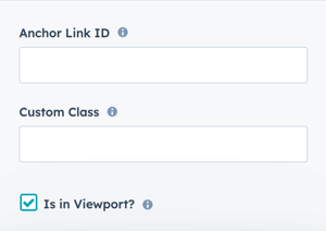
Important: This setting impacts Page Speed and Core Web Vitals scores. The stats counter animation is most effective when users scroll to it, so placing it below the fold is often optimal.
Learn more about this setting as it relates to Page Speed and Core Vitals.