
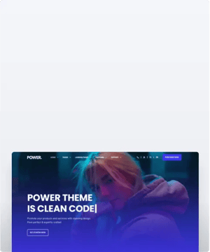
POWER Mini CTA Module
How to configure the Mini CTA/Button module for POWER Pro theme in HubSpot

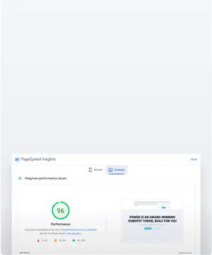
Very minimal impact to page load speed when used as a button and when you keep the number of CTAs on a page low.
Can increase page load speed when used as a CTA.
HubSpot's tracking code for CTAs adds extra code to the page that has to be loaded.
Only use CTAs for actions that are part of your critical conversion path(s) or that you are actively tracking in a campaign.
Buttons can be set up to match any CTA style from your theme settings, including the 4 custom styles.
What is the difference between a Mini CTA and Sec CTA?
The Mini CTA can be used in a custom drag-and-drop section and the Sec CTA is designed to be used as an section.
Button Type
There are two layout options available: CTA or Button.
Button Type > CTA
When CTA is chosen, the option to Choose CTA is available which opens the HubSpot CTA sidebar where you can choose an existing CTA or create a new CTA.
Button Type > Button
When Button is chosen, additional settings are available to configure the button.
Button Type > Button > Button Title
Button Title is the text that will appear on the button
Button Type > Button > Button Link
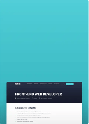
The Button Link dropdown allows you to choose the type of link to include for the button: External, Content, File, Email Address, or Blog
Based on your selection, you can either add the URL or email address or choose the page, file, or blog post.
Button Type > Button > Open in New Window
There is a toggle to allow you to open the link in a new window. The default is set to open in the same window/tab.
Tip: If your link is leaving your website, it is recommended to open it in a new window.
Button Type > Button > Link Type
There is a check box for "No Follow" which allows you to indicate that the link is not associated with your website. This setting has SEO implications if used incorrectly.
Layout > Alignment
Specify the alignment of the CTA/button within the section and/or column. Choices are Left (default), Center, and Right.
Layout > Margin Top, Margin Bottom, Margin Right, Margin Left
Individual settings for margin can be set in pixels, the default is 0px. Refer to Settings that apply to all Mini Modules for more details about using margin and padding to style a section and/or column.
Style > CTA Style
Option to choose any of the CTA/button styles configured in your theme settings including:
- Solid Primary
- Solid Regular
- Solid Regular for Primary Background
- Border Primary
- Border Regular
- Link
- Link Back
- Custom 01
- Custom 02
- Custom 03
- Custom 04
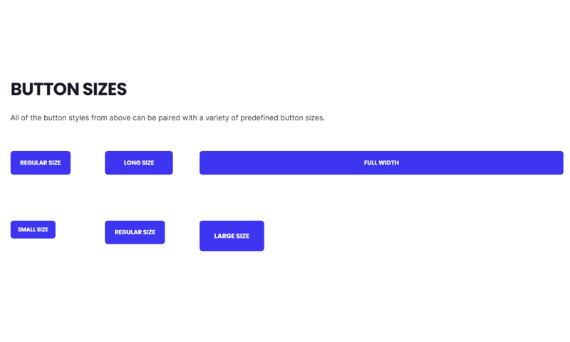
Style > CTA Size
Ability to override the default size of the CTA with choices for Regular, Long, Full Width, Small, and Large.
Animation
Checkbox to turn on/off Animate on Scroll. Turning off here will only apply to this module, to turn animation off globally refer to Theme Options for Animations.
Ability to change the Animation Type and Delay for the CTA/button.
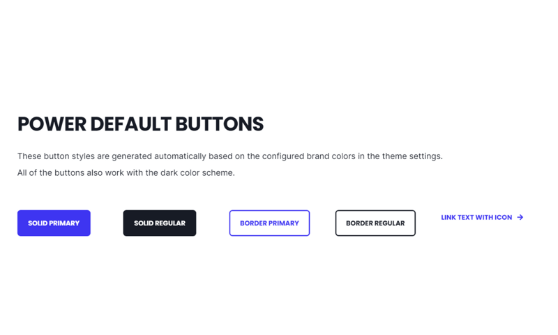
Style > CTA Style
Solid Primary
Solid Regular
Border Primary
Border Regular
Link
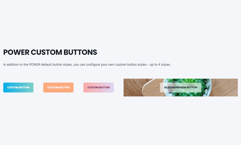
Style > CTA Style
Custom 01
Custom 02
Custom 03
Custom 04
Custom Button styles can be configured using a variety of style options in your theme settings (default buttons shown).
Style > CTA Style
Solid Primary
Style > CTA Size
Regular
Long
Full Width
Small
Regular
Large
DESIGN SOMETHING COOL WITH THIS POWER MODULE?
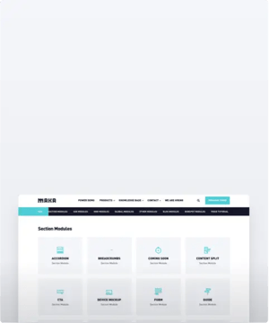
Share it with us!- MODULE OVERVIEW
- SEC Accordion
- SEC Breadcrumbs
- Coming Soon
- SEC CTA
- SEC Form
- SEC Images
- SEC Map
- SEC Post Preview
- SEC Simple Listing
- SEC Stats Counter
- SEC Steps
- SEC Timeline
- Sticky Sub-Menu
- SUB Accordion
- SUB Stats Counter
- SUB Steps
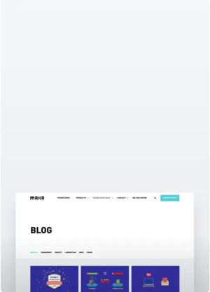
- Mini CTA
- Mini Icon
- Mini Tag
- Previous Next Navigation
- Page Settings
- HS Heading
- HS Divider
- HS Rich Text
- Back to Module Library