
TABLE OF CONTENTS
Page Speed Impact
Module Options
Page Speed Impact
Low - Very minimal impact to page load speed, the code for this module has been optimized to limit resources needed on page load.
Exceptions - Additional impact if images, videos and other content are added to the rich-text accordion items.
Performance considerations:
- Basic accordion: Minimal impact
- With images: Optimize images before adding
- With videos: Use YouTube embeds
- Many items: Still performs well
- Complex rich text: May increase load time
Note: For more detailed performance advice, review the POWER Performance Guide!
Setup Instructions
How to Set Up the POWER Accordion Module
Content → PWR Sec Accordion
The POWER Accordion module is designed to present content in a structured and visually appealing way. Use it to organize information, enhance readability, and create an interactive experience on your website!
Module Options
These settings are available for the POWER Sec Accordion module.
Building the Testimonials Module
Intro to Title
The smaller text above the title; can be left blank to hide on the page.
Title
The main heading for the section; can be left blank to hide on the page.
Title - Header Type
Choice of H1, H2, H3, or H4. This is how Google will determine the heading type. This does not control the formatting of the font, there is a separate setting under Style → Title Size to determine how the heading will display.
Header type selection:
- H1: Page title (typically one per page)
- H2: Major section headings (most common for modules)
- H3: Subsection headings
- H4: Minor headings
SEO importance: Header type tells search engines about content hierarchy and importance.
Description
You can add any amount of body text here or it can be left blank to hide on the page.
Description use cases:
- Introduce accordion content
- Provide context or instructions
- Explain purpose of section
- Guide user interaction
Accordion
This is where you will add the items that appear in the accordion.

Item management:
Hover actions: When you hover over the preset item, you will see two icons appear for actions you can take:
- Edit: Modify item content
- Clone: Duplicate item with formatting
Adding items:
Method 1 - Add link above first item: Additionally, there is a + Add link above the first item where additional items can be added.
Method 2 - Add within item settings: There is also a + Add link within the item settings to easily add additional items one after the other.
Tip: Depending on the complexity of the "answers" to your FAQ, it could be better to create the first item and then use the clone function to retain the formatting vs. using the +Add to create a set number of default items. If you have fairly simple Q&A without a lot of formatting, there is also a + Add link within the item settings to easily add additional items one after the other.
Accordion Item(s) → Title
This is where the Question goes if FAQ, otherwise, this is where the title/text goes that you want to display when the item is collapsed. This is a required field because it is used as the name of the item within the module, it can't be blank.
Accordion Item(s) → Description
This is where the Answer goes if FAQ, otherwise, this is where the text goes that you want to display when the item is expanded. The description uses a rich-text editor so you can format the answer as you'd like.
Description capabilities:
- Full rich-text editing
- Text formatting (bold, italic, lists)
- Links and buttons
- Images and videos (use sparingly)
- Multiple paragraphs
- HTML support

Accordion Item(s) → Open by default
By default, all items will be collapsed. If you want the item (or items) to be expanded on page load, you can check this box.

Accordion Item(s) → Animation
You can also override the default animation settings at the item level.

What layout options are available?
Layout → Choose Layout
There are two layout options available:
-
1 Column
-
2 Column

1 Column Layout:

2 Column Layout:

Layout → Intro Width
This allows you to control the width of the text, with two choices: Narrow or Default.
The module is set to "Narrow" when you add it to the page (this was the original layout prior to adding this choice as a setting). Narrow limits the width of the section text (intro to title, title, and description) within the section.
"Default" allows the text to fill the width of the module; the width is dependent on whether the section is set to "content width" or "full width" in the section settings.

Layout → Centered
By default, the section text (intro to title, title, and description) is left-aligned. If you want the text to be centered, you can check this box.
Layout → Padding Top and Padding Bottom
Choice of Standard, None, Small, Medium, Large, or First Section with Header. Refer to Settings that apply to all Section Modules for more details about these choices.
Layout → Show More
Enabling this option will allow you to hide your content behind a "show more" button depending on the size of your content.
Show More functionality:
- Initially shows portion of content
- "Show More" button reveals rest
- Useful for long accordion sections
- Reduces initial page height
- Improves perceived performance
When to use:
- Many accordion items (10+)
- Long-form content
- Page length concerns
- Progressive disclosure
- Mobile optimization

Layout → Show More Options
Within these options the "collapsed height" is the height of your module that you wish to set as the initially displayed section of your content. Any content that is above this collapsed height will be hidden initially behind your "show more" button.
Collapsed height settings: Within here you can set the initial height for your content within Desktop, Tablet and Mobile screen widths.
Device-specific heights:
- Desktop: Set pixel height
- Tablet: Custom height for tablets
- Mobile: Optimized mobile height
Button customization: You can also customise your button style based on thestandard theme button styles or use any of your custom button styles.
What styling options are available?
Style → Color Scheme
Choice of Light or Dark.
Tip: If you change the background color for the module, the definition of Light Color scheme is a light background with dark text and Dark Color scheme is a dark background with light text. Based on your background color, you would need to toggle the color scheme to ensure the text color displays properly and is legible.
Style → Intro Title Style - Text
The Default uses the text style from the Theme Settings based on the color scheme selected.
You can override the Theme Settings by choosing Color or Gradient and completing the corresponding color settings.
Style → Intro Title Style - Background
The Default is transparent, where the text is displayed directly on the background for the module.
You can apply a background Color or Gradient to the text to give the appearance of a highlight behind the text.
Style → Intro Title Style - Border Radius
When a background color or gradient is applied, you will also have the option to configure the Border Radius in pixels.
If not set, the default Border Radius from your Theme Settings will apply.
Style → Title Style
The Default uses the text style from the Theme Settings based on the color scheme selected.
You can override the Theme Settings by choosing Color or Gradient and completing the corresponding color settings.
Style → Title Size
The Default is set to match what you chose for Title Header-Type, what Google sees from an SEO perspective. This setting gives you the option to change the Title Size to H1, H2, H3, H4, H5, or H6 so that the text will be styled based on your Theme Settings for the corresponding header tag chosen here.
Visual vs. SEO:
- Header Type: SEO/semantic (what Google sees)
- Title Size: Visual styling (how it looks)
- Can be different for design flexibility
Example:
- Header Type: H2 (tells Google it's a section heading)
- Title Size: H1 (displays with larger H1 styling)
Style → Select Variant
This setting allows you to choose how you'd like the items in the accordion to look.
Variant choices:
- Text Only
- Boxed
- Boxed Border
- Boxed Glassmorphism

Check out the Configurations below to see how each of these variants can be styled.
Style → Overwrite Box Color
By default, the collapsed items use the background color established in your theme settings. If you want to change the item colors, you can check this box. This setting does not work for the "Text Only" Style Variant.
Style → Overwrite Box Color → Box Color Scheme
Once checked, you will have the choice to change between Light or Dark color scheme.
Style → Overwrite Box Color → Custom Box Background Color
Additionally, you can select a custom color for the item background when collapsed to use in place of the theme default.
The background color of the item on hover can only be set at the global level in the Theme Settings → Color → POWER → Boxed Elements.
Style → Background
Choice of Background Color, Background Image/Video, Background Gradient, or Transparent. Refer to Settings that apply to all Section Modules for more details about these choices.
Style → Shape Divider
Optional Shape Divider(s) can be added to the top or bottom of this module. Refer to Settings for configuring Shape Dividers for more details about these choices.
How do I configure animations?
Animation
Checkbox to turn on/off Animate on Scroll. Turning off here will only apply to this section, to turn animation off globally refer to Theme Options for Animations.
Animation → Section
Ability to change the Animation Type and Delay for the Section.
Animation → Intro to Title
Ability to change the Animation Type and Delay for the Intro to Title.
Animation → Title
Ability to change the Animation Type and Delay for the Title.
Animation → Description
Ability to change the Animation Type and Delay for the Description.
Tip: When modifying animation settings for an individual section, we recommend opening the preview link in a separate tab so you can easily preview the changes as you make them by refreshing the page.
Anchor Link ID
Set an anchor link for the module. Can be used to create a link directly to that section on the page and/or to include in an on-page menu (like Sticky Sub-Menu) to allow users to jump to that section without scrolling.
Easily add an anchor link to this section, for full instructions refer to Setting up Anchor Links.
Custom Class
Ability to add a Custom Class to use in the child.css for individual customizations.
Custom class use cases:
- Module-specific styling
- Advanced customizations
- Developer modifications
- Unique design requirements
See full instructions for setting a Custom Class for Section Modules.
Is in Viewport?
Performance setting to determine how the CSS is loaded for the module.
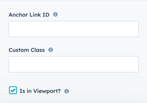
If the module is at the top of the page and located within the viewport of the browser, check this option to ensure the CSS loads on page load.
If the module is outside of the viewport, especially on mobile, uncheck this box so the CSS loads asynchronously.
Performance impact:
- In viewport: CSS loads immediately (critical CSS)
- Outside viewport: CSS loads asynchronously (better performance)
Best practices:
- Check if module is above the fold
- Uncheck for modules further down page
- Especially important on mobile
- Improves Core Web Vitals
Learn more about this setting as it relates to Page Speed and Core Vitals.