Theme Settings Structure
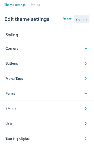
There are 8 sections in Theme Settings for Styling:
- Corners
- Buttons
- Menu Tags
- Forms
- Sliders
- Lists
- Text Highlights
- Code Highlighting
Styling
Navigate to: Theme Settings → Styling
This design group provides options to modify the default POWER styling to perfect the details for your website.
Purpose:
Fine-tune visual details to match your brand and create a polished, professional appearance.
How do I configure Link styling?
Styling → Links
The Link Style tab gives you control over how links appear across your site in both their default and interactive states.
There are two states that can be configured:
-
Link Regular — the default appearance of a link
-
Link Hover — the appearance when a cursor is hovered over a link
For each state, you can set the Font Weight and Text Decoration (e.g. underline, none). Under the Colors tab within each state, you can define colors separately for HTML Default, Light Scheme, and Dark Scheme. Within each of these, there are three color options available: Link Color, Text Decoration Color, and Background Color.
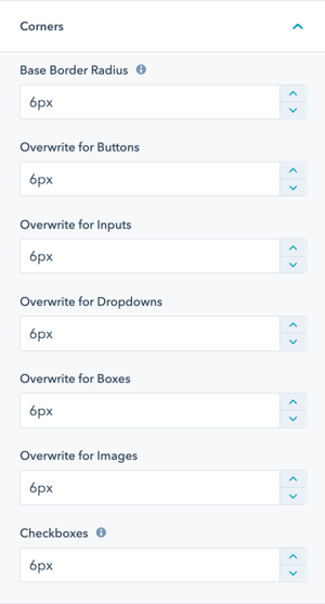
How do I configure Corner styling?
Styling → Corners
The style settings for corners will define how round your buttons, inputs, dropdowns, boxes, images, and checkboxes appear.
Base Border Radius: Defining the Base Border Radius will be the base size in pixels that all other settings inherit (except checkboxes, they can't be larger than 6 pixels or they would turn into radio buttons), with the option to overwrite any of the individual settings.
What Base Border Radius affects:
- Buttons and CTAs
- Form inputs
- Dropdown menus
- Content boxes
- Images
- Checkboxes (limited to 6px maximum)
Inheritance system:
- Set base value once
- All elements inherit automatically
- Override individual elements as needed
- Maintain consistency easily
Border radius recommendations:
- 0px: Sharp, modern, minimalist
- 3-6px: Subtle, professional (default is 6px)
- 8-12px: Friendly, approachable
- 15-20px: Soft, rounded, playful
- 25px+: Very rounded, pill-shaped
How do I create Custom Button styles?
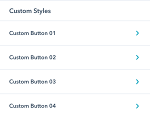
Styling → Buttons → Custom Styles
In addition to the default styles used for CTAs and Buttons, you can define up to 4 custom buttons.
Once defined, each of these button styles can be selected within POWER modules and also has a corresponding CSS class that can be used in rich text editors.
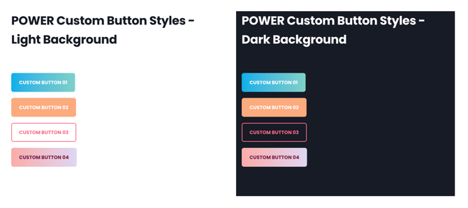
Custom button options:
- Custom Button 01
- Custom Button 02
- Custom Button 03
- Custom Button 04
Benefits:
- Create brand-specific button styles
- Support multiple button variations
- Use consistently across site
- No custom CSS needed
- Easy to update globally
Additional Settings for CTAs and Buttons.
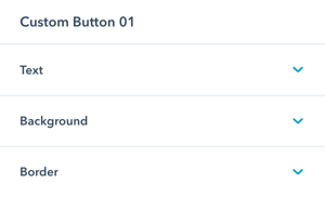
Styling → Buttons → Custom Styles → Custom Button 01-04
For each custom button, you can set the style for Text, Background, and Border.
For each of these options, you will have the option to configure the regular state and hover state for the button.
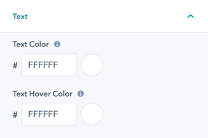
Styling → Buttons → Custom Styles → Custom Button 01-04 → Text
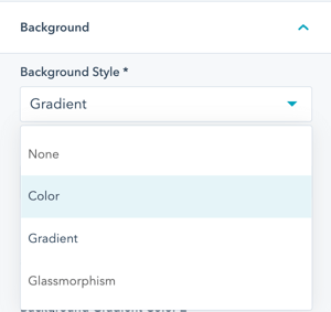
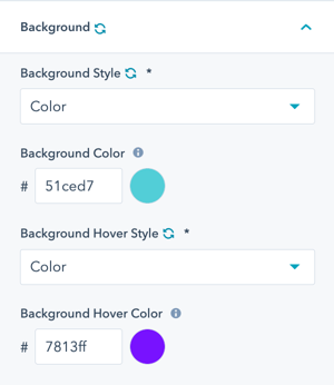
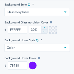
Styling → Buttons → Custom Styles → Custom Button 01-04 → Background → Background Style
Custom Buttons can have a transparent background (none) or color, gradient, or glassmorphism background style.
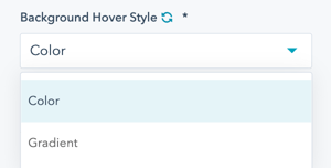
Styling → Buttons → Custom Styles → Custom Button 01-04 → Background → Background Hover Style
On hover, custom buttons can change to a color or gradient.
Styling → Buttons → Custom Styles → Custom Button 01-04 → Background → Color
Styling → Buttons → Custom Styles → Custom Button 01-04 → Background → Gradient
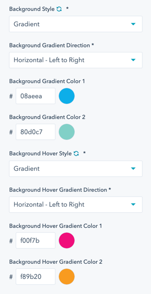
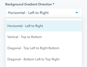
Styling → Buttons → Custom Styles → Custom Button 01-04 → Background → Gradient → Background Gradient Direction
Styling → Buttons → Custom Styles → Custom Button 01-04 → Background → Glassmorphism
Styling → Buttons → Custom Styles → Custom Button 01-04 → Border
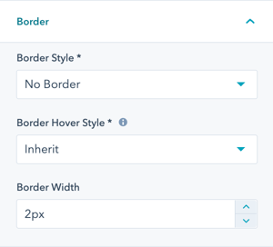
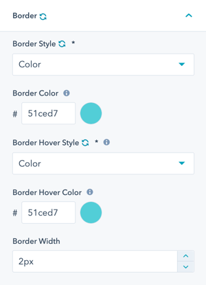
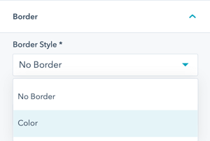
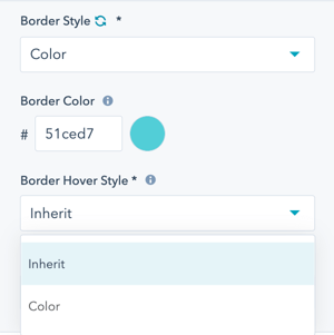
Styling → Buttons → Custom Styles → Custom Button 01-04 → Border → Border Style
Styling → Buttons → Custom Styles → Custom Button 01-04 → Border → Border Hover Style
Inherit will retain the settings for the regular state, or you can select another color.
Styling → Buttons → Custom Styles → Custom Button 01-04 → Shadows
Option to set up to 2 shadows for your custom button.
Styling → Buttons → Custom Styles → Custom Button 01-04 → Shadows 1-2
Custom shadows can be positioned inside or outside of your button. The size and position of the shadow can be set through the horizontal offset, vertical offset, blue radius and the spread radius.

Specific styles for the shadow of your button when the cursor is hovered over this by checking the "alternative hover styles" box.

Styling → Buttons → Custom Sizes → Custom Button 01-02
Set a custom size to add into your button modules. This is additional padding, font-sizes and line-height to be selected on top of the default sizes within your CTA/Button modules.
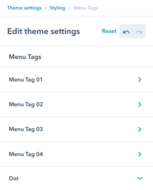
How do I style Menu Tags?
How do I configure Menu Tags?
Styling → Menu Tags
The style settings for menu tags will define how menu tags and the pulsing dot appear.
There are four menu tags that can be configured as well as a Dot.
Menu tag options:
- Menu Tag 01
- Menu Tag 02
- Menu Tag 03
- Menu Tag 04
- Dot (pulsing indicator)
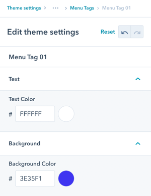
Styling → Menu Tags → Menu Tag 01-04
For each menu tag, you can set the style for:
- Text color
- Background color
Styling → Menu Tags → Dot
For the dot, you can set:
- Color
- Visibility (show/hide)
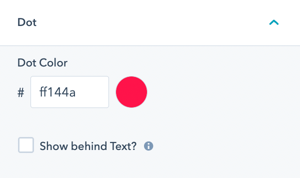
Styling → Menu Tags → Show behind Text?
The default for the dot is to be in the upper left of the menu item and when it pulses it is above the text.
Check the box for the option to show the dot behind the text instead.
Dot positioning options:
- Default: Upper left, above text (more prominent)
- Behind text: Upper left, behind text (more subtle)
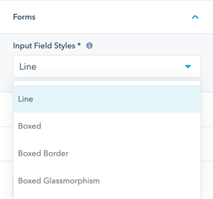
How do I configure Form styling?
Styling → Forms
Select the Input Field Style for your default form settings. This will be applied to all POWER Sec Form Modules, where you can override the default for individual modules/pages.
Available form styles: Multiple pre-configured input field styles to choose from.
Preview Form Styles: Review visual examples of each form style before selecting.
Form style characteristics:
- Input field appearance
- Border styles
- Focus states
- Label positioning
- Error state styling
Override capability: While this sets the global default, you can override for individual forms when needed.
How do I configure Slider styling?
Styling → Sliders
Modify the default styling for bullet points used for sliders used in the POWER Sec Images and POWER Sec Testimonials modules.
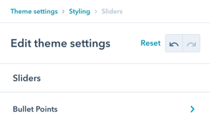
Styling → Sliders → Bullet Points
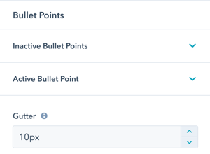
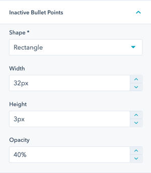
Styling → Sliders → Bullet Points → Inactive Bullet Points
Inactive Bullet Points are the slides not currently shown.
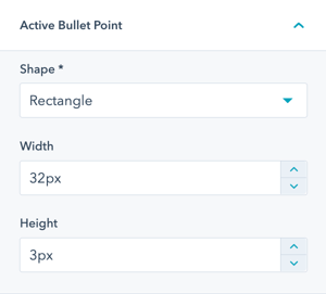
Styling → Sliders → Bullet Points → Active Bullet Points
The Active Bullet Point is for the slide currently visible/active.
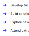
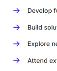
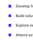
Styling → Lists → UL - Bullet List
Modify the default styling for bullet points for unordered lists across all modules and rich text fields.
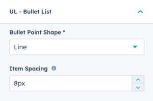
There are 8 choices available for bullet point styles:
- Arrow
- Arrow Thin
- Checkmark
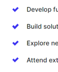
- Checkmark Thin
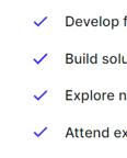
- Circle
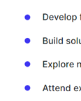
- Circle Outline
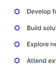
- Line
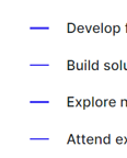
- Square
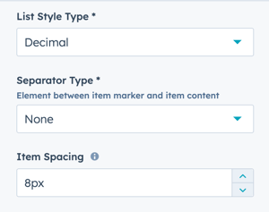
Styling → Lists → OL - Numbered List
Modify the default styling for numbering for ordered lists across all modules and rich text fields.
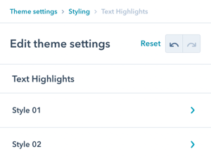
How do I configure Text Highlights?
Styling → Text Highlights
The style settings for text highlights will define how the mark and em HTML tags appear.
There are two styles that can be configured:
- Style 01 (mark HTML tag)
- Style 02 (em HTML tag)
Purpose: Create visual emphasis for important text without custom CSS.
Styling → Text Highlights → Style 01
Style 01 applies to the mark HTML tag.
Check the box to Activate Style (otherwise the default HubSpot definition applies).
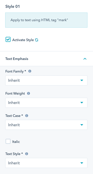
Styling → Text Highlights → Style 01 → Text Emphasis → Font Family
Inherit uses the pre-configured font family of the text element.
Option to change to Base or Accent font.
Styling → Text Highlights → Style 01 → Text Emphasis → Font Weight
Inherit uses the pre-configured font weight of the text element.
Option to change the font weight, make sure only font weights included in your font settings are chosen.
Styling → Text Highlights → Style 01 → Text Emphasis → Text Case
Inherit uses the pre-configured case of the parent text element.
Option to change the capitalization to one of Uppercase, Lowercase, or Capitalize.
Styling → Text Highlights → Style 01 → Text Emphasis → Italic
Option to change the text to Italic.
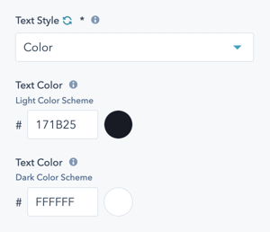
Styling → Text Highlights → Style 01 → Text Emphasis → Text Style
Inherit uses the pre-configured color of the text element.
Option to change the text to a specific color for Light and Dark Schemes.
Styling → Text Highlights → Style 01 → Underline/Mark
Option to Activate Underline/Mark.
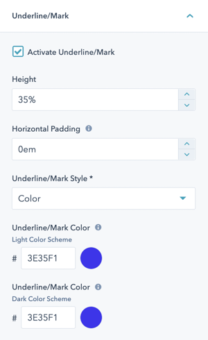
Styling → Text Highlights → Style 01 → Underline/Mark → Height
Defines the height of the underline/mark; how tall you want it to be relative to the font size.
Styling → Text Highlights → Style 01 → Underline/Mark → Horizontal Padding
Defines the horizontal padding in ems.
The unit em is a dynamic unit that takes the font size into account. 1em = same as font size of the text. 0.5em = half the font-size of the text, etc.
Styling → Text Highlights → Style 01 → Underline/Mark → Underline/Mark Style
Choice of Color or Gradient.
Option to define the color and/or gradient for light and dark scheme separately.
Styling → Text Highlights → Style 02
Style 02 applies to the em HTML tag.
Check the box to Activate Style (otherwise the default HubSpot definition applies).
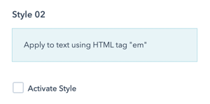
Style 02 has the same settings and options as Style 01.
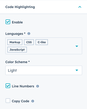
Styling → Code Highlighting → Languages
Code Highlighting is enabled by default and automatically applies to common code languages.
Styling → Code Highlighting → Languages
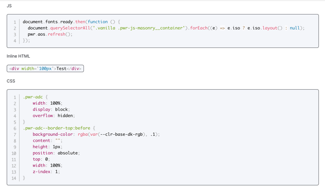
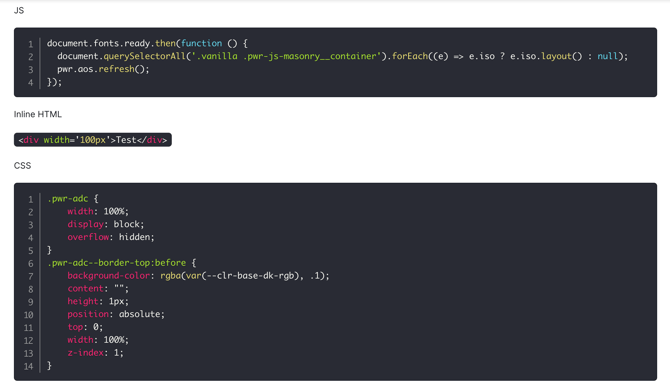
Styling → Code Highlighting → Color Scheme
Choice of Light or Dark color scheme
Example of light scheme:
Example of dark scheme:
Styling → Code Highlighting → Line Numbers
Uncheck the box to remove the Line Numbers.
Example without line numbers:
Styling → Code Highlighting → Copy Code
Check the box to add a copy button on hover (upper right corner).
Example with copy button: