Skip to content
maka-img_mm_marketplace
maka marketplace

Discover Products to help you POWER up with CMS Hub

maka-img_mm_power-pro
Power Pro Theme

Check out the POWER demo and see all the latest features

maka-img_mm_performance
Performance

POWER is optimized to perform, review the results

maka-img_mm_customer-showcase
Customer Showcase

See how our customers used the POWER Theme

POWER Pro V34 released on November 2nd 2023 – Read Changelog

maka-img_mm_documentation_3
Getting Started

Follow our guide to save time and avoid missing a step

maka-img_mm_module-library
Module Library

From page speed impact to set up instructions, you'll find it all

maka-img_mm_video-tutorials
Video tutorials

Find all POWER videos in the same spot for quick answers

maka-mm_faq-2
FAQs

Have questions?
Search for answers

Experiencing an issue with POWER? Submit a support ticket here

maka-img_mm_about-us
About us

“Would I rather be feared or loved? Easy. Both. I want people to be afraid of how much they love me.”
– Michael Scott, not us

maka-img_mm_blog
Blog

This is mostly a demo right now. We are working on some really cool things around the office.

maka-img_mm_career
Career

Quite possibly the most fun you will have at work, ever. Did we mention how cool we are?

Having issues with POWER?
SUBMIT A SUPPORT TICKET


Schedule a Q&A or Demo
PREPURCHASE CONSULTATION


Looking for Custom Development?
REQUEST A QUOTE


Other questions?
CONTACT US / CHAT BOT

Divider Common Module

How to configure the Divider common module for POWER Pro theme in HubSpot

hubspot-icon-module-divider

DIVIDER

Add a line to create a visual horizontal divider to sections by adding to your drag-and-drop layouts.

hs-common-module-divider-horizontal-rule

FAQ

Why is the color I picked for the Divider module not working?

The theme overwrites the color for the Horizontal Rule to be your primary brand color.

Module Options

The Divider module can be used in the drag-and-drop editor to create custom section layouts.

Helpful Links: Settings for Theme Styles

Height

Add the height in pixels to set the line weight.
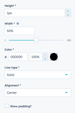
divider-common-module-settings-hubspot

Width

The default is 50% and can be set from 1 to 100% of the module width.

If set to 100%, to span from edge to edge of the page the section content and alignment also needs to be set to Full Width.

section-full-width

Color

Add a Hex value or use the color picker to select a color. Adjust the percentage from 0 to 100% to set the opacity.

Line Type

Choice of Solid, Dotted, or Dashed.

Alignment

Choice of Left, Centered, or Right

Show padding?

Check the box to configure optional padding up to 20 px above and below the divider.
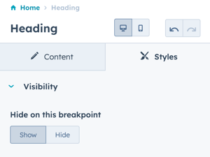
Styles → Visibility

Option to Show or Hide on this breakpoint (based on desktop or mobile toggle selection).

heading-visibility-desktop-mobile

Styles → Alignment and spacing

Option to configure the padding for the Top, Left, Right, and Bottom of the module, and the margin for the Top and Bottom.

hubspot-common-module-styles-alignment-and-spacing

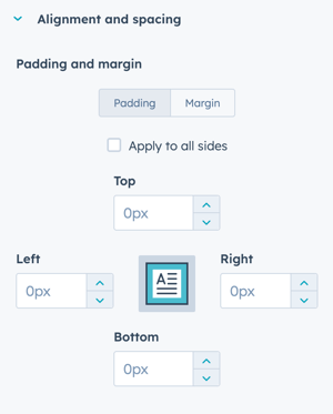
The padding and margin can be configured independently for the desktop and mobile breakpoints. Checking the box "Apply to all sides" will apply the same settings to all breakpoints and sides.

Styles → Typography

Option to overwrite the theme settings for the selected heading type. The changes will only apply to this instance of the heading module.

hubspot-common-module-styles-typography

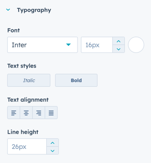
This setting doesn't apply to the divider module since there is no text included.
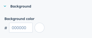
Styles → Background

Add a Hex value for the desired background color or use the color picker to choose a color.

common-module-background-color

Styles → Border

Option to add a border to the Heading module, this applies to all four sides to create a boxed outline.

common-module-border

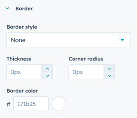
Not recommended to use in combination with the Divider module.

NEVER MISS A POWER UPDATE

We are continuously improving our modules and updating our documentation. Stay in the loop.