Theme Settings
What is the Back to Top Button?
The Back to Top Button is a floating button that allows users to quickly scroll back to the top of the page with one click.
Button benefits:
- Improves user experience on long pages
- Reduces scrolling effort
- Enhances navigation
- Mobile-friendly convenience
- Customizable appearance
- Global or device-specific display
Common use cases:
- Long-form blog posts
- Product pages with detailed descriptions
- FAQ pages
- Documentation pages
- Service pages
- Any page requiring significant scrolling
Once selected, the Back to Top Button visibility options, layout, and style settings can be configured.
How do I enable the Back to Top Button?
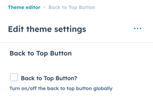
Back to Top Button → Back to Top Button?
Option to turn on/off the back to top button globally.
Enable/disable:
- Check box: Button enabled site-wide
- Uncheck box: Button disabled completely
Global control: This setting affects all pages across your website.
Option to turn on/off the back to top button globally.
Back to Top Button → Visibility
Choice of After Scroll or Always Visible, the default option is After Scroll.
Visibility options:
After Scroll (Default):
- Button appears after user scrolls down
- Hides at top of page
- More elegant, less intrusive
- Recommended for most sites
Always Visible:
- Button always visible on screen
- Displays even at top of page
- More prominent
- Use for specific needs
Recommendation: After Scroll provides better user experience by appearing only when needed.
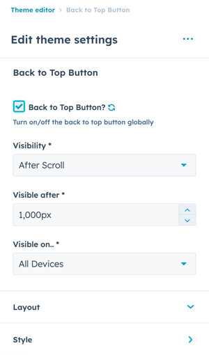
Back to Top Button → Visible after
Set the number of pixels from the top of the browser viewport when the button should appear.
This option only applies when After Scroll is selected.
Back to Top Button → Visible on..
Choice of All Devices, Desktop/Tablet Only, or Mobile Only.
What are the layout options for Back to Top Button ?
Back to Top Button → Layout
Set the Position, Spacing, and Spacing (Mobile) for the back to top button.
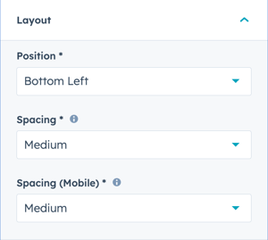
Back to Top Button → Layout → Position
Choice of Bottom Left, Bottom Center, or Bottom Right.
Back to Top Button → Layout → Spacing
Choice of None, Small, Medium, or Large.
Space between back to top button and window borders.
Back to Top Button → Layout → Spacing (Mobile)
Choice of None, Small, Medium, or Large.
Space between back to top button and window borders for mobile screens.
How do I style the Back to Top Button ?
Back to Top Button → Style
Set the Shape, Border Radius, Size, Colors, Border, and Shadow settings for the back to top button.
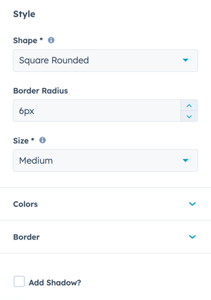
Back to Top Button → Style → Shape
Choice of Square, Square Rounded, or Circle.
Back to Top Button → Style → Border Radius
Available for Square Rounded Shape only, the default pixels are inherited from Styling → Corners → Base Border Radius and can be overwritten here (once overwritten, any changes to the Base Border Radius will not update this setting futher).
Back to Top Button → Style → Colors
Set the Arrow and Background Colors.
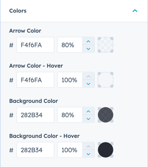
Define the Arrow Color, Arrow Color - Hover, Background Color, and Background Color - Hover by selecting the color hex code or use HubSpot’s color picker. Additionally, the opacity for each color can be configured.
Back to Top Button → Style → Border
Choice of No Border or Color.
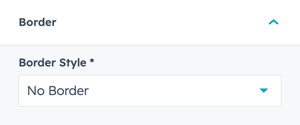
Back to Top Button → Style → Border Style
When Color is selected, additional options to configure the Border appearance are available
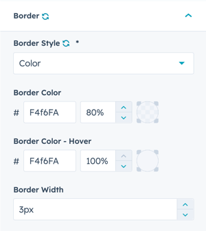
Define the Border Color and Border Color - Hover by selecting the color hex code or use HubSpot’s color picker. Additionally, the opacity for each color can be configured.
Back to Top Button → Style → Border Style → Border Width
Set the number of pixels to define the border width (thickness of the border).
Back to Top Button → Style → Add Shadow
Check the box to add a shadow to the back to top button.