
TABLE OF CONTENTS
Page Speed Impact
Setup Instructions
Module Options
Page Speed Impact
Low - The mega menu itself will not have a significant impact on page speed.
Exceptions - Additional impact on desktop if images are added to the rich-text editor without being properly sized and compressed. An image background can also impact page performance.
Take a look at our performance guide to get your website running its best!
Setup Instructions
How to Set Up the Advanced Mega Menu
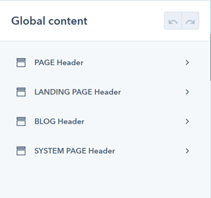
POWER Header → Global Content
The Advanced Mega Menu is configured from the Global Header and has to be set up independently for each page type where you would like to use this feature.
Publishing the Global Header with Advanced Mega Menu
When you're ready to publish the Global Header, you'll click the orange Publish to X assets button in the upper right corner.

If you used the "Show Permanently" option while building your Advanced Mega Menu, please make sure you have unchecked the box prior to publishing. Once published all changes are visible on all live pages with the corresponding header.
You can continue to build your Advanced Mega Menu without publishing by clicking Back to page editor and leaving with unpublished changes.

Setting up Navigation for the Advanced Mega Menu
Essentially, the Advanced Mega Menu allows you to replace the child menu items for your top-level navigation.
To ensure your menu works on tablet and mobile, we suggest building the navigation for your Advanced Mega Menu to contain the necessary top-level items and adding child items as needed for tablet and mobile.
Once activated, the Mega Menu(s) will replace the child items for desktop so that you would see the top-level items and the corresponding Mega Menu.
Alternatively, you can create the top-level menu to be used with your Advanced Mega Menu on desktop and then create a mobile-specific menu that can be added to the header settings.
You will also need to set up individual menus to be used within the columns if you are using the Menu content type.
If you use the Simple menu content type you can create and edit your menu directly within your footer editor.
Simple menu content types allow you to create a menu directly in your CMS page editor. This has improved this improves performance and accessibility compared to advanced navigation menus available in the global HubSpot settings.
For HubSpot global advanced menus you can choose the "menu" content type.
Outlining Your Advanced Mega Menu
The layout of the mega menu is based on a 12-column grid, this allows for the most flexible layout to work with a variety of content elements and design layouts.
If you're not familiar with a 12-column grid in design, imagine 12 columns in a spreadsheet and you get to pick how many of those columns should be included in each of the menu columns.

For example, if you want your menu to have 2 columns, you could divide the 12 columns out to have 3 and 9, 4 and 8, 6 and 6, 8 and 4, or 9 and 3. These numbers form the width of the two columns where your content will go.
Within each column, you can create groups of content within a wrapper. The wrapper allows you to apply style and layout settings to unify the contents and create rows within the columns. You can have multiple contents in a wrapper, and multiple wrappers in a column.
Components of the Advanced Mega Menu
Use these links to jump to the corresponding configuration settings below.
Mega Menu(s) = overall structure that will replace the existing dropdown for top-level navigation; 1 per top-level menu item
Column(s) = the main structure of the Mega Menu; 1 to 6 columns per mega menu
Wrapper(s) = a grouping of content within a column; at least 1 per column
Content(s) = choice of content type to be added to the wrapper; at least 1 per wrapper
Sub Area Top = an area above the mega menu for additional content, can be one to three columns, each with one content item; 1 per mega menu
Sub Area Bottom = an area below the mega menu for additional content, can be one to three columns, each with one content item; 1 per mega menu
Styling the Advanced Mega Menu
Use these links to jump to the corresponding style settings below.
Mega Menu Style = overall style of the Mega Menu, the background here is the furthest layer back
Column Style = individual style settings per column, this layer is on top of the Mega Menu
Wrapper Style = style settings for individual wrappers within a column, this layer is on top of the Column and all content within the wrapper sits on top of the wrapper styles
Sub Area Top Style = independent of the Mega Menu Style settings, on the same layer as the Mega Menu background
Sub Area Bottom Style =independent of the Mega Menu Style settings, on the same layer as the Mega Menu background
Module Options
These settings are available for each Header Type. We recommend opening a second browser window once you have the PAGE Header configured to make it easier to configure the Advanced Mega Menu for any additional page types needed.
Activating the Advanced Mega Menu
POWER Header → Advanced Mega Menu
Advanced Mega Menu is for Desktop only, all other devices will use the existing menu as configured.

POWER Header → Layout → Choose Layout
If you are using the Advanced Mega Menu the Layout needs to be set to Dropdown or one of the Mega Menu choices, it is not compatible with the Burger, Burger Only, or Landing Page.

POWER Header → Advanced Mega Menu → Mega Menu(s)
Build a Mega Menu for any of the Menu Items in your Main Navigation Menu (a top-level menu with 4 items can have up to 4 mega menus. If no mega menu is built for an item, the existing menu structure remains).
Click Add one to get started. This will open the settings for your first Mega Menu.
POWER Header → Advanced Mega Menu → Layout
The settings will open to the Layout section first, this is where you will define the basic structure of your Mega Menu.

POWER Header → Advanced Mega Menu → Layout → Width of Mega Menu
Choice of Content Width, Full Width, or Custom Width.
If set to full width, the mega menu spans the whole window width. If set to content width, the mega menu spans only the content area width.
POWER Header → Advanced Mega Menu → Layout → Width of Mega Menu → Custom Width
Choice of Content Width or Full Width.
If set to custom width, you can determine the width of the mega menu in pixels. We recommend building your Mega Menu first using Content Width and returning here to set a Custom Width if you want the Mega Menu to be narrower.
POWER Header → Advanced Mega Menu → Layout → Width of Content
If set to full width, the mega menu content spans the whole mega menu container. If set to content width, the mega menu content spans only the content area width.
POWER Header → Advanced Mega Menu → Layout → Column Layouts & Widths
The column layout is based on a 12-column grid. The numbers in brackets are the column widths based on the total being 12.
Column Layouts & Widths available include:
- 1 Column - [ 12 ]
- 2 Columns - [ 3 | 9 ]
- 2 Columns - [ 4 | 8 ]
- 2 Columns - [ 6 | 6 ]
- 2 Columns - [ 8 | 4 ]
- 2 Columns - [ 9 | 3 ]
- 3 Columns - [ 2 | 2 | 8 ]
- 3 Columns - [ 2 | 8 | 2 ]
- 3 Columns - [ 8 | 2 | 2 ]
- 3 Columns - [ 3 | 3 | 6 ]
- 3 Columns - [ 3 | 6 | 3 ]
- 3 Columns - [ 6 | 3 | 3 ]
- 3 Columns - [ 4 | 4 | 4 ]
- 4 Columns - [ 2 | 2 | 2 | 6 ]
- 4 Columns - [ 2 | 2 | 4 | 4 ]
- 4 Columns - [ 2 | 4 | 2 | 4 ]
- 4 Columns - [ 2 | 4 | 4 | 2 ]
- 4 Columns - [ 3 | 2 | 2 | 5 ]
- 4 Columns - [ 3 | 3 | 3 | 3 ]
- 4 Columns - [ 3 | 5 | 2 | 2 ]
- 4 Columns - [ 4 | 2 | 2 | 4 ]
- 4 Columns - [ 4 | 2 | 4 | 2 ]
- 4 Columns - [ 4 | 4 | 2 | 2 ]
- 4 Columns - [ 6 | 2 | 2 | 2 ]
- 5 Columns - [ 2 | 2 | 2 | 2 | 4 ]
- 5 Columns - [ 2 | 2 | 2 | 3 | 3 ]
- 5 Columns - [ 3 | 3 | 2 | 2 | 2 ]
- 5 Columns - [ 4 | 2 | 2 | 2 | 2 ]
- 6 Columns - [ 2 | 2 | 2 | 2 | 2 | 2 ]
POWER Header → Advanced Mega Menu → Layout → Column Padding
Set a custom padding for each column.
POWER Header → Advanced Mega Menu → Layout → Compensate Outer Column Padding
Choice of None, Left, Right, or Left & Right.
This makes the most sense for layout = full-width and content = content width. If the column does not have a background style, this setting allows for it to better align the content to the other content of the page.
We recommend building the mega menu columns first and coming back to see if this setting is needed.
POWER Header → Advanced Mega Menu → Layout → Space between Wrappers
Set the space in pixels between each of the wrappers within this column.
POWER Header → Advanced Mega Menu → Layout → Height Mode
Choice of Standard or stretched. If set to stretched each wrapper will stretch to fill up the column vertically. Standard will be the content height.
Adding a Mega Menu
POWER Header → Advanced Mega Menu → Mega Menu(s)
After you select the number of columns, you'll need to scroll to the top of the settings to start on some of the basics before you start building.

POWER Header → Advanced Mega Menu → Mega Menu(s) → Internal Name
This is where you can name each of your mega menus, we suggest naming it after the top-level menu item you are building for so you can keep track of them easily.
If left blank, your mega menu will be named by default.

POWER Header → Advanced Mega Menu → Mega Menu(s) → Target
Choose the menu item from the Main Navigation Menu that should be targeted for this mega menu (for a top-level menu with 4 items, you would enter 2 here to target the second item).
This menu has 3 top-level items, the numbering for the targets starts on the left.

A separate Mega Menu would need to be built for each top-level item, otherwise, the existing menu items will remain as configured in the Navigation settings.
POWER Header → Advanced Mega Menu → Mega Menu(s) → Show Permanently
Check this setting to force the mega menu to display in the preview. This is for editing purposes so you can see the menu without having to hover over the menu.
With this option activated, the preview viewport should be larger than 992px in width to be able to see the mega menu. Otherwise, the viewport should be larger than the content width (Default: 1200px). The latter applies to the live site as well.
POWER Header → Advanced Mega Menu → Mega Menu(s)
Below the Show Permanently setting are the settings where you'll start building the structure for your mega menu.
We recommend building out the structure and contents and then going back to review the style and alignment options to refine the design and layout.

In addition to the main column layout, you have the option to configure a Sub Area on Top and a Sub Area on Bottom; these settings essentially allow you to add an additional row of content above and/or below the footer.
It is important to note that these sub-areas have different settings and some limitations compared to the main columns; this is not how you would create rows within the columns, which is done by adding more than one wrapper to a column.
Jump to Mega Menu Style Settings ↓
Skip Sub Area Top settings (jump to column setup) ↓
Adding a Sub Area on Top
POWER Header → Advanced Mega Menu → Mega Menu(s) → Show Sub Area on Top
To activate the Sub Area on Top, check the box to reveal the settings.

POWER Header → Advanced Mega Menu → Mega Menu(s) → Sub Area Top
The settings will open with the Layout section set to 3 Columns, this is the max number of columns for the Sub Area Top.

POWER Header → Advanced Mega Menu → Mega Menu(s) → Sub Area Top → Column Layouts & Widths
The column layout is based on a 12-column grid. The numbers in brackets are the column widths based on the total being 12.
Column Layouts & Widths available include:
- 1 Column - [ 12 ]
- 2 Columns - [ 3 | 9 ]
- 2 Columns - [ 4 | 8 ]
- 2 Columns - [ 6 | 6 ]
- 2 Columns - [ 8 | 4 ]
- 2 Columns - [ 9 | 3 ]
- 3 Columns - [ 2 | 2 | 8 ]
- 3 Columns - [ 2 | 8 | 2 ]
- 3 Columns - [ 8 | 2 | 2 ]
- 3 Columns - [ 3 | 3 | 6 ]
- 3 Columns - [ 3 | 6 | 3 ]
- 3 Columns - [ 6 | 3 | 3 ]
- 3 Columns - [ 4 | 4 | 4 ]
POWER Header → Advanced Mega Menu → Mega Menu(s) → Sub Area Top → Vertical Alignment
The Vertical Alignment of sub-content (how the content aligns within the Sub Area Top).
Choice of Top, Middle, or Bottom.
POWER Header → Advanced Mega Menu → Mega Menu(s) → Sub Area Top → Padding Top and Padding Bottom
Choice of Standard or None.
POWER Header → Advanced Mega Menu → Mega Menu(s) → Sub Area Top → Column 1 -3
For each column, you can configure the Content and Layout.
In the Sub Areas, it is only possible to add one content item per column.

POWER Header → Advanced Mega Menu → Mega Menu(s) → Sub Area Top → Column 1 -3 → Content
Choice of Empty, Button/Link, CTA, or Rich Text Field.
POWER Header → Advanced Mega Menu → Mega Menu(s) → Sub Area Top → Column 1 -3 → Content → Alignment Horizontal
Choice of Left, Center, or Right.
Determine where the content should be positioned within the column.
Sub Area Top Style Settings
POWER Header → Advanced Mega Menu → Mega Menu(s) → Sub Area Top → Style
The style settings for the Sub Area Top apply to all columns.

POWER Header → Advanced Mega Menu → Mega Menu(s) → Sub Area Top → Style → Color Scheme
Choice of Light, Dark, or Inherit.
Tip: If you change the background color for the module, the definition of Light Color scheme is a light background with dark text and Dark Color scheme is a dark background with light text. Based on your background color, you would need to toggle the color scheme to ensure the text color displays properly and is legible.
POWER Header → Advanced Mega Menu → Mega Menu(s) → Sub Area Top → Style → Border
Choice of Top, Bottom, or None.
POWER Header → Advanced Mega Menu → Mega Menu(s) → Sub Area Top → Style → Background
Choice of Background Color, Background Image, Background Gradient, Glassmorphism/Blur, Transparent.
POWER Header → Advanced Mega Menu → Mega Menu(s) → Sub Area Top → Style → Background → Background Color
Define the background color by the color hex code or use HubSpot’s color picker. Additionally, the opacity of the background color can be configured.

POWER Header → Advanced Mega Menu → Mega Menu(s) → Sub Area Top → Style → Background → Background Image
Select an Image for the Sub Area Top background.

POWER Header → Advanced Mega Menu → Mega Menu(s) → Sub Area Top → Style → Background → Background Image → Background Position
Choice of Bottom, Center, Left, Right, or Top.
For the Image, you can choose where the focal point is within the content area.
POWER Header → Advanced Mega Menu → Mega Menu(s) → Sub Area Top → Style → Background → Background Image → Background Image Overlay
Option to add an overlay to the background image, as a single color or gradient.
Setting the opacity for the color or gradient is required to see the image through the overlay.
For the gradient option, you can either set an opacity per gradient color or an overall opacity for the entire gradient.

POWER Header → Advanced Mega Menu → Mega Menu(s) → Sub Area Top → Style → Background → Background Gradient → Background Gradient Direction
Choice of Horizontal - Left to Right, Vertical - Top to Bottom, Diagonal - Top Left to Bottom Right, or Diagonal - Bottom Left to Top Right.
Define each of the background gradient colors by the color hex code or use HubSpot’s color picker. Additionally, the opacity of each color can be set.

POWER Header → Advanced Mega Menu → Mega Menu(s) → Sub Area Top → Style → Background → Glassmorphism/Blur
Define the background color by the color hex code or use HubSpot’s color picker to be used to create the Glassmorphism/Blur effect. Additionally, the opacity of the background color can be configured.
For browsers that do not support this effect, a non-blur version will be set.

POWER Header → Advanced Mega Menu → Mega Menu(s) → Sub Area Top → Style → Background → Transparent
If set to transparent, the content on the page behind the Sub Area Top will be visible.
Configuring Columns
POWER Header → Advanced Mega Menu → Mega Menu(s) → Column 1 -6
For each column, you need to add at least one Wrapper.

POWER Header → Advanced Mega Menu → Mega Menu(s) → Column 1 -6 → Layout → Alignment Vertical
Choice of Top, Middle, or Bottom.
Aligns the wrappers within the column.
Column Style Settings
POWER Header → Advanced Mega Menu → Mega Menu(s) → Column 1-6 → Style
The style settings for the Column apply to the entirety of the column; each column can be styled independently otherwise the style settings from the Mega Menu will be inherited.
Column styles are layered on top of the Mega Menu styles, which can then be layered on top of with Wrapper styles.
POWER Header → Advanced Mega Menu → Mega Menu(s) → Column 1-6 → Style → Color Scheme
Choice of Light, Dark, or Inherit.
Tip: If you change the background color for the module, the definition of Light Color scheme is a light background with dark text and Dark Color scheme is a dark background with light text. Based on your background color, you would need to toggle the color scheme to ensure the text color displays properly and is legible.
POWER Header → Advanced Mega Menu → Mega Menu(s) → Column 1-6 → Style → Border
Choice of Top, Bottom, or None.
POWER Header → Advanced Mega Menu → Mega Menu(s) → Column 1-6 → Style → Background
Choice of Background Color, Background Image, Background Gradient, Glassmorphism/Blur, Transparent.
POWER Header → Advanced Mega Menu → Mega Menu(s) → Column 1-6 → Style → Background → Background Color
Define the background color by the color hex code or use HubSpot’s color picker. Additionally, the opacity of the background color can be configured.
POWER Header → Advanced Mega Menu → Mega Menu(s) → Column 1-6 → Style → Background → Background Image
Select an Image for the Column background.
POWER Header → Advanced Mega Menu → Mega Menu(s) → Column 1-6 → Style → Background → Background Image → Background Position
Choice of Bottom, Center, Left, Right, or Top.
For the Image, you can choose where the focal point is within the content area.
POWER Header → Advanced Mega Menu → Mega Menu(s) → Column 1-6 → Style → Background → Background Image → Background Image Overlay
Option to add an overlay to the background image, as a single color or gradient.
Setting the opacity for the color or gradient is required to see the image through the overlay.
For the gradient option, you can either set an opacity per gradient color or an overall opacity for the entire gradient.
POWER Header → Advanced Mega Menu → Mega Menu(s) → Column 1-6 → Style → Background → Background Gradient → Background Gradient Direction
Choice of Horizontal - Left to Right, Vertical - Top to Bottom, Diagonal - Top Left to Bottom Right, or Diagonal - Bottom Left to Top Right.
Define each of the background gradient colors by the color hex code or use HubSpot’s color picker. Additionally, the opacity of each color can be set.
POWER Header → Advanced Mega Menu → Mega Menu(s) → Column 1-6 → Style → Background → Glassmorphism/Blur
Define the background color by the color hex code or use HubSpot’s color picker to be used to create the Glassmorphism/Blur effect. Additionally, the opacity of the background color can be configured.
For browsers that do not support this effect, a non-blur version will be set.
POWER Header → Advanced Mega Menu → Mega Menu(s) → Column 1-6 → Style → Background → Transparent
If set to transparent, the background of the Mega Menu behind the Column will be visible.
Configuring a Wrapper
POWER Header → Advanced Mega Menu → Mega Menu(s) → Column 1 -6 → Wrapper(s)
A wrapper is how you will group items within the column and allows you to apply additional styling. You can create multiple wrappers per column to separate content, but you will need at least one wrapper to add content to the column.
You can create rows across multiple columns by creating wrappers that contain the same content elements with the same height.

POWER Header → Advanced Mega Menu → Mega Menu(s) → Column 1 -6 → Wrapper(s) → Internal Name
If left blank the Internal Name will default to "Wrapper(s) 1, and continue in sequential order for each wrapper in the column.
We recommend adding a name for your own sanity.

POWER Header → Advanced Mega Menu → Mega Menu(s) → Column 1 -6 → Wrapper(s) → Layout
Settings for Height and Horizontal and Vertical Alignment of the content within the wrapper. A custom height can be set for the wrapper on desktop.
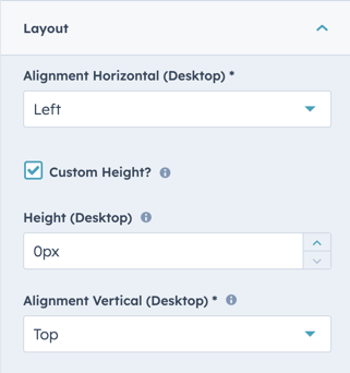
POWER Header → Advanced Mega Menu → Mega Menu(s) → Column 1 -6 → Wrapper(s) → Layout → Height
If left empty or set to 0, the height will dynamically change based on the content inside the wrapper.
POWER Header → Advanced Mega Menu → Mega Menu(s) → Column 1 -6 → Wrapper(s) → Layout → Alignment Horizontal
Choice of Left, Center, or Right.
This is how you would like the content to align within the wrapper.
POWER Header → Advanced Mega Menu → Mega Menu(s) → Column 1 -6 → Wrapper(s) → Layout → Alignment Vertical
Choice of Top, Middle, or Bottom
This will only have an effect if the configured wrapper height exceeds the height of the wrapper content.
For example, if you set the wrapper height to 100px and your content is only 50px tall, then you can choose whether you want it aligned at the top, middle, or bottom of the wrapper which will determine where the remaining 50px will be distributed.
Wrapper Style Settings
POWER Header → Advanced Mega Menu → Mega Menu(s) → Column 1-6 → Wrapper(s) → Style
The style settings for the Wrapper apply to the entirety of the wrapper; each wrapper can be styled independently otherwise the style settings from the Column will be inherited.
Wrapper styles are layered on top of the Column styles, which are layered on top of Mega Menu Styles.
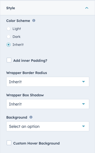
POWER Header → Advanced Mega Menu → Mega Menu(s) → Column 1-6 → Wrapper(s) → Style → Color Scheme
Choice of Light, Dark, or Inherit.
Tip: If you change the background color for the module, the definition of Light Color scheme is a light background with dark text and Dark Color scheme is a dark background with light text. Based on your background color, you would need to toggle the color scheme to ensure the text color displays properly and is legible.
POWER Header → Advanced Mega Menu → Mega Menu(s) → Column 1-6 → Wrapper(s) → Style → Add inner Padding?
Option to add inner padding to the wrapper. This will allow you to add further padding inside your wrapper. With the option to set specific padding sizes for both top/bottom and left/right.
POWER Header → Advanced Mega Menu → Mega Menu(s) → Column 1-6 → Wrapper(s) → Style → Wrapper Border Radius?
Option to set the border radius to inherit, true or false. Inherit will take the border radius from your module styles. True will allow you to set a custom border radius and false will set no border radius.
POWER Header → Advanced Mega Menu → Mega Menu(s) → Column 1-6 → Wrapper(s) → Style → Wrapper Box Shadow?
Option to set the box shadow to inherit, true or false. Inherit will take the box shadow from your module styles. True will allow you to set a custom border radius and false will set no box shadow.
POWER Header → Advanced Mega Menu → Mega Menu(s) → Column 1-6 → Wrapper(s) → Style → Background
Choice of Background Color, Background Image, Background Gradient, Glassmorphism/Blur, Transparent.
POWER Header → Advanced Mega Menu → Mega Menu(s) → Column 1-6 → Wrapper(s) → Style → Background → Background Color
Define the background color by the color hex code or use HubSpot’s color picker. Additionally, the opacity of the background color can be configured.
POWER Header → Advanced Mega Menu → Mega Menu(s) → Column 1-6 → Wrapper(s) → Style → Background → Background Image
Select an Image for the Wrapper background.
POWER Header → Advanced Mega Menu → Mega Menu(s) → Column 1-6 → Wrapper(s) → Style → Background → Background Image → Background Position
Choice of Bottom, Center, Left, Right, Top or Paralax.
For the Image, you can choose where the focal point is within the content area.
POWER Header → Advanced Mega Menu → Mega Menu(s) → Column 1-6 → Wrapper(s) → Style → Background → Background Image → Background Image Overlay
Option to add an overlay to the background image, as a single color or gradient.
Setting the opacity for the color or gradient is required to see the image through the overlay.
For the gradient option, you can either set an opacity per gradient color or an overall opacity for the entire gradient.
POWER Header → Advanced Mega Menu → Mega Menu(s) → Column 1-6 → Wrapper(s) → Style → Background → Background Gradient → Background Gradient Direction
Choice of Horizontal - Left to Right, Vertical - Top to Bottom, Diagonal - Top Left to Bottom Right, or Diagonal - Bottom Left to Top Right.
Define each of the background gradient colors by the color hex code or use HubSpot’s color picker. Additionally, the opacity of each color can be set.
POWER Header → Advanced Mega Menu → Mega Menu(s) → Column 1-6 → Wrapper(s) → Style → Background → Glassmorphism/Blur
Define the background color by the color hex code or use HubSpot’s color picker to be used to create the Glassmorphism/Blur effect. Additionally, the opacity of the background color can be configured.
For browsers that do not support this effect, a non-blur version will be set.
POWER Header → Advanced Mega Menu → Mega Menu(s) → Column 1-6 → Wrapper(s) → Style → Background → Transparent
If set to transparent, the background of the Column behind the Wrapper will be visible.
POWER Header → Advanced Mega Menu → Mega Menu(s) → Column 1-6 → Wrapper(s) → Style → Custom Hover Background
Set a custom background colour for this wrapper to display when a cursor hovers over this specific section.
POWER Header → Advanced Mega Menu → Mega Menu(s) → Column 1-6 → Wrapper(s) → Animation
Set a loading animation type and delay for this wrapper.
POWER Header → Advanced Mega Menu → Mega Menu(s) → Column 1-6 → Wrapper(s) → Custom Class
Set a custom CSS class to target this wrapper specifically within your stylesheets.
Adding a Content Item to a Wrapper
POWER Header → Advanced Mega Menu → Mega Menu(s) → Column 1 -6 → Wrapper(s) → Content(s)
Adding Content is how you will add content items to your Mega Menu.
Choice of Button/Link, CTA, Icon, Icon with Text, Image, Intro Title, Line, Menu, Rich-Text-Field, Spacer or Title.

POWER Header → Advanced Mega Menu → Mega Menu(s) → Column 1 -6 → Wrapper(s) → Internal Name
If left blank the Internal Name will default to "Content(s) 1, and continue in sequential order for each content in the wrapper.
We recommend adding a name for your own sanity.

POWER Header → Advanced Mega Menu → Mega Menu(s) → Column 1 -6 → Wrapper(s) → Content(s) → Button/Link
Add a Button or individual Link to your Wrapper that can be styled using any of the CTA/Button Styles, including the Link style.
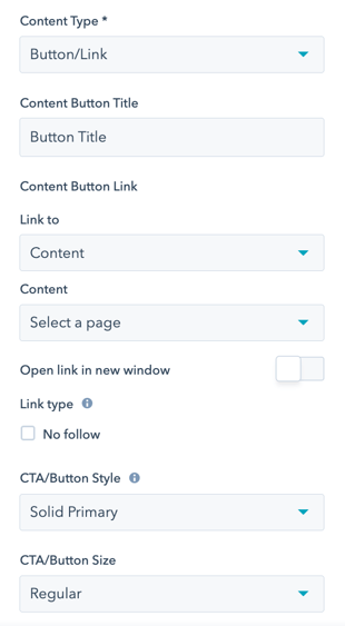
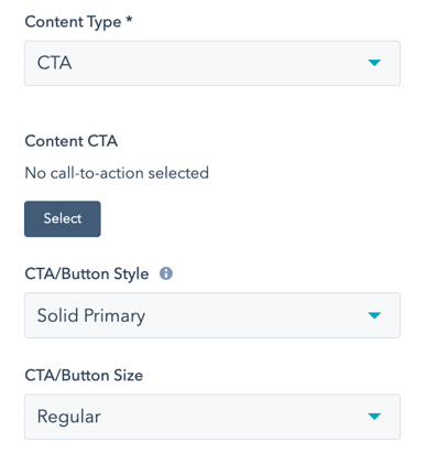
POWER Header → Advanced Mega Menu → Mega Menu(s) → Column 1 -6 → Wrapper(s) → Content(s) → CTA
Add a CTA to your Wrapper that can be styled using any of the CTA/Button Styles, including the Link style.
We recommend using the Button/Link content type if you do not need to track conversions. Adding multiple CTAs can cause an impact on your page speed due to the amount of code needed for the HubSpot tracking code.
POWER Header → Advanced Mega Menu → Mega Menu(s) → Column 1 -6 → Wrapper(s) → Content(s) → Icon
Add an icon to your wrapper. You can choose between an icon from the free HubSpot Fontawesome collection, your own Fontawesome pro icon set or upload a custom image.
Please use an image with dimensions 30x30 px or 60x60 px for retina displays
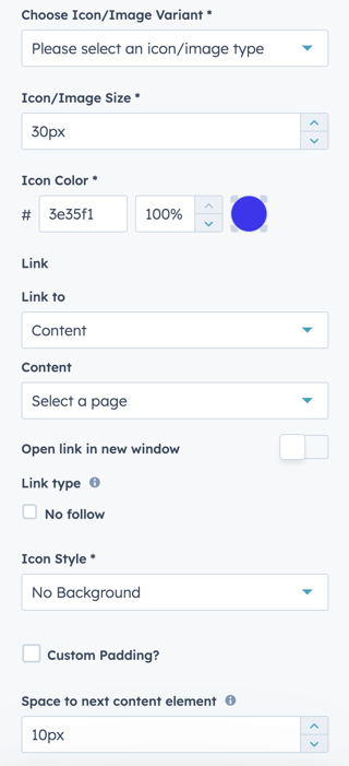
You can set your icon's size and color through the next options.
POWER Header → Advanced Mega Menu → Mega Menu(s) → Column 1 -6 → Wrapper(s) → Content(s) → Icon → Link To
Option to link your icon to External URL, Content, File, Email address, Phone number, Pop-up CTA, Payment link or Blog.
POWER Header → Advanced Mega Menu → Mega Menu(s) → Column 1 -6 → Wrapper(s) → Content(s) → Icon → Icon Style
Choice to set your icon with no background, circular or square.
POWER Header → Advanced Mega Menu → Mega Menu(s) → Column 1 -6 → Wrapper(s) → Content(s) → Icon with Text
This will include the icon options, a rich text field and a CTA.
POWER Header → Advanced Mega Menu → Mega Menu(s) → Column 1 -6 → Wrapper(s) → Content(s) → Image
Upload an image for your wrapper or choose from your HubSpot image library.
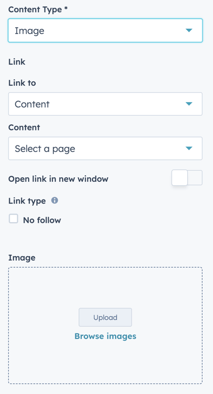
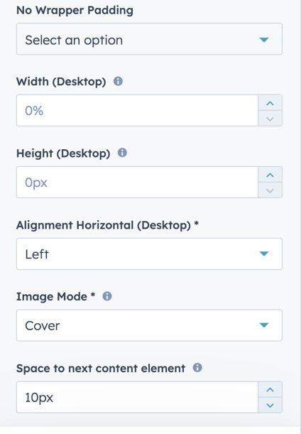
Further image options can be set in the next options. No padding can be set for the Top, Left, Right or Bottom of your image. The width in % and Height in px can be set for desktop devices along with the alignment within the wrapper.
The image mode will allow you to set how the image fits in your wrapper. Options here are:
- Cover: This will set your image to cover the entire of your wrapper. Your image may become cropped or distorted to fit the wrapper depending on your image and wrapper sizes.
- Contain: This scales the image to fit within the element and contain it's aspect ratio. This will stop your image being distorted but may cause some additional spacing around your image.
The space to next element option will allow you to set a custom spacing at the bottom of this wrapper before the next wrapper. If this is set to 0 this space will automatically be set.
POWER Header → Advanced Mega Menu → Mega Menu(s) → Column 1 -6 → Wrapper(s) → Content(s) → Intro Title
Set an intro sub-title as your wrapper content. By default this will inherit styles from your theme. You can override this through the Style - Text option and set a custom color or gradient and the Style - Background to set a custom background color for this content.
POWER Header → Advanced Mega Menu → Mega Menu(s) → Column 1 -6 → Wrapper(s) → Content(s) → Line
Define the line color, opacity, height, and padding for the top and bottom of the line.
POWER Header → Advanced Mega Menu → Mega Menu(s) → Column 1 -6 → Wrapper(s) → Content(s) → Menu
Add a Menu to your Wrapper to add a series of links as you would have in a typical menu.
Click Create new to configure an advanced menu for the links needed for this column wrapper.

POWER Header → Advanced Mega Menu → Mega Menu(s) → Column 1 -6 → Wrapper(s) → Content(s) → Rich Text Field
The Rich Text Field is the most flexible option for adding content to your Mega Menu. There is so much you can do!

POWER Header → Advanced Mega Menu → Mega Menu(s) → Column 1 -6 → Wrapper(s) → Content(s) → Spacer
Set the height of the Spacer in pixels.
Add a spacer to the wrapper to separate content or align with content in other columns.

POWER Header → Advanced Mega Menu → Mega Menu(s) → Column 1 -6 → Wrapper(s) → Content(s) → Title
Add a Title to your Wrapper. If you require more styling in the Title in your Mega Menu, use the Rich Text Field content type.
The default style will inherit your style from your theme settings. You can also choose to override the default with a custom color or gradient in this wrapper. Title font sizes and line-heights can be set within this wrapper for this title.
Adding a Sub Area on Bottom
POWER Header → Advanced Mega Menu → Mega Menu(s) → Show Sub Area on Bottom
To activate the Sub Area on Bottom, check the box to reveal the settings.
POWER Header → Advanced Mega Menu → Mega Menu(s) → Sub Area Bottom
The settings will open with the Layout section set to 3 Columns, this is the max number of columns for the Sub Area Bottom.

POWER Header → Advanced Mega Menu → Mega Menu(s) → Sub Area Bottom → Column Layouts & Widths
The column layout is based on a 12-column grid. The numbers in brackets are the column widths based on the total being 12.
Column Layouts & Widths available include:
- 1 Column - [ 12 ]
- 2 Columns - [ 3 | 9 ]
- 2 Columns - [ 4 | 8 ]
- 2 Columns - [ 6 | 6 ]
- 2 Columns - [ 8 | 4 ]
- 2 Columns - [ 9 | 3 ]
- 3 Columns - [ 2 | 2 | 8 ]
- 3 Columns - [ 2 | 8 | 2 ]
- 3 Columns - [ 8 | 2 | 2 ]
- 3 Columns - [ 3 | 3 | 6 ]
- 3 Columns - [ 3 | 6 | 3 ]
- 3 Columns - [ 6 | 3 | 3 ]
- 3 Columns - [ 4 | 4 | 4 ]
POWER Header → Advanced Mega Menu → Mega Menu(s) → Sub Area Bottom → Vertical Alignment
The Vertical Alignment of sub-content (how the content aligns within the Sub Area Bottom).
Choice of Top, Middle, or Bottom.
POWER Header → Advanced Mega Menu → Mega Menu(s) → Sub Area Bottom → Padding Top and Padding Bottom
Choice of Standard or None.
POWER Header → Advanced Mega Menu → Mega Menu(s) → Sub Area Bottom → Column 1 -3
For each column, you can configure the Content and Layout.
In the Sub Areas, it is only possible to add one content item per column.
POWER Header → Advanced Mega Menu → Mega Menu(s) → Sub Area Bottom → Column 1 -3 → Content
Choice of Empty, Button/Link, CTA, or Rich Text Field.
POWER Header → Advanced Mega Menu → Mega Menu(s) → Sub Area Bottom → Column 1 -3 → Content → Alignment Horizontal
Choice of Left, Center, or Right.
Determine where the content should be positioned within the column.
Sub Area Bottom Style Settings
POWER Header → Advanced Mega Menu → Mega Menu(s) → Sub Area Bottom → Style
The style settings for the Sub Area Bottom apply to all columns.
POWER Header → Advanced Mega Menu → Mega Menu(s) → Sub Area Bottom → Style → Color Scheme
Choice of Light, Dark, or Inherit.
Tip: If you change the background color for the module, the definition of Light Color scheme is a light background with dark text and Dark Color scheme is a dark background with light text. Based on your background color, you would need to toggle the color scheme to ensure the text color displays properly and is legible.
POWER Header → Advanced Mega Menu → Mega Menu(s) → Sub Area Bottom → Style → Border
Choice of Top, Bottom, or None.
POWER Header → Advanced Mega Menu → Mega Menu(s) → Sub Area Bottom→ Style → Background
Choice of Background Color, Background Image, Background Gradient, Glassmorphism/Blur, Transparent.
POWER Header → Advanced Mega Menu → Mega Menu(s) → Sub Area Bottom → Style → Background → Background Color
Define the background color by the color hex code or use HubSpot’s color picker. Additionally, the opacity of the background color can be configured.
POWER Header → Advanced Mega Menu → Mega Menu(s) → Sub Area Bottom → Style → Background → Background Image
Select an Image for the Sub Area Bottom background.
POWER Header → Advanced Mega Menu → Mega Menu(s) → Sub Area Bottom → Style → Background → Background Image → Background Position
Choice of Bottom, Center, Left, Right, or Top.
For the Image, you can choose where the focal point is within the content area.
POWER Header → Advanced Mega Menu → Mega Menu(s) → Sub Area Bottom → Style → Background → Background Image → Background Image Overlay
Option to add an overlay to the background image, as a single color or gradient.
Setting the opacity for the color or gradient is required to see the image through the overlay.
For the gradient option, you can either set an opacity per gradient color or an overall opacity for the entire gradient.
POWER Header → Advanced Mega Menu → Mega Menu(s) → Sub Area Bottom→ Style → Background → Background Gradient → Background Gradient Direction
Choice of Horizontal - Left to Right, Vertical - Top to Bottom, Diagonal - Top Left to Bottom Right, or Diagonal - Bottom Left to Top Right.
Define each of the background gradient colors by the color hex code or use HubSpot’s color picker. Additionally, the opacity of each color can be set.
POWER Header → Advanced Mega Menu → Mega Menu(s) → Sub Area Bottom → Style → Background → Glassmorphism/Blur
Define the background color by the color hex code or use HubSpot’s color picker to be used to create the Glassmorphism/Blur effect. Additionally, the opacity of the background color can be configured.
For browsers that do not support this effect, a non-blur version will be set.
POWER Header → Advanced Mega Menu → Mega Menu(s) → Sub Area Bottom → Style → Background → Transparent
If set to transparent, the content on the page behind the Sub Area Bottom will be visible.
Mega Menu Style Settings
POWER Header → Advanced Mega Menu → Mega Menu(s) → Style
The style settings for the Mega Menu apply to the entirety of mega menu and is the background for all Columns, Wrappers, and Contents.

POWER Header → Advanced Mega Menu → Mega Menu(s) → Style → Color Scheme
Choice of Light, Dark, or Inherit.
Tip: If you change the background color for the module, the definition of Light Color scheme is a light background with dark text and Dark Color scheme is a dark background with light text. Based on your background color, you would need to toggle the color scheme to ensure the text color displays properly and is legible.
POWER Header → Advanced Mega Menu → Mega Menu(s) → Style → Border Radius
This will apply a border radius to the mega menu to round the corners to match the style in your theme settings; otherwise, the default is square edges.
Border Radius value is set in Theme Settings → Styling → Corners → Overwrite for Boxes.

POWER Header → Advanced Mega Menu → Mega Menu(s) → Style → Border Radius → only for bottom corners?
When Border Radius is checked, option to apply only for bottom corners allows you to remove the radius from the top corners where the Mega Menu touches the nav bar to make it a more seamless look.
POWER Header → Advanced Mega Menu → Mega Menu(s) → Style → Top Border
Shows a subtle line at the top of the mega menu to visually separate the header from the mega menu.
POWER Header → Advanced Mega Menu → Mega Menu(s) → Style → Bottom Shadow
Shows a subtle box shadow at the bottom of the mega menu.
POWER Header → Advanced Mega Menu → Mega Menu(s) → Style → Background → Background Color
Define the background color by the color hex code or use HubSpot’s color picker. Additionally, the opacity of the background color can be configured.
POWER Header → Advanced Mega Menu → Mega Menu(s) → Style → Background → Background Image
Select an Image for the Wrapper background.
POWER Header → Advanced Mega Menu → Mega Menu(s) → Style → Background → Background Image → Background Position
Choice of Bottom, Center, Left, Right, or Top.
For the Image, you can choose where the focal point is within the content area.
POWER Header → Advanced Mega Menu → Mega Menu(s) → Style → Background → Background Image → Background Image Overlay
Option to add an overlay to the background image, as a single color or gradient.
Setting the opacity for the color or gradient is required to see the image through the overlay.
For the gradient option, you can either set an opacity per gradient color or an overall opacity for the entire gradient.
POWER Header → Advanced Mega Menu → Mega Menu(s) → Style → Background → Background Gradient → Background Gradient Direction
Choice of Horizontal - Left to Right, Vertical - Top to Bottom, Diagonal - Top Left to Bottom Right, or Diagonal - Bottom Left to Top Right.
Define each of the background gradient colors by the color hex code or use HubSpot’s color picker. Additionally, the opacity of each color can be set.
POWER Header → Advanced Mega Menu → Mega Menu(s) → Style → Background → Glassmorphism/Blur
Define the background color by the color hex code or use HubSpot’s color picker to be used to create the Glassmorphism/Blur effect. Additionally, the opacity of the background color can be configured.
For browsers that do not support this effect, a non-blur version will be set.
POWER Header → Advanced Mega Menu → Mega Menu(s) → Background → Transparent
If set to transparent, the background of the Column behind the Wrapper will be visible.