
How do I remove the white space from the section around a Sec Module?
A new section includes a default of 80px padding at the top and bottom that can be modified in the style settings for the section.
Looking to add some interactivity and excitement to your website? Check out our selection of Section Modules!
Each Section Module contains various layout options and configurations to customize the features of the module to fit your content and design layouts.
With Section Modules, you can provide a dynamic and engaging experience for your site visitors:
- Configure background images or videos
- Add overlays and gradients
- Enable the parallax effect for image backgrounds
- Add tabs, filters, table of contents, and other interactive features
How to find Section Modules in the Page Editor
Section Modules are labeled in the Page Editor as "Sec" and are preconfigured sections to help build your website pages quicker and also enhance the features of the module.
Example of Section Modules:

Edit Section Alignment and Spacing
After you've added a Sec Module to the page, when you move your mouse over the upper right corner of the module, you can access the Section menu. Click the pencil icon to "Style section" and you can adjust the following settings.
SECTION → Alignment and spacing → Content Alignment
Choose between Center content and Full width.
For Section Modules, choose the Full Width setting. You will have the option to further configure the padding and content within the module, you may encounter issues if you don't properly set the alignment to Full Width.
You can customise a fullwidth module further through your boxed section settings in your module layout.
SECTION → Alignment and spacing → Padding and margin
Option to adjust the Top, Left, Right, and Bottom Padding and Margin for the Section.
All of these settings are pre-configured in Sec Modules, depending on your background styling you can further adjust the settings here if needed.
For the most flexibility with the background options within the module, we recommend resetting the default for Top and Bottom from 80px to 0px.
Check Apply to all sides first, then type 0px in Top and this will not only reset the Top and Bottom to 80px, but will ensure the module has the proper padding on tablet and mobile, without any further adjustment necessary for mobile.

SECTION → Background
Option to set the Section Background to color, image, or gradient.

SECTION → Background → Color
If you are using a color background in the Sec Module, you have the option to set the Section Background color to match if you have added additional padding to the Section.

SECTION → Background → Image
The Sec Module has more options for configuring an Image as the background, but if you've modified the padding for the Section, you have an option to add the image to the Section here if desired.
Section Image size options include: Resize to fill container, Resize to show entire image, Display full size.
Section Image alignment options include: Top-left, Top-center, Top-right, Middle-left, Centered, Middle-right, Bottom-left, Bottom-center, Bottom-right.

SECTION → Background → Gradient
If you have added padding and would like to use a gradient background for the Sec Module, you will have to configure the gradient for the Section Background. The available gradient options are limited compared to those in the Sec Modules.
Section Gradient options include: Top to bottom, Left to right, Top left to bottom right, and Top right to bottom left.

It is important to note that the background options within the POWER Sec Modules contain more options than those in the default Section settings.
Background Settings for Section Modules
These settings apply to all Section Modules, for detailed settings for individual modules, refer to the module library.
Style → Background
Choice of Background Color, Background Image/Video, Background Gradient, or Transparent.
Style → Background → Color
Define the background color by the color hex code or use HubSpot’s color picker. Additionally, the opacity of the background color can be configured.

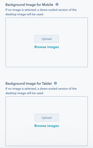
Style → Background → Image/Video
Select an Image for the module background or as a fallback image for the Video. The image should be at least 2000 px wide.
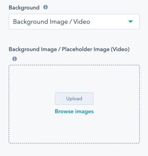
For more control over the responsiveness of an image and how the image is cropped, you can load separate images for Mobile and Tablet.
For the Video, you can load an mp4 from your HubSpot Files or through a link from YouTube or Vimeo.
If both an mp4 and a link are added, the YouTube/Vimeo link will take priority.
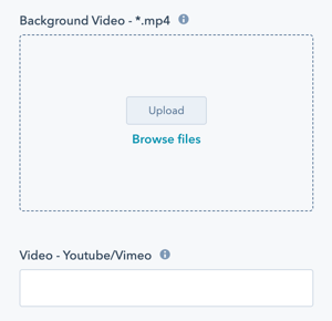
Please make sure that the file size for the video is not too big. A general rule of thumb is to keep reducing the file size until it starts to noticeably be degraded. Try to export videos in 720p and with a bitrate under 700kb/s (preferably 500kb/s).
Style → Background → Play Mode
Choice of Loop or Play Once.
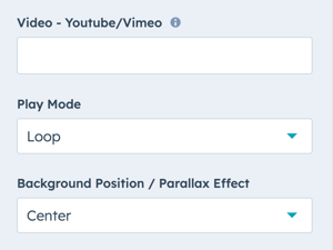
Style → Background → Background Position / Parallax Effect
For the Image, you can choose where the focal point is within the content area. This will determine how the image is resized for smaller screens to ensure it is responsive and your content has the desired layout.
You can also choose to enable the Parallax Effect which will scroll the image within the content area as the site visitor scrolls on the page.

Style → Background → Background Image Overlay
Option to add an overlay to the background image, as a single color or gradient.
Setting the opacity for the color or gradient is required to see the image through the overlay.
For the gradient option, you can either set an opacity per gradient color or an overall opacity for the entire gradient.

Style → Background → Gradient
Choice of Horizontal - Left to Right, Vertical - Top to Bottom, Diagonal - Top Left to Bottom Right, or Diagonal - Bottom Left to Top Right.
Define each of the background gradient colors by the color hex code or use HubSpot’s color picker. Additionally, the opacity of each color can be set.

Style → Background → Transparent
There will not be a background applied to the module and any background set for the section will be visible.
Style → Background → Overwrite Box Colors
If your section has been set as a boxed section you can overwrite your default box colors here.
Style → Background → Section Shadow
Add a box-shadow to your section to create a 3d effect for visual depth.
Slider Settings
Please note that while many section modules include the slider option, it is not available in all modules. Be sure to check the specific module settings to see if this feature is supported.
Module → Slider

Module → Slider → Use Slider?
Enable this option to activate the slider feature for this module, allowing multiple items to be displayed in a sliding carousel format.
Module → Slider → Settings →Slides
Set the number of slide items and the contents for your slider.
Module → Slider → Settings → Transition Option
Select the transition type for the slider from the dropdown menu:
- Manual: Users manually navigate through the items.
- Autoplay: Items transition automatically at set intervals.
- Continuous: Items move continuously in a marquee-like fashion.
Module → Slider → Settings → Reverse Transition
Reverse the transition direction of your items when enabled.
Module → Slider → Settings → Transition Time
The time of your transitions in milliseconds.
Module → Slider → Settings → Transition Effect
Select the desired transition effect for the slider. Currently, only the "Slide" effect is available, which smoothly moves items horizontally.
Module → Slider → Settings → Continuous Transition Speed
Set the speed for the continuous transition effect. This controls how quickly the items move in the marquee-like continuous mode. Adjust the value to achieve the desired transition speed.
Module → Slider → Settings → Navigation - Arrows
Enable this option to display navigation arrows, allowing users to manually navigate through the slider items.
Module → Slider → Settings → Navigation - Bullets
Enable this option to display navigation bullets, allowing users to see their position within the slider and easily navigate through the items.
Module → Slider → Settings → Keyboard Control
Enable this option to allow users to navigate through the slider items using keyboard arrow keys.
Horizontal Content Fade Option

The Horizontal Fade option is available exclusively in modules that feature the slider option. This feature adds a smooth horizontal fade effect to the left and right borders of the section, enhancing the visual appeal and creating a seamless transition at the edges.

Module → Style → Horizontal Content Fade
Enable this option to apply a smooth horizontal fade effect to the left and right borders of the section, enhancing the visual transition at the edges.
Module → Style → Width of Fade
Specify the width of the horizontal fade effect as a percentage. This determines how far the fade extends from the left and right borders of the section.
Other Options
Layout → Padding Top and Padding Bottom
Choice of Standard, None, Small, Medium, Large, or First Section with Header.
The theme includes predefined padding options that can be modified in your Theme Settings.
The default definitions are:
- Standard = ~135px
- None = 0px
- Small = 40px
- Medium = 80px
- Large = 140px
- First Section With Header = adds additional spacing to account for the header height automatically
- Used when you choose a module other than the Hero module for the first module on the page
Layout → Margin Top and Margin Bottom
Choice of None, Small, Medium or Large. These are defined by these sizes:
- None = 0px
- Small = 40px
- Medium = 80px
- Large = 140px
Layout → Boxed Section
Toggle this checkbox to enable the Boxed Section Settings to contain your section within a boxed section instead of a full width section.
Layout → Boxed Section Settings
Choice of Full Width, Content Width - Padding Inside and Content Width - Padding Outside.
- Full width: This covers the entire width of the window and includes a little extra space on both sides.
- Content Width - Padding Inside: This sets the section to align with the content width and also adds extra space inside the section for padding.
- Content Width - Padding Outside: Similar to Content Width - Padding Inside, but this makes the section wider on the edges without making the inside content cramped.
Style → Shape Divider
Optional Shape Divider(s) can be added to the top or bottom for most Section Modules. Refer to Settings for configuring Shape Dividers for more details about these choices.
Visibility
Set your module's visibility across multiple device sizes. Choose to hide on these options:
- Desktop screens
- Small Desktop Screens
- Tablet screens
- Mobile screens
Accessibility
Add in Aria labels for the elements within your module to assist with accessibility and ensure screen readers can correctly read your module's content.
Animation
Checkbox to turn on/off Animate on Scroll. Turning off here will only apply to this module, to turn animation off globally refer to Theme Settings for Animations.
Anchor Link ID
Set an anchor link for the module. Can be used to create a link directly to that section on the page and/or to include in an on-page menu (like Sticky Sub-Menu) to allow users to jump to that section without scrolling.
Easily add an anchor link to this section, for full instructions refer to Setting up Anchor Links.
Custom Class
Ability to add a Custom Class to use in the child.css for individual customizations.
Please avoid the usage of this feature and try to use the native functionality as much as possible!
If you are trying to do something that should be in the product, please contact us.
A CSS class name must begin with an underscore (_), a hyphen (-), or a letter(a–z), followed by any number of hyphens, underscores, letters, or numbers. There is a catch: if the first character is a hyphen, the second character must be a letter or underscore, and the name must be at least 2 characters long.