
Sub Modules Overview
Ready to create your own custom section layouts? Check out our selection of Sub Modules!
Each Sub Module contains the core functionality of the Section Modules, with a range of layout and style options, plus the added flexibility to create custom drag-and-drop sections using these powerful building blocks.
Sub Module capabilities:
- Core functionality of Section Modules
- Flexible layout options
- Extensive style options
- Custom section creation
- Drag-and-drop building blocks
With Sub Modules, you can use HubSpot's drag-and-drop page editor to its full potential:
Sub Module benefits:
- Combine modules to create Sections, Columns, and Rows
- Swap between Light and Dark Scheme styles
- Combine with Mini Modules for even more POWER
Design flexibility: Create complex, custom layouts without code.
How do I find Sub Modules?
Sub Modules are labeled in the Page Editor as "Sub" and are flexible modules that allow you to build your own section layouts to create dynamic page designs.
Identification: Look for "Sub" prefix in module names.
Example of Sub Modules: (Shows list of Sub Modules with "Sub" prefix)
Sub Module naming:
- Sub Text
- Sub Image
- Sub Button
- Sub Icon
- Sub Video
- Sub Spacer
- And more...
Module location: Found in module panel in page editor alongside other modules.

Edit Section Alignment and Spacing
After you've created a section and added a Sub Module to the page, when you move your mouse over the upper right corner of the module, you can access the Section menu. Click the pencil icon to "Style section" and you can adjust the following settings.
Accessing section settings:
- Hover over upper right corner of module
- Section menu appears
- Click pencil icon
- "Style section" opens settings
Section-level control: Settings apply to entire section, not individual module.
SECTION → Alignment and spacing → Vertical Alignment
Choose how the modules should be aligned vertically within the Section.
SECTION → Alignment and spacing → Content Alignment
Choose between Center content and Full width.
SECTION → Alignment and spacing → Padding and margin
Option to adjust the Top, Left, Right, and Bottom Padding and Margin for the Section.

SECTION → Background
Option to set the Section Background to color, image, or gradient.

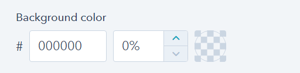
SECTION → Background → Color
Option to set the Section Background color.
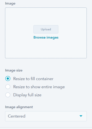
SECTION → Background → Image
Option to add an image background to the Section if desired.
Section Image size options include: Resize to fill container, Resize to show entire image, Display full size.
Section Image alignment options include: Top-left, Top-center, Top-right, Middle-left, Centered, Middle-right, Bottom-left, Bottom-center, Bottom-right.
SECTION → Background → Gradient
Option to configure the gradient for the Section Background.
Section Gradient options include: Top to bottom, Left to right, Top left to bottom right, and Top right to bottom left.

It is important to note that the background options within the POWER Sec Modules contain more options than those in the default Section settings that you can choose from when creating sections using Sub Modules, Mini Modules, and HubSpot Modules.
What settings are available for all Sub Modules?
These settings apply to all Sub Modules, for detailed settings for individual modules, refer to the module library.
Layout > Centered
Option to center the content of the Sub Module.
Content centering:
- Center text alignment
- Center module content
- Horizontal centering
- Visual balance
Style > Color Scheme
Choice of Light or Dark.
Color scheme definition:
- Light: Light background with dark text
- Dark: Dark background with light text
Color scheme tip: Tip: If you change the background color for the module, the definition of Light Color scheme is a light background with dark text and Dark Color scheme is a dark background with light text. Based on your Section Background color, you would need to toggle the color scheme to ensure the text color displays properly and is legible.
Color scheme selection: Match color scheme to section background for proper contrast and readability.
Contrast importance: Ensures text remains readable on any background.\
Animation
Checkbox to turn on/off Animate on Scroll. Turning off here will only apply to this module, to turn animation off globally refer to Theme Settings for Animations.
Animation control:
- Enable/disable per module
- Animate on Scroll functionality
- Module-level control
- Override global settings
Global animation: Turning off here will only apply to this module, to turn animation off globally refer to Theme Settings for Animations.
Animation uses:
- Visual interest
- Draw attention
- Progressive disclosure
- Modern feel
Anchor Link ID
Set an anchor link for the module. Can be used to create a link directly to that section on the page and/or to include in an on-page menu (like Sticky Sub-Menu) to allow users to jump to that section without scrolling.
Anchor link functionality:
- Direct links to sections
- Jump navigation
- Table of contents links
- Sticky menu integration
- Smooth scrolling
Easily add an anchor link to this section, for full instructions refer to Setting up Anchor Links.
Anchor link uses:
- Long-form content
- Jump navigation
- Sticky menus
- Page sections
- Quick access
Custom Class
Ability to add a Custom Class to use in the child.css for individual customizations.
Custom class usage: Apply specific CSS styling via child theme.
Important recommendation: Please avoid the usage of this feature and try to use the native functionality as much as possible!
If you are trying to do something that should be in the product, please contact us.
Native functionality preferred: Use built-in features before resorting to custom CSS.
CSS class naming rules: A CSS class name must begin with an underscore (_), a hyphen (-), or a letter(a–z), followed by any number of hyphens, underscores, letters, or numbers. There is a catch: if the first character is a hyphen, the second character must be a letter or underscore, and the name must be at least 2 characters long.
Valid class examples:
.my-class._private-class.section-1.custom_style