
TABLE OF CONTENTS
Page Speed Impact
Module Options
Page Speed Impact
How does the Sec Timeline module affect page speed?
-
Low impact:
- Images are lazy loaded by default
- Module load time is minimal with optimized content
-
Medium impact:
- Module placed above the fold
- Unoptimized images or videos used
- Multiple large media files in timeline items
Performance Tips:
- Convert images to WebP format for next-gen optimization
- Compress images using TinyPNG or similar tools before uploading
- Avoid placing heavy media files above the fold
- Use appropriate image dimensions for your layout
Note: For more detailed performance advice, review the POWER Performance Guide!
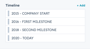
How do I add and edit Timeline items?
Each Timeline item represents a milestone in your vertical layout. Items automatically stagger left and right for a clean visual effect.
Intro to Title
Smaller text displayed above the main section title. Leave blank to hide this field on the page.
Title
Main heading for the timeline section. This field is optional but recommended for SEO.Title - Header Type
Choose the HTML heading level for SEO purposes:
- H1 (page title - use sparingly)
- H2 (major sections)
- H3 (subsections)
- H4 (minor subsections)
Important: This setting controls the HTML heading type, not the visual font size. To adjust font size, use Style → Title Size.
Description
Add body text describing the timeline or milestones using the text editor. Leave blank if no description is needed.How do I configure individual timeline settings?
Timeline
Add items to the timeline to create milestones.
Each step in the timeline is automatically positioned on the left and then right to create the staggered layout.
Timeline → Title
Add a title to each milestone. Use descriptive titles with dates for clarity.
Example: "2024 – Product Launch" or "Q1 2025 – Series A Funding"
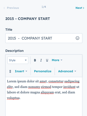
Timeline → Description
Add detailed text using the rich text editor. You can include:
- Formatted text (bold, italic, lists)
- Links
- Multiple paragraphs
Timeline → Image
Add an optional image for the item milestone box. Leave blank if not needed.
Tip: Use consistent image dimensions across all milestones for a cohesive look.
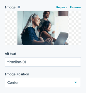
Timeline → Alt text
Add descriptive text for accessibility and SEO. Always include alt text when using images.
Timeline → Image Position
Align the image inside the milestone box:
- Top: Image appears at the top of the box
- Center: Image centered vertically
- Bottom: Image at the bottom of the box
- Left: Image aligned to the left side
- Right: Image aligned to the right side
How do I set animations for timeline items?
Timeline → Animation → Animation Type
Choose from available animation options:
- Default: Inherits global animation style from theme settings
- None: Disables animation for this specific item
- Other styles: Select from fade, slide, zoom, and other effects
Timeline → Animation → Delay
Set animation delay in milliseconds:
- Range: 0–3000 ms
- Increment: 50 ms steps
- Use delays to create staggered animation effects
Tip: Add 100-200ms delays between consecutive timeline items for a cascading effect.
How do I adjust layout settings?
Control section width, alignment, and content spacing for the entire timeline module.
Layout → Intro Width
Choose the width constraint for section text:
- Narrow: Limits section text width (original layout style)
- Default: Text fills available module width based on Full Width/Content Width settings

Layout → Centered
Enable to center-align section text and milestone boxes. Uncheck for left alignment (default setting).Layout → Timeline Content Centered
Enable to center the content inside each individual timeline milestone box.
Layout → Padding & Margin Top and Bottom
Select spacing options for the module:
- Standard: Default theme spacing
- None: No spacing
- Small: Minimal spacing
- Medium: Moderate spacing
- Large: Maximum spacing
- First Section with Header: Special spacing for first page section
Layout → Show More
Enable to collapse content behind a "Show More" button. This is useful for long timelines that might overwhelm users.

Layout → Show More Options
Configure collapsed height for different devices:
- Desktop: Set pixel height for desktop view
- Tablet: Set pixel height for tablet view
- Mobile: Set pixel height for mobile view
Customize the button appearance using:
- Standard theme button styles
- Custom button styles you've created
Tip: Test the collapsed height on actual devices to ensure enough content is visible to engage users
You can also customise your button style based on the standard theme button styles, or use any of your custom button styles.
How do I style the module?
Style → Color Scheme
Choose the base color scheme:
- Light: Dark text on light background
- Dark: Light text on dark background
Important: Adjust the color scheme based on background images or colors to ensure readability.
Style → Intro Title Style - Text
Control the intro title text appearance:
- Inherit from theme settings
- Override with custom Color
- Override with Gradient effect
Style → Intro Title Style - Background
Set a background color or gradient behind the intro text to make it stand out.Style → Intro Title Style - Border Radius
Configure rounded corners for the background highlight. Defaults to theme settings if left unset.Style → Title Style
Control the main title appearance:
- Inherit from theme settings
- Override with custom Color
- Override with Gradient effect
Style → Title Size
Match the header type (H1–H6) or override font size using theme settings.
Style → Overwrite Box Colors
Enable this option to change the box color for the "Standard" layout.
Note: Box Color refers to the background color of the milestone box (not the hover state color).
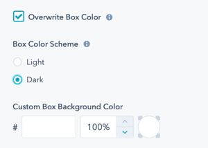
Style → Overwrite Box Color → Color Scheme
Choose between:
- Light: Light background with dark text
- Dark: Dark background with light text
Tip: When you change the module background color, adjust the box color scheme to ensure text remains legible.
Style → Overwrite Box Color → Custom Box Background Color
Options available:
- Change default Light or Dark color using Hex values
- Control color opacity on a scale of 0 to 100%
Example: Use 80% opacity for a subtle overlay effect over background images.
Style → Background
Choose from multiple background types:
- Background Color: Solid color fill
- Background Image/Video: Media background
- Background Gradient: Color gradient effect
- Transparent: No background
Refer to Settings that apply to all Section Modules for more details about these choices.
Style → Shape Divider
Add optional shape dividers to the top or bottom of the module. Shape dividers create visual separation between sections.
Refer to Settings for configuring Shape Dividers for more details about these choices.
How can I add animations and anchors?
Animation
Enable or disable Animate on Scroll for the entire module.
Note: To turn animation off globally for all modules, refer to Theme Options for Animations.
Animation → Section
Set animation type and delay independently for:
- Section container
- Intro text
- Title
- Description
Animation → Intro Title
Change the Animation Type and Delay specifically for the Intro Title.
Animation → Title
Ability to change the Animation Type and Delay for the Title.
Animation → Description
Change the Animation Type and Delay specifically for the description text.
How do I control module visibility?
Visibility
Choose to hide your module on specific screen sizes:
- Hide on desktop only
- Hide on tablet only
- Hide on mobile only
- Show on all devices (default)
Tip: Use visibility settings to create device-specific experiences without duplicating content.
For more information see common module information.
How do I set up anchor links?
Anchor Link ID
Set an anchor link for the module. Can be used to create a link directly to that section on the page and/or to include in an on-page menu (like Sticky Sub-Menu) to allow users to jump to that section without scrolling.
Easily add an anchor link to this section, for full instructions refer to Setting up Anchor Links.
How do I add custom CSS classes?
Custom Class
Add a Custom Class identifier to use in the child.css file for individual customizations.
This allows you to:
- Apply unique styling to specific timeline modules
- Override theme styles for particular instances
- Create reusable custom styles
See full instructions for setting a Custom Class for Section Modules.