Visually represent your values with a text overlay.

How does the Sec Values module affect page speed?
-
Low impact: Optimized module code limits load-time resources.
-
Medium impact: Using image or video backgrounds can slightly affect performance.
Performance Tips:
-
Convert images to WebP format for next-gen optimization
-
Compress images with TinyPNG or similar tools
-
Refer to the Performance Guide for best practices to optimize your website’s speed.
Note: For more detailed performance advice, review the POWER Performance Guide!
Helpful Links: Settings that apply to all Section Modules and Settings for Theme Styles.
How do I add and edit Value Items?
This is where you add the value items displayed in the module.
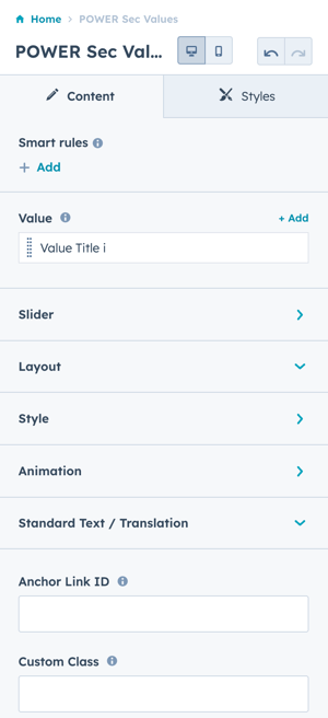
When hovering over an existing item, two icons appear — Edit and Clone.
Click + Add to create new value items.
Value Item(s) → Title
Option to add a Title, visible on the box front and above the description text on hover.
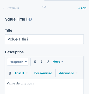
Value Item(s) → Description
Add a Description that appears on hover.
The field supports rich-text formatting, allowing custom text styles, lists, and links.
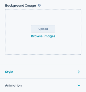
Value Item(s) → Background Image
Set the background image for each value card.
Value Item(s) → Style → Background Image Position
Define image alignment: Bottom, Center, Left, Right, or Top.
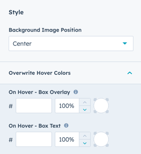
Value Item(s) → Style → Overwrite Hover Colors
Override the default hover overlay and text colors at the individual item level.
Use module-level style settings (below) to apply hover colors across all items.
Use the module style settings ↓ to overwrite all of the items to be the same color, overwriting the theme's default color.
Value Item(s) → Animation
Change the animation type per item.
Overrides the module’s default animation settings.

How do I use the Slider feature?
Slider
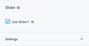
Slider → Use Slider?
Checkbox to activate slider functionality.
⚠️ Note: Slider is not compatible with related posts filter.
Slider → Number of visible items
Default is 3.
Can be changed to 1 or more, depending on layout design.
This setting overwrites Number of Posts to Show under Layout.
Slider → Number of items to slide
Default: 1.
Avoid setting this higher than the number of visible items.
Slider → Transition Option
Choose from:
-
Manual
-
Autoplay (default)
-
*Continuous
Manual mode allows navigation via:
-
Keyboard arrow keys
-
Arrows or bullets (if enabled)
Slider → Transition Time
Set the transition duration (in milliseconds).
Applies to Autoplay and Continuous options.
Slider → Transition Effect
Choose Slide as the transition effect.
Slider → Loop
Enable to continuously loop slides.
Note: This duplicates content in the page’s HTML, which may trigger SEO tool warnings.
Slider → Autoplay - Interval Timeout
Define the time delay (in milliseconds) between automatic transitions.
Slider → Navigation - Arrows
Enable or disable arrow navigation on the slider.
Slider → Navigation - Bullets
Checkbox to activate the bullets below the slider for navigation.
Slider → Keyboard Control
Allow slider navigation via keyboard arrow keys.
✅ Recommended for accessibility.
Works only when the slider is visible in the viewport.
How do I adjust layout settings?
Layout → Overwrite Box Height?
Set a manual box height for all value cards.
Layout → Box Content Padding
Define inner padding for each box.
Layout → Full Width (Content)
Toggle between:
-
Full Width: edge-to-edge layout
-
Boxed: contained layout within page width

Layout → Boxed Section
Set your section module as a boxed section within your webpage.
Layout → Centered
Check to center-align text.
Unchecked = left-aligned (default).
Layout → Padding & Margin Top and Bottom
Choice of Standard, None, Small, Medium, Large, or First Section with Header. Refer to your theme settings for these for more information on this sizing.
How do I style the module?
Style → Color Scheme
Select Light or Dark scheme.
Light = dark text on light background; Dark = light text on dark background.
💡 Adjust this based on your module’s background color for readability.
Style → Background Image Position
Choose a default image position for all value items:
Bottom, Center, Left, Right, or Top
Style → Overwrite Hover Colors
Override the theme’s default brand primary hover colors at the module level.
Style → Overwrite Box Color → On Hover - Box Overlay
Customize overlay color using a color picker or hex code.
You can also set overlay opacity.
Style → Overwrite Box Color → On Hover - Box Text
Customize hover text color and opacity.
Style → Background
Options:
-
Background Color
-
Image/Video
-
Gradient
-
Transparent
Choice of Background Color, Background Image/Video, Background Gradient, or Transparent. Refer to Settings that apply to all Section Modules for more details about these choices.
How can I add animations and anchors?
Animation
Checkbox to enable or disable Animate on Scroll for this section only.
To turn animation off globally refer to Theme Options for Animations.
Visbility
Hide the module on specific screen sizes.
Useful for simplifying mobile layouts.
Choose to hide your module on specific screen sizes. For more information see common module information.
Animation → Section
Adjust Animation Type and Delay for the entire section.
Anchor Link ID
Set a unique anchor link for the module to create in-page navigation.
Easily add an anchor link to this section, for full instructions refer to Setting up Anchor Links.
How can I add a custom class or control CSS loading?
Custom Class
Add a custom CSS class for advanced styling via child.css.
See full instructions for setting a Custom Class for Section Modules.
Is in Viewport?
Control how CSS loads based on module visibility.
-
✅ Checked: Loads CSS immediately (for above-the-fold content)
-
⛔ Unchecked: Loads CSS asynchronously (for below-the-fold content)
⚡ Recommended for improving Core Web Vitals and page performance.
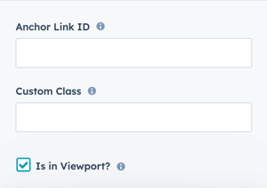
Learn more about this setting as it relates to Page Speed and Core Vitals.