A shape divider is an SVG file that adds a non-linear division between sections on your website page to enhance the design layout. Shape dividers create visual interest and smooth transitions as users scroll through your content.
What are Shape Dividers?
Shape Dividers are SVG-based design elements that add textural, non-linear divisions between sections on your website. Common use cases include:
- Creating visual transitions between sections
- Adding depth and dimension to page layouts
- Breaking up long-form content visually
- Enhancing modern, dynamic designs
- Creating wave or curve effects
- Adding geometric patterns between sections
- Building layered, complex visual effects
- Improving visual hierarchy

TABLE OF CONTENTS
Page Speed Impact
Step by step guide
Page Speed Impact
How does the Sec Values module affect page speed?
-
Low impact scenarios:
- Adding shape dividers does not significantly impact page load speed
- Created with very small SVG files that are optimized
- Loaded asynchronously
- Pages with shape dividers will not load any additional JS files
-
Medium impact scenarios:
- Depending on layering and position on page
- May have impact on mobile devices due to additional files that have to be loaded
- Multiple shape dividers on the same page
- Complex layering of shapes for a section
Performance Tips:
- Because they are SVG files, your shape dividers will be fully responsive on all screen sizes and resolutions, including retina displays
- If multiple shape dividers are on the same page or complex layering of shapes for a section, we recommend that you disable on mobile
- Can disable on mobile for basic shapes as well to reduce impact overall
Take a look at our performance guide to get your website running its best!
Shape Dividers are designed to enhance your website layout by adding textural elements to the horizontal sections on the page, helping to blur the edges of sections of content to create a smooth transition as the user scrolls down the page.
How do I add Shape Dividers to my page?
Content → Website Pages → [POWER SEC Module] → Style → Shape Divider
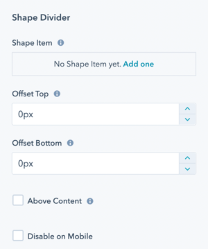
Style → Shape Divider → Shape Item
This is where you will add the shapes to build your Shape Divider. You can add as many shapes as you would like.
Shape layering logic:
The first item in this list will be in the back (bottom layer).
The last item in this list will be visible in the front (top layer).
Style → Shape Divider → Offset Top and Offset Bottom
The shape grows into the content area for the section. The offset adds space between the shape and the content area so you can control whether the shape overlaps the content.
How offsets work:
- Positive offset: Adds space between shape and content
- Negative offset: Allows shape to overlap content
- Top offset: Controls spacing above shape
- Bottom offset: Controls spacing below shape
Style → Shape Divider → Above Content
If true, this hides the content if the shape overlaps it.
Warning: Enabling this can hide important content. Use carefully and test thoroughly.
Style → Shape Divider → Disable on Mobile
Option to disable shape dividers on mobile to reduce the load time for the page (shape and JS files don't have to be loaded).
When to disable on mobile:
- Multiple shape dividers on the page
- Complex layering of shapes
- Performance-critical pages
- Sites with mobile-first audience
- To simplify mobile layouts
Style → Shape Divider → Shape Item → Add one
Click this link to add your first shape.
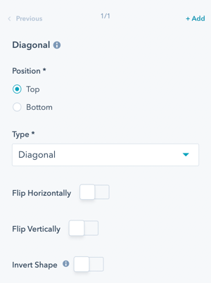
Style → Shape Divider → Shape Item → Diagonal
The default shape is Diagonal and will be the name of the Item until you change the shape.
Initial setup:
- Click "Add one" to create first shape
- Shape appears with default name (Diagonal)
- Configure shape properties
- Add additional shapes as needed
- Reorder for proper layering
Style → Shape Divider → Shape Item → Diagonal → Position
Choose where the shape divider appears:
Top of the Section
- Shape appears at top of section
- Transitions from previous section
- Creates entrance effect
Bottom of the Section
- Shape appears at bottom of section
- Transitions to next section
- Creates exit effect
Design considerations:
- Top shapes create introduction to section
- Bottom shapes create conclusion
- Use consistently across similar sections
- Consider reading flow
- Test visual impact of placement
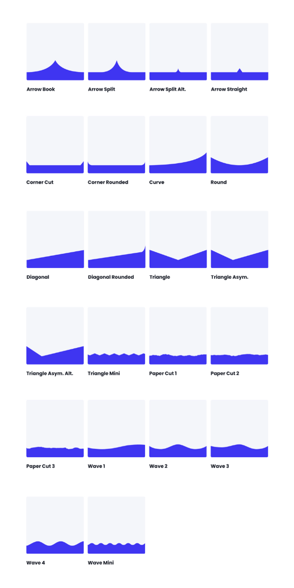
Style → Shape Divider → Shape Item → Diagonal → Type
Select the shape you would like to use:
Directional Shapes:
- Arrow Book
- Arrow Split
- Arrow Split Alt.
- Arrow Straight
Corner Shapes:
- Corner Cut
- Corner Rounded
Curved Shapes:
- Curve
- Round
Diagonal Shapes:
- Diagonal
- Diagonal Rounded
Triangle Shapes:
- Triangle
- Triangle Asym.
- Triangle Asym. Alt
- Triangle Mini
Organic Shapes:
- Paper Cut 1
- Paper Cut 2
- Paper Cut 3
Wave Shapes:
- Wave 1
- Wave 2
- Wave 3
- Wave 4
- Wave Mini
Shape selection tips:
- Waves: Organic, flowing, natural feel
- Diagonals: Dynamic, modern, bold
- Triangles: Sharp, geometric, professional
- Curves: Soft, friendly, approachable
- Arrows: Directional, guiding, purposeful
- Paper Cuts: Unique, artistic, creative
Style → Shape Divider → Shape Item → Diagonal → Flip Horizontally
Option to flip the shape on the y-axis to flip the left side of the shape to the right side of the shape.
Use case: Mirror the shape direction for visual variety or to match content flow.
Style → Shape Divider → Shape Item → Diagonal → Flip Vertically
Option to flip the shape on the x-axis to flip the top of the shape to the bottom of the shape.
Use case: Invert the shape direction for alternating sections or different effects.
Style → Shape Divider → Shape Item → Diagonal → Invert Shape
Fill the other area of the shape with color, creating the inverse shape from what is shown.
Effect: Creates opposite fill pattern, useful for alternating light and dark sections.
Style → Shape Divider → Shape Item → Diagonal → Transform Style

Choice of Stretch or Scale Ratio.
Scale Ratio will respect the width to height ratio of the original shape; the height will change depending on the device's width. Stretch will stretch the shape to fit your width and height settings; the height will stay the same across devices.
Style → Shape Divider → Shape Item → Diagonal → Width
Adjust from 100% to 300% of the original shape's width.
Style → Shape Divider → Shape Item → Diagonal → Height
Available for Stretch Transform Style only. Set the height in pixels.
Style → Shape Divider → Shape Item → Diagonal → Color Type
Choose between two coloring options:
Color
- Single solid color fill
- Simple, clean appearance
- Best for most use cases
- Matches section backgrounds easily
Gradient
- Multi-color gradient fill
- Dynamic, eye-catching effect
- Modern design aesthetic
- More complex visual impact
Style → Shape Divider → Shape Item → Diagonal → Color Type → Color
When Color is selected:
Configuration options:
- Select color using color picker
- Enter hex value directly
- Choose from brand colors
- Adjust opacity if available
Color selection tips:
- Match section background colors
- Use complementary colors for contrast
- Consider color psychology
- Maintain brand consistency
- Test visibility on different backgrounds

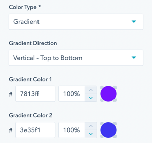
Style → Shape Divider → Shape Item → Diagonal → Color Type → Gradient
When Gradient is selected:
Configuration options:
- Set gradient start color
- Set gradient end color
- Choose gradient direction
- Adjust gradient angle
- Control color stops
Gradient tips:
- Use subtle gradients for professional look
- Bold gradients for creative designs
- Match brand color palette
- Test readability of content near gradient
- Consider gradient direction with content flow