Connect related content by including links to previous and next pages in a sequence. The Previous/Next Navigation module helps users navigate through sequential content like blog posts, tutorials, or multi-page guides.
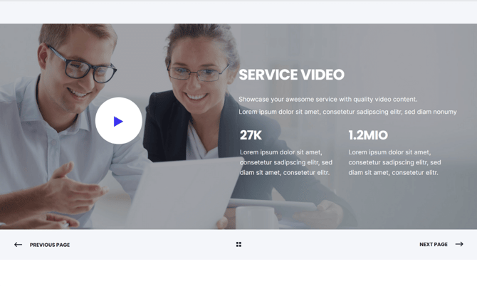
TABLE OF CONTENTS
Page Speed Impact
Module Options
Page Speed Impact
How does the Previous/Next Navigation module affect page speed?
-
Low impact:
- Very minimal impact to page load speed
- The code for this module has been optimized
- Limited resources needed on page load
- Lightweight navigation element
Performance Tips:
- Place your previous/next navigation in the same place across all pages that you're connecting
- Consistent placement improves user experience and perceived performance
- Avoid adding heavy backgrounds or complex styling
- Use simple, fast-loading navigation design
Note: For more detailed performance advice, review the POWER Performance Guide!
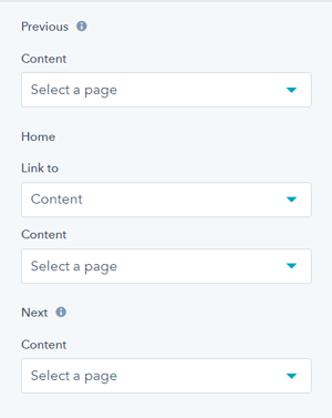
How do I configure navigation links?
Navigation
This is where you will add the links for Previous, Home, and Next.
Three navigation options available:
Previous Link
- Links to the previous page in the sequence
- Usually displays "Previous" or "← Previous Post"
- Positioned on the left side
Home Link
- Links to a home or index page
- Usually displays as a home icon or "Back to All"
- Positioned in the center
Next Link
- Links to the next page in the sequence
- Usually displays "Next" or "Next Post →"
- Positioned on the right side
Previous and Next are automatically configured for Posts when "Link to" is set to Blog.
How do I style the module?
Style → Color Scheme
Choose the base color scheme:
- Light: Light background with dark text
- Dark: Dark background with light text
Important: When you change the module background color, toggle the color scheme to ensure text remains legible.
Color scheme definitions:
- Light Color scheme = light background with dark text
- Dark Color scheme = dark background with light text
Tip: Based on your background color, toggle the color scheme to ensure proper text contrast and readability.
Style → Background
Choose from multiple background types:
- Background Color: Solid color fill
- Background Image/Video: Media background
- Background Gradient: Color gradient effect
- Transparent: No background (most common for navigation)
Choice of Background Color, Background Image/Video, Background Gradient, or Transparent. Refer to Settings that apply to all Section Modules for more details about these choices.
Style → Shape Divider
Add optional shape dividers to the top or bottom of the module for visual separation between sections.
Use cases:
- Separate navigation from content above
- Create visual transition to footer
- Add design interest to page
- Define content boundaries
Optional Shape Divider(s) can be added to the top or bottom of this module. Refer to Settings for configuring Shape Dividers for more details about these choices.
How do I add animations to the module?
Animation
Checkbox to turn on/off Animate on Scroll. Turning off here will only apply to this section, to turn animation off globally refer to Theme Options for Animations.
Animation → Section
Ability to change the Animation Type and Delay for the Section.
Animation → Previous
Ability to change the Animation Type and Delay for the Previous.
Animation → Next
Ability to change the Animation Type and Delay for the Next.
Animation → Back
Ability to change the Animation Type and Delay for the Back (home).
How do I customize navigation text?
Standard Text/Translation
This is where you can change the default text used in the module.
