The Sec Post Preview module displays blog posts dynamically on any page of your website. Common use cases include:
- Homepage blog highlights and recent posts
- Related articles within blog posts
- Author-specific post showcases
- Popular content sections
- Tag-based content displays
- Topic-specific resource pages
- Category landing pages
- Newsletter signup pages with content previews

TABLE OF CONTENTS
Page Speed Impact
Module Options
Page Speed Impact
- Images are lazy loaded by default
- The module has minimal impact on page speed with optimized images
- Text-only layouts load extremely fast
Medium impact:
- Module placed above the fold increases initial page load time
- Unoptimized blog post featured images
- Multiple post previews with large images
- Video thumbnails or GIFs in featured images
Performance Tips:
- Optimize all blog post featured images before uploading
- Convert images to WebP format for next-gen performance
- Compress images using TinyPNG or similar tools (supports JPG, PNG, WebP)
- Use appropriate image dimensions (recommended: 1200x630px for featured images)
- Consider using Text Only layout for sections below the fold
- Limit the number of posts displayed to 3-6 per section
Note: For more detailed performance advice, review the POWER Performance Guide!
Module Options
Intro to Title
Add smaller text displayed above the main title. Leave blank to hide this field on the page.
Title
Main heading for the section. This field is optional and can be left blank.
Title - Header Type
Choose the HTML heading level for SEO purposes:
- H1: Page title (use once per page)
- H2: Major sections
- H3: Subsections
- H4: Minor subsections
Important: This setting controls the HTML heading type for Google indexing, not the visual font size. Styling is managed under Style → Title Size
Description
Add any amount of body text to introduce your blog post section. Leave blank if no description is needed.
How do I add a button or CTA?
Button Type
Choose between CTA or Button.
CTA
Opens the HubSpot CTA sidebar to select or create a new CTA.
How do I add a button or CTA?
Button Type
Choose between two options:
- CTA: HubSpot Call-to-Action with tracking
- Button: Standard button with custom settings
How do I configure a HubSpot CTA?
When CTA is selected:
- Click Choose CTA to open the HubSpot CTA sidebar
- Select an existing CTA or create a new one
- CTA analytics will be tracked in HubSpot
Use case: Use CTAs when you need to track conversions, like newsletter signups or content downloads.
How do I configure a standard button?
When Button is selected, configure these settings:
Button Title
- The text that appears on the button
- Keep concise (1-4 words recommended)
- Examples: "View All Posts", "Read Our Blog", "Explore Articles"
Button Link
- Choose link type: External, Content, File, Email Address, or Blog
- Enter URL/email or select from HubSpot content based on type
Open in New Window
- Toggle on: Opens link in new window/tab
- Toggle off (default): Opens in same window/tab
Tip: If your link leaves your website, it's recommended to open in a new window.
Link Type - No Follow
- Check "No Follow" to indicate the link is not associated with your website
- Has SEO implications if used incorrectly
What layout options are available?
Layout → Choose Layout
Select from six flexible layout options to match your design needs:
1. Standard
2. Large Horizontal
3. Large Vertical
4. Small Horizontal
5. Small Vertical
6. Text Only
Tip: Test each layout with your actual blog posts to see which works best for your content and page design.

Layout → Number of Posts to Show
Set how many posts to display. This setting applies to:
- Large Vertical layout
- Small Horizontal layout
- Small Vertical layout
Recommended limits:
- 3-6 posts for optimal page performance
- Fewer posts on mobile for better UX
Note: This setting is overridden if you enable the slider functionality.
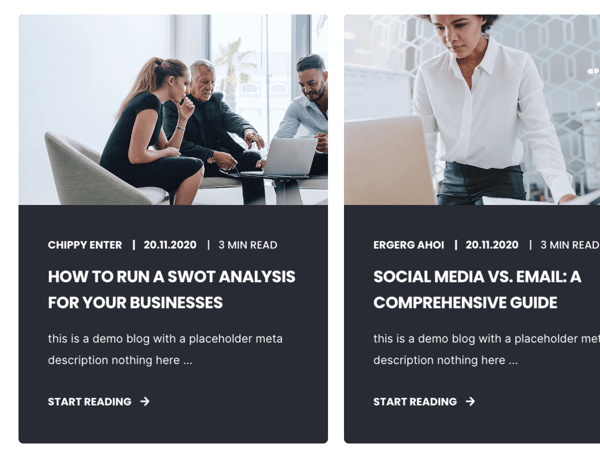
Layout → Show Author
Toggle to show or hide the author name.
Available in: Standard and Text Only layouts only.
Tip: Show author names to build credibility and personal connection with readers.
Layout → Show Date
Toggle to show or hide the publication date.
Available in: Standard and Text Only layouts only.
Best practice: Display dates for news-related content, but consider hiding for evergreen content.
Layout → Show Reading Time
Toggle to show or hide the estimated reading time.
Available in: Standard and Text Only layouts only.
Benefit: Reading time helps users decide whether they have time to read the post now.
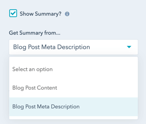
Layout → Show Summary
Enable to display a summary excerpt below the post title.
Available in: Standard and Text Only layouts only.
Layout → Get Summary from...
Choose the source for post summaries:
Blog Post Content
- Pulls text directly from the beginning of the blog post
- Automatically extracts the first paragraph or section
Blog Post Meta Description
- Uses the meta description defined in blog post settings
- More control over summary text
Tip: Use Meta Description for better control over preview text and SEO consistency.
Layout → Truncate Summary
Enable to shorten the summary after a set number of characters.
Default: 128 characters when enabled.
Layout → Truncate at ... Characters
Set the exact number of characters where the summary will be cut off.
Character guidelines:
- 72 characters: Approximately 1.5 lines (very short)
- 128 characters: Approximately 2-3 lines (default)
- 200 characters: Approximately 3-4 lines (longer preview)
Tip: Shorter summaries work better for mobile layouts and grid displays.
Layout → Intro Width
Control the width of section text:
- Narrow (default): Limits the width of intro title, title, and description text
- Default: Text fills available module width based on Full Width/Content Width settings

Layout → Centered
Enable to center-align the intro, title, and description text.
Default: Left-aligned content.
Tip: Centered layouts work well with featured post sections and hero areas.
Layout → Padding & Margin Top and Bottom
Select spacing options:
- Standard: Default theme spacing
- None: No spacing
- Small: Minimal spacing
- Medium: Moderate spacing
- Large: Maximum spacing
- First Section with Header: Special spacing for first page section
Refer to your theme settings for these for more information on this sizing.
How do I style the module?
Style → Color Scheme
Choose the base color scheme:
- Light: Light background with dark text
- Dark: Dark background with light text
Important: When you change the module background color, toggle the color scheme to ensure text remains legible.
Style → Intro Title Style - Text
Control intro title text appearance:
- Default: Inherits from Theme Settings based on color scheme
- Color: Override with custom color
- Gradient: Override with gradient effect
Style → Intro Title Style - Background
Set background behind intro text:
- Default: Transparent (text displays directly on module background)
- Color: Apply solid background color for highlight effect
- Gradient: Apply gradient background for highlight effect
Style → Intro Title Style - Border Radius
Configure rounded corners for the background highlight (in pixels). If not set, defaults to your Theme Settings.
Style → Title Style
Control main title appearance:
- Default: Inherits from Theme Settings based on color scheme
- Color: Override with custom color
- Gradient: Override with gradient effect
Style → Title Size
Choose visual size for the title:
- Default: Matches Title Header-Type (H1-H4)
- Override: Select H1, H2, H3, H4, H5, or H6 for styling based on Theme Settings
Important: This changes visual appearance only, not the SEO heading type.
Style → Overwrite Box Color
Enable to change the box color for the "Standard" layout.
Note: Box Color refers to the background color of the post preview box below the image, not the hover color.
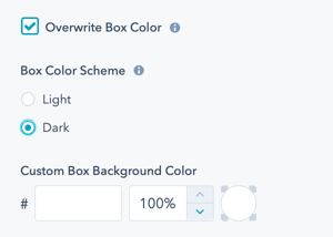
Style → Overwrite Box Color → Color Scheme
Choose between:
- Light: Light background with dark text
- Dark: Dark background with light text
Tip: When you change the module background color, adjust the box color scheme to ensure text remains legible.
Style → Overwrite Box Color → Custom Box Background Color
Customize the box color:
- Change default Light or Dark color using Hex values
- Control color opacity on a scale of 0 to 100%
Example: Use 95% opacity for a subtle overlay effect that allows background colors to show through slightly.
How do I style buttons and CTAs?
Style → CTA Style
Choose from button styles configured in your theme settings:
- Solid Primary
- Solid Regular
- Solid Regular for Primary Background
- Border Primary
- Border Regular
- Link
- Link Back
- Custom 01
- Custom 02
- Custom 03
- Custom 04
Style → CTA Size
Override the default button size:
- Regular: Standard button size
- Long: Extended width button
- Full Width: Button spans full container width
- Small: Compact button
- Large: Oversized button
Style → Background
Choose from multiple background types:
- Background Color: Solid color fill
- Background Image/Video: Media background
- Background Gradient: Color gradient effect
- Transparent: No background
Performance tip: Solid colors and gradients load faster than images or videos.
Refer to Settings that apply to all Section Modules for more details about these choices.
Style → Shape Divider
Add optional shape dividers to the top or bottom of the module for visual separation between sections.
Refer to Settings for configuring Shape Dividers for more details about these choices.
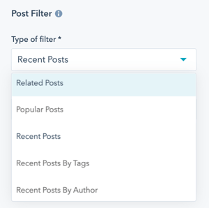
How do I filter which posts to display?
Post Filter → Type of Filter
Choose how posts are selected for display:
Related Posts
- Shows posts related to the current content
- Based on tags, authors, or manually specified posts
- Best for blog post templates
Popular Posts
- Displays most-viewed posts
- Choose timeframe for popularity calculation
- Great for homepage highlights
Recent Posts
- Shows newest published posts
- Based on publish date
- Ideal for blog archives and news sections
Recent Posts by Tags
- Shows recent posts filtered by specific tags
- Select up to three tags
- Perfect for topic-specific pages
Recent Posts by Author
- Shows recent posts from specific authors
- Enter author name(s)
- Useful for author profile pages
How do I configure Related Posts?
Post Filter → Type of Filter → Related Posts
Determine related posts using up to three methods:
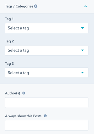
Tags
- Select up to three tags to match
- Posts with matching tags will be included
- Most common method for relating content
Author(s)
- Enter the exact author name as configured in HubSpot
- Configure multiple authors by separating with commas (no spaces)
- Example:
John Smith,Jane Doe,Alex Johnson
Always Show This Posts
- Specify blog posts that should always appear
- Enter post IDs separated by commas (no spaces)
- Find post ID in the URL when editing:
https://app.hubspot.com/blog/HUBSPOT-ID/edit/POST_ID/...
Example: 12345678,87654321,11223344
Tip: Use "Always Show This Posts" to feature important content regardless of other filter criteria.
How do I configure Popular Posts?
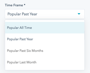
Post Filter → Type of Filter → Popular Posts
Display most-viewed posts based on timeframe and optional tag filtering.
Timeframe options:
- Popular All Time: Most viewed since blog creation
- Popular Past Year: Most viewed in the last 365 days
- Popular Past Six Months: Most viewed in the last 180 days
- Popular Last Month: Most viewed in the last 30 days
Tag filter:
- Optionally limit to a single tag
- Useful for topic-specific popular posts
Use case: Feature your best-performing content to increase engagement and time on site.
How do I configure Recent Posts?
Post Filter → Type of Filter → Recent Posts
Display posts based on the most recent publish date. No additional configuration required
Post Filter → Type of Filter → Recent Posts by Tags
Display recent posts filtered by tags.
Configuration:
- Select up to three tags
- Posts sorted by most recent publish date
- Only posts with selected tags will appear
Use case: Create topic-specific content hubs or landing pages.
Post Filter → Type of Filter → Recent Posts by Author
Display recent posts from specific authors.
Configuration:
- Enter exact author name(s) as configured in HubSpot
- Separate multiple authors with commas (no spaces)
- Posts sorted by most recent publish date
Example: Sarah Williams,Michael Chen
Use case: Author bio pages, team member profiles, or contributor showcases.
How do I select which blog to display posts from?
Post Filter → Blog
Select the specific blog to display posts from.
If not selected: The default blog from your HubSpot account will be used.
Use case: Useful when you have multiple blogs in your HubSpot portal (e.g., company blog, product blog, news blog).
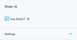
How do I enable the slider functionality?
See Post Preview Slider in Action
Slider → Use Slider?
Check this box to activate slider functionality for your post previews.
This setting is only visible once you update the Post Filter to change the default (related posts) because the functionality is currently not working for this filter type.
Important notes:
- Only works for Standard, Large Vertical, and Text Only layouts
- Not currently working for Related Posts filter
- This setting becomes visible after you update the Post Filter
Slider → Number of Visible Items
Set how many post previews display at once:
- Default is 3
- Minimum is 1
- Maximum is unlimited (though higher numbers affect layout)
Important: This setting will override the "Number of Posts to Show" setting under Layout.
Slider → Number of Items to Slide
Set how many posts advance with each transition:
- Default is 1
- Don't set higher than the number of visible items
This provides flexibility to slide single or multiple post previews with each transition.
Slider → Number of Blog Posts
Set the total number of blog posts to include in the slider:
- Default is 6
- Can be changed to include as many posts as you'd like
Tip: Keep total posts reasonable (6-12) for optimal performance.
See also: Slider Performance Optimization, Carousel Best Practices
Slider → Transition Option
Choose how users navigate the slider:
Manual
- Users click arrows or bullet points
- Users press arrow keys on keyboard
- No automatic advancement
Autoplay (default)
- Slides advance automatically at set intervals
- User can still manually navigate
Continuous
- Slides advance continuously without pause
- Creates seamless, constant motion
Slider → Transition Time
Set the duration of the slide transition in milliseconds. Applies to Autoplay or Continuous options.
Recommended: 300-800ms for smooth transitions
Slider → Transition Effect
The effect is set to Slide for smooth horizontal transitions.
Slider → Autoplay - Interval Timeout
Set the pause duration between automatic slides in milliseconds. Applies to Autoplay or Continuous options.
Recommended: 4000-6000ms (4-6 seconds) for users to read post titles and summaries
See also: Slider Timing Best Practices, User Experience Guidelines
Slider → Navigation - Arrows
Check to activate left and right arrows on the slider for navigation.
Recommended: Always enable for clear user control.
Slider → Navigation - Bullets
Check to activate bullet points below the slider for navigation.
Recommended: Enable for users to see how many slides exist and their current position.
Slider → Keyboard Control
Check to activate slider control via arrow keys on the keyboard.
Important: Only works when the slider is visible in the browser viewport. This setting is recommended for accessibility.
See also: Accessibility Best Practices, Keyboard Nav
How do I add animations to the module?
Animation
Enable or disable Animate on Scroll for the entire module. Turning off here applies only to this section.
Note: To turn animation off globally for all modules, refer to Theme Options for Animations.
Animation → Section
Set animation type and delay for the entire section container.
Animation → Intro to Title
Set animation type and delay specifically for the intro title text.
Animation → Title
Set animation type and delay specifically for the main title.
Animation → Description
Set animation type and delay specifically for the description text.
Animation → Contact Information Box
Set animation type and delay for the contact information section (if applicable).
Animation → Button/CTA
Set animation type and delay specifically for the button or CTA.
Animation → Form
Set animation type and delay for any forms in the section (if applicable).
How can I preview animation changes?
When modifying animation settings for an individual section:
- Open the preview link in a separate browser tab
- Make animation changes in the editor
- Refresh the preview tab to see updates
- Repeat until satisfied with the animation
Tip: Use progressive delays (e.g., intro: 0ms, title: 100ms, posts: 200ms, button: 300ms) for a cascading reveal effect.
How do I control module visibility?
Visibility
Choose to hide your module on specific screen sizes:
- Hide on desktop only
- Hide on tablet only
- Hide on mobile only
- Show on all devices (default)
Use case: Display different post layouts or post counts for mobile vs. desktop users.
For more information see common module information.
How do I customize text and translations?
Standard Text/Translations → Link Text
Change the default link text from "Start Reading" to your preferred text.
Examples:
- "Read More"
- "Continue Reading"
- "View Post"
- "Learn More"
- "Read Full Article"
Standard Text/Translations → Read Time Text
Change the default read time text from "%s min read" to your preferred format.
Important: Don't remove the %s placeholder or the reading time minutes will not display.
Examples:
%s minute read%s minReading time: %s minutes%s-minute article
Tip: Customize these texts to match your brand voice and language requirements.
How do I set up anchor links?
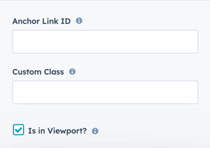
Anchor Link ID
Set an anchor link identifier for the module. Use anchor links to:
- Create direct links to specific sections
- Build on-page navigation menus (like Sticky Sub-Menu)
- Allow users to jump to sections without scrolling
Example: Set Anchor Link ID as "featured-posts" to create links like yoursite.com/blog#featured-posts
For full instructions refer to Setting up Anchor Links.
How do I add custom CSS classes?
Custom Class
Add a Custom Class identifier to use in the child.css file for individual customizations.
This allows you to:
- Apply unique styling to specific post preview modules
- Override theme styles for particular instances
- Create reusable custom styles across multiple pages
See full instructions for setting a Custom Class for Section Modules.
What is the "Is in Viewport" setting?
Is in Viewport?
This performance setting determines how CSS is loaded for the module.
When to check this box:
- Module is at the top of the page
- Module is located within the browser viewport on page load
- Ensures CSS loads immediately on page load
When to uncheck this box:
- Module is outside of the initial viewport
- Module is below the fold, especially on mobile
- Allows CSS to load asynchronously for better performance
Important: This setting impacts Page Speed and Core Web Vitals scores.
 ]
]
Learn more about this setting as it relates to Page Speed and Core Vitals.