Showcase your images with an image slider, image comparison, or add hotspots to create interactive elements for your page layouts.
What is the POWER Sec Image Module?
The POWER Sec Image Module is a versatile image display tool with multiple layout options for showcasing images in engaging, interactive ways.
Module capabilities:
- Image sliders (multiple variants)
- Before/after image comparison
- Interactive image hotspots
- Lottie animations
- Responsive image display
Common use cases:
- Product showcases
- Before/after transformations
- Project portfolios
- Image galleries
- Interactive diagrams
- Animated graphics

How does the Sec Images module affect page speed?
-
Low impact: Depending on the layout chosen, only the necessary CSS and JS are loaded.
-
Medium impact - If used in the browser viewport it will increase the impact on page speed.
Performance Tips:
- Convert images to WebP where possible to meet criteria to serve images in next-gen format
- If the module is not in the browser viewport (especially on mobile), you can further improve the performance by unchecking the "Is in Viewport?" setting.
- To reduce image file sizes without losing quality, use TinyPNG to compress your images (JPG, PNG, WebP)
Note: For more detailed performance advice, review the POWER Performance Guide!
What content settings are available?
Intro to Title
The smaller text above the title; can be left blank to hide on the page.
Title
The main heading for the section; can be left blank to hide on the page.
Title - Header Type
Choice of H1, H2, H3, or H4. This is how Google will determine the heading type. This does not control the formatting of the font, there is a separate setting under Style → Title Size to determine how the heading will display.
Description
You can add any amount of body text here or it can be left blank to hide on the page.
What is the deprecated Image setting?
Image (DEPRECATED)
Images added here are not compatible with the updated slider settings. If your images are using this setting they will continue to work, but we recommend rebuilding your slider with the new Image Item(s) setting.
Migration recommendation: Rebuild sliders using the new Image Item(s) setting for full functionality and compatibility.
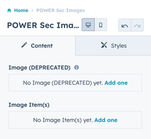
How do I add images to the module?
Image Item(s)
Click Add one to select the first image for the slider. Additional images can be added by clicking + Add or hovering over the existing image and cloning it.
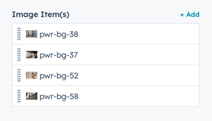
Image Item(s) → Image
Add, Replace, or Remove the image.
Image Item(s) → Alt text
Add or update alt text for the image selected.
Image Item(s) → Width
Update the width of the image, Height will remain proportional to the original image dimensions as you change the width.
Image Item(s) → Height
Update the height of the image, Width will remain proportional to the original image dimensions as you change the height.
Can I link images?
Image Item(s) → Link → Link to
Choose whether to link the image to External, Content, FIle, Email address, or Blog. Once selected, the corresponding setting to configure the link will be visible.
Image Item(s) → Link → Open link in new window
Check the box to determine whether the link will open in the current browser tab/window or open in a new tab/windw.
Image Item(s) → Link → Link type
Option to configure the link as No follow, changing this setting can impact your SEO.
A No follow link is typically reserved for links to external sources (not internal content).
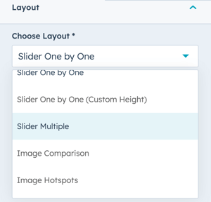
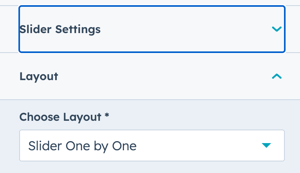
What layout options are available?
Layout → Choose Layout
There are six layout options available:
- Slider One by One
- Slider One by One (Custom Height)
- Slider Multiple
- Image Comparison
- Image Hotspots
- Lottie File
Once the layout is selected, the corresponding settings will appear above the Layout section.
By default, the Slider Settings are visible before you get to the Layout section.
Layout → Choose Layout → Slider One by One
The image is shown in the same proportions as it is loaded.

Layout → Choose Layout → Slider One by One (custom height)
Option to set the height of the image to a specific height.
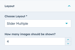
Layout → Choose Layout → Slider Multiple
Option to show multiple images instead of a single image.
The slider displays four images in a row, if less than four images are loaded the images will repeat.

Layout → Choose Layout → Slider Multiple → How many images should be shown?
Set the number of images to be shown, default is 4.
What Slider Settings are available?
Slider Settings
This setting is only visible when the Layout is one of Slider One by One, Slider One by One (custom height), and Slider Multiple.
Applies to: Slider layouts only, not Image Comparison or Hotspots.
Layout → Choose Layout
Choice between One by one (display each testimonial individually) with 2 different style options, Multiple (show multiple testimonials at once and two or three column listings (display testimonials in columns or two or three).
Slider Settings → Autoplay
Checkbox to activate autoplay. If turned on, the image slider rotates automatically.
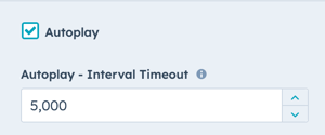
Slider Settings → Autoplay → Autoplay - Interval Timeout
Autoplay time in milliseconds. This setting is only visible if Autoplay is checked.
Slider Settings → Navigation - Arrows
Checkbox to activate the arrows on the left and right of the slider for navigation.
This option requires the Section to be set to Full Width.

Slider Settings → Navigation - Bullets
Checkbox to activate the bullets below the slider for navigation.
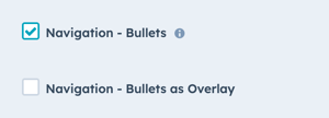

Slider Settings → Navigation - Bullets as Overlay
Checkbox to overlay the bullets on top of the images rather than below. This setting is only visible if Navigation - Bullets is checked.

What is Image Comparison?
Layout → Image Comparison
See Image Comparison in Action
Also known as before and after images, the Image Comparison layout allows you to compare two images.
Image comparison features:
- Side-by-side image comparison
- Before/after slider
- Toggle or hover interaction
- Labels for each image
- Interactive reveal
Use cases:
- Before/after transformations
- Product comparisons
- Design iterations
- Renovation projects
- Photo editing showcases
- A/B testing visualization

Image Comparison → Image (Left)
Set the Image visible on the left, this is also the image visible by default for the toggle or before hovering (typically labeled as the Before image).
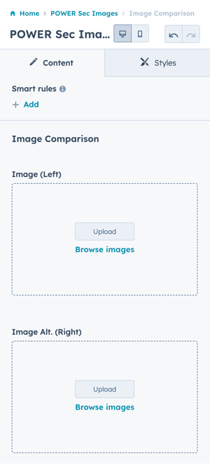
Image Comparison → Image Alt. (Right)
Set the Image visible on the right, this is also the image visible after activating the toggle or on hover (typically labeled as the After image).
Image Comparison → Label Left
Add the text to display on the Left Image (e.g. Before).
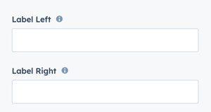
Image Comparison → Label Right
Add the text to display on the Left Image (e.g. Before).
Image Comparison → Hover Note
Add the text to display on mobile to indicate that the user should tap the image to change from the Left image to the Right image. This setting is only visible if the Comparison Variant is set to Hover.
Image Comparison → Layout → Comparison Variant
Choice of Before/After Slider, Toggle, or Hover.
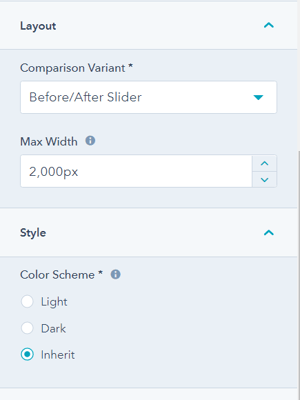
Image Comparison → Layout → Max Width
If not set to Full Width, this can be set to allow the max width to be smaller than the content width.
Image Comparison → Style → Color Scheme
Choice of Light, Dark, or Inherit.
Sets the color scheme for the image labels, if set to inherit the settings from the module style settings apply.
Image Comparison → Style → Color Toggle Active
For Toggle Layout, the option to change the default background color when the toggle is active.
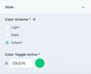
Image Comparison → Animation → Icon Animation
Choice of None or Pulse.
What are Image Hotspots?
Layout → Image Hotspots
Option to configure hotspots to identify points of interest as an overlay on an image.
Image hotspots features:
- Interactive markers on images
- Hover to reveal information
- Multiple hotspots per image
- Custom positioning
- Numbered or icon markers
Use cases:
- Product feature callouts
- Interactive diagrams
- Map locations
- Architectural plans
- Educational illustrations
- Explainer graphics

Image Hotspots → Image
Select the image to use as the background for your hotspots.
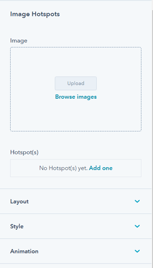
Image Hotspots → Hotspot(s)
Configure up to 10 hotspots to overlay on the image.
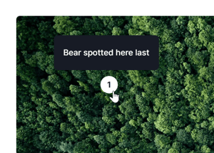
Image Hotspots → Hotspot(s) → Hotspot Text
Add the text that is visible on hover, the width of the text box on hover is narrow and works best with shorter texts.
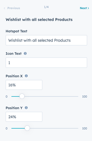
Image Hotspots → Hotspot(s) → Icon Text
Add a number or character to label the Hotspot. Only visible when Number/Character is selected as the Icon Style.
Image Hotspots → Hotspot(s) → Position X
The position of the hotspot is based on an X and Y grid - think of the upper left corner as 0,0 and the bottom right as 100,100. The middle of the image is 50,50.
Position X is the horizontal placement, with far-left being 0 and far-right being 100.
Image Hotspots → Hotspot(s) → Position Y
Position Y is the vertical placement, with the very top being 0 and the very bottom being 100.
Image Hotspots → Layout → Max Width
If not set to Full Width, this can be set to allow the max width to be smaller than the content width.
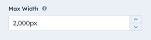
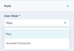
Image Hotspots → Style → Icon Style
Choice of Plus (+) or Number/Character (single digit).
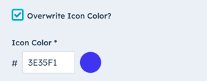
Image Hotspots → Style → Overwrite Icon Color?
Option to configure the color for the hotspot icon background. The default is your Primary color from Theme Settings.
Image Hotspots → Style → Color Scheme
Choice of Light, Dark, or Inherit.
Sets the color scheme for the image labels, if set to inherit the settings from the module style settings apply.
How do I add a Lottie File?
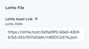
Lottie File > Lottie Asset Link
Lottie File > Lottie Asset Link
Add the JSON link from your Lottie Account (how to get the Lottie File link):
See: How to get the Lottie File link
⚠️ When the Lottie File is added to the page, it will show a blank space. The animation is only visible on the preview page or live page.
Editor limitation: Lottie animations don't display in page editor, only on preview/live pages
⚠️ When the Lottie File is added to the page, it will show a blank space. The animation is only visible on the preview page or live page.
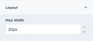
Lottie File > Layout > Max Width:
The default Max Width is set to 20px, adjust this accordingly to work with your layout.
Max width sizing:
- Default: 20px (very small)
- Adjust to appropriate size
- Maintains aspect ratio
- Test at actual size
What Lottie Player settings are available?
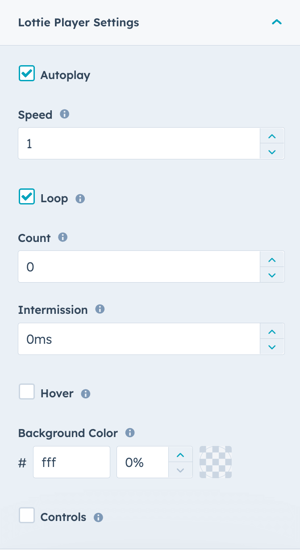
Lottie File > Lottie Player Settings
The animation is set to Autoplay and Loop by default.
Lottie player controls:
Autoplay: Uncheck the box to require click interaction to start the animation.
- Default: On (plays automatically)
- Off: Requires user interaction
Speed: The default is 1, setting speed to less than 1 will make it slower and greater than 1 will make it faster.
- 0.5: Half speed
- 1.0: Normal speed (default)
- 2.0: Double speed
Loop: Uncheck the box to play the animation only once, otherwise the animation will loop. The default is to loop indefinitely.
- On: Continuous loop
- Off: Play once
Count: Defines the number of times to loop the animation. Setting the count property to 0 and keeping Loop checked, loops the animation indefinitely.
- 0: Infinite loop (with Loop on)
- 1+: Specific number of loops
Intermission: The duration to pause before playing each cycle in a looped animation. Set this parameter to 0 (no pause) or any positive number.
- 0: No pause
- 1000+: Milliseconds between loops
Hover: Check the box to play the animation when the user hovers the mouse over the icon.
- Off: Normal playback
- On: Trigger on hover
Background Color: The default setting is set to transparent so the animation inherits the background from the module or section. Select a hex value to change the background color and set the transparency percentage to greater than 0% to make it visible.
- Default: Transparent
- Custom: Set color and opacity
Controls: Displays player controls.
- Off: No controls (default)
- On: Show play/pause
What layout settings are available?
Additional Layout Settings
Layout → Full Width: Option to have the slider or image span the full width of the screen.
This is different from the setting for the Section content and alignment that must be set to Full Width for the slider to work as expected.
Full width notes:
- Module spans entire screen width
- Section must also be full-width
- Both settings required
- Creates dramatic effect
Layout → Intro Width
This allows you to control the width of the text, with two choices: Narrow or Default.
The module is set to "Narrow" when you add it to the page (this was the original layout prior to adding this choice as a setting). Narrow limits the width of the section text (intro to title, title, and description) within the section.
"Default" allows the text to fill the width of the module; the width is dependent on whether the section is set to "content width" or "full width" in the section settings.
Intro width options:
- Narrow: Constrained text width
- Default: Full module width

Layout → Centered
By default, the section text (intro to title, title, and description) is left-aligned. If you want the text to be centered, you can check this box.
Layout → Padding & Margin Top and Bottom
Choice of Standard, None, Small, Medium, Large, or First Section with Header. Refer to your theme settings for these for more information on this sizing.
What styling options are available?
Module Styling
Style → Color Scheme
Choice of Light or Dark.
Tip: If you change the background color for the module, the definition of Light Color scheme is a light background with dark text and Dark Color scheme is a dark background with light text. Based on your background color, you would need to toggle the color scheme to ensure the text color displays properly and is legible.
Style → Intro Title Style - Text
The Default uses the text style from the Theme Settings based on the color scheme selected.
You can override the Theme Settings by choosing Color or Gradient and completing the corresponding color settings.
Style → Intro Title Style - Background
The Default is transparent, where the text is displayed directly on the background for the module.
You can apply a background Color or Gradient to the text to give the appearance of a highlight behind the text.
Style → Intro Title Style - Border Radius
When a background color or gradient is applied, you will also have the option to configure the Border Radius in pixels.
If not set, the default Border Radius from your Theme Settings will apply.
Style → Title Style
The Default uses the text style from the Theme Settings based on the color scheme selected.
You can override the Theme Settings by choosing Color or Gradient and completing the corresponding color settings.
Style → Title Size
The Default is set to match what you chose for Title Header-Type, what Google sees from an SEO perspective. This setting gives you the option to change the Title Size to H1, H2, H3, H4, H5, or H6 so that the text will be styled based on your Theme Settings for the corresponding header tag chosen here.
Style → Background
Choice of Background Color, Background Image/Video, Background Gradient, or Transparent. Refer to Settings that apply to all Section Modules for more details about these choices.
Style → Shape Divider
Optional Shape Divider(s) can be added to the top or bottom of this module. Refer to Settings for configuring Shape Dividers for more details about these choices.
What animation options are available?
Animation Settings
Checkbox to turn on/off Animate on Scroll. Turning off here will only apply to this section, to turn animation off globally refer to Theme Options for Animations.
Animation → Section
Ability to change the Animation Type and Delay for the Section.
Animation → Intro to Title
Ability to change the Animation Type and Delay for the Intro to Title.
Animation → Title
Ability to change the Animation Type and Delay for the Title.
Animation → Description
Ability to change the Animation Type and Delay for the Description.
Animation → Images
Ability to change the Animation Type and Delay for the Images.
What additional settings are available?
Additional Module Settings
Visibility: Choose to hide your module on specific screen sizes. For more information see common module information.
Device visibility:
- Show/hide on desktop
- Show/hide on tablet
- Show/hide on mobile
Choose to hide your module on specific screen sizes. For more information see common module information.
Anchor Link ID
Set an anchor link for the module. Can be used to create a link directly to that section on the page and/or to include in an on-page menu (like Sticky Sub-Menu) to allow users to jump to that section without scrolling.
Easily add an anchor link to this section, for full instructions refer to Setting up Anchor Links.
Custom Class
Ability to add a Custom Class to use in the child.css for individual customizations.
See full instructions for setting a Custom Class for Section Modules.
Is in Viewport?
Performance setting to determine how the CSS is loaded for the module.
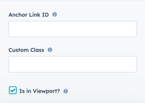
If the module is at the top of the page and located within the viewport of the browser, check this option to ensure the CSS loads on page load.
If the module is outside of the viewport, especially on mobile, uncheck this box so the CSS loads asynchronously.
Learn more about this setting as it relates to Page Speed and Core Vitals.