Create compelling Form layouts to convert site visitors and capture valuable data directly to your HubSpot CRM.
What is the POWER Sec Form Module?
The POWER Sec Form module allows you to add HubSpot forms to your pages with customizable layouts and styling options.
Module purpose:
- Capture leads and conversions
- Collect visitor information
- Integrate with HubSpot CRM
- Multiple layout options
- Customizable styling
Form capabilities:
- Five layout options
- Custom styling per module
- GDPR compliance options
- CAPTCHA spam prevention
- Workflow integration
- Follow-up email automation
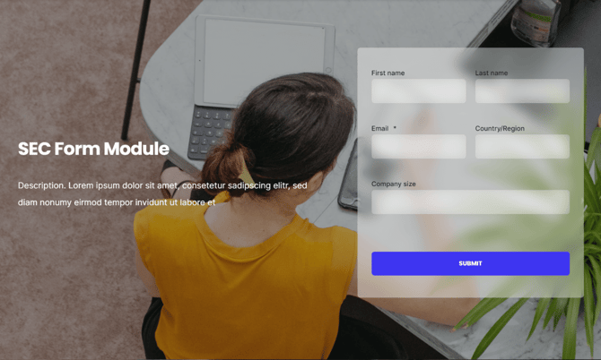
TABLE OF CONTENTS
Page Speed Impact
Module Options
Page Speed Impact
Low impact: HubSpot's code for forms adds extra code to the page that has to be loaded.
Forms with fewer fields: Forms with fewer fields, like newsletter subscription forms with only an email field, have less code that has to load which reduces the impact of your forms on page loading.
Email-only forms: Minimal performance impact with single field forms.
Medium impact: Even with limited styling, forms with multiple fields will have a greater impact on page speed.
Multi-field consideration: More fields = more code = slower loading.
Additional impact: Additional impact on desktop and mobile if images are added to the rich-text editor without lazy loading and/or compression.
Background impact: An image or video background also impacts page performance.
Performance Tips
Use CTAs on your main pages that lead to landing pages or pages with full forms to reduce the impact of the form on site performance.
Performance strategy:
- Use CTA buttons on content pages
- Link to dedicated form pages
- Better for SEO-sensitive pages
- Improved page speed
Note: For more detailed performance advice, review the POWER Performance Guide!
Module Options
Intro to Title
The smaller text above the title; can be left blank to hide on the page.
Title
The main heading for the section; can be left blank to hide on the page.
Title - Header Type
Choice of H1, H2, H3, or H4. This is how Google will determine the heading type. This does not control the formatting of the font, there is a separate setting under Style → Title Size to determine how the heading will display.
Header type options:
- H1: Main page heading
- H2: Major section
- H3: Subsection
- H4: Minor heading
SEO vs Visual: Header Type = SEO/structure. Title Size = Visual appearance.
Important distinction:
- Header Type: What Google sees
- Title Size: What users see
- Can be different
Description
You can add any amount of body text here or it can be left blank to hide on the page.
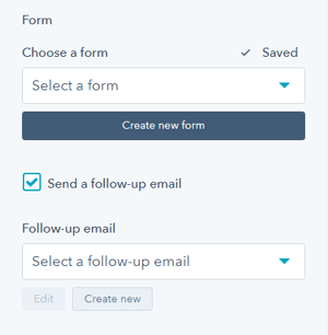
How do I select and configure a form?
Form → Choose a Form
You can choose a form that you've already set up or create a new form.
Form selection:
- Choose existing HubSpot form
- Create new form
- Configure in HubSpot
- Import to module
Form Content → Form Fields
Edit the form fields or open the form using the Form Editor.
Form Content → Button Text
Text to display for the form button (required).
Form Content → GDPR Options
Dropdown with GDPR options to include in your form.
Form Content → CAPTCHA
Toggle to activate CAPTCHA for SPAM prevention.
What happens after form submission?
Thank You → What will a visitor see when submitting your form?
Decide what happens on form submission. Choice of redirecting to another page or displaying an inline thank you message.
Thank you options:
- Redirect: Send to thank you page
- Inline message: Show message on page
This setting applies only to this page, not all locations the form is used.
Module-specific: Form behavior can differ per page module.
Best practices:
- Clear confirmation
- Set expectations
- Next steps
- Additional resources
Form Automation → Always create new contact for email address
Toggle to determine whether a new contact will be created.
Form Automation → Simple workflows
Shows whether the form is included in any simple workflows.
Form Automation → Workflows
Option to add form to a Workflow or manage workflows.
Form → Send a follow-up email
You can choose an email that you've already set up or create a new email.
What layout options are available?
Layout → Choose Layout
There are five layout options available: Horizontal (50/50), Horizontal (60/40), Horizontal Boxed, Vertical (wide), or Vertical (narrow).
Layout → Centered
By default, the section text (intro to title, title, and description) is left-aligned. If you want the text to be centered, you can check this box.
Layout → Padding & Margin Top and Bottom
Choice of Standard, None, Small, Medium, Large, or First Section with Header. Refer to your theme settings for these for more information on this sizing.
What style options are available?
Style → Color Scheme
Choice of Light or Dark.
Tip: If you change the background color for the module, the definition of Light Color scheme is a light background with dark text and Dark Color scheme is a dark background with light text. Based on your background color, you would need to toggle the color scheme to ensure the text color displays properly and is legible.
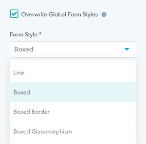
Style → Overwrite Global Form Styles
The default form style is configured in your theme settings, checking this box will allow you to change the style to be unique for this module.
Global vs custom:
- Default: Use theme form styles
- Override: Custom styles per module
When to override:
- Campaign-specific styling
- A/B testing
- Special designs
- Brand variations
Style → Intro Title Style - Text
The Default uses the text style from the Theme Settings based on the color scheme selected.
You can override the Theme Settings by choosing Color or Gradient and completing the corresponding color settings.
Style → Intro Title Style - Background
The Default is transparent, where the text is displayed directly on the background for the module.
You can apply a background Color or Gradient to the text to give the appearance of a highlight behind the text.
Style → Intro Title Style - Border Radius
When a background color or gradient is applied, you will also have the option to configure the Border Radius in pixels.
If not set, the default Border Radius from your Theme Settings will apply.
Style → Title Style
The Default uses the text style from the Theme Settings based on the color scheme selected.
You can override the Theme Settings by choosing Color or Gradient and completing the corresponding color settings.
Style → Title Size
The Default is set to match what you chose for Title Header-Type, what Google sees from an SEO perspective. This setting gives you the option to change the Title Size to H1, H2, H3, H4, H5, or H6 so that the text will be styled based on your Theme Settings for the corresponding header tag chosen here.
Style → Button Style
Option to choose any of the button styles configured in your theme settings including:
- Solid Primary
- Solid Regular
- Solid Regular for Primary Background
- Border Primary
- Border Regular
- Link
- Link Back
- Custom 01
- Custom 02
- Custom 03
- Custom 04
Style → Overwrite Box Color
By default, the form fields use the background color established in your theme settings. If you want to change the box colors, you can check this box. This setting only works for the Boxed and Boxed Border variants.
Style → Overwrite Box Color → Box Color Scheme
Once checked, you will have the choice to change between Light or Dark color scheme.
Style → Overwrite Box Color → Custom Box Background Color
Additionally, you can select a custom color for the form field background when collapsed to use in place of the theme default.
Style → Box Border
Only applies to Boxed layout. Once checked, you will have the choice to change the Border Color and Border Width.
Style → Box Border → Box Border Color
Choice of Dark, Light, Primary, or Custom.
Style → Box Border → Custom Box Border Color
Ability to define a custom border color using a Hex code or the Color Picker tool.
Style → Box Border → Custom Box Border Width
Set the width of the border in pixels, with a minimum of 1 px and maximum of 10 px.
Style → Background
Choice of Background Color, Background Image/Video, Background Gradient, or Transparent. Refer to Settings that apply to all Section Modules for more details about these choices.
Style → Shape Divider
Optional Shape Divider(s) can be added to the top or bottom of this module. Refer to Settings for configuring Shape Dividers for more details about these choices.
What animation options are available?
Animation
Checkbox to turn on/off Animate on Scroll. Turning off here will only apply to this section, to turn animation off globally refer to Theme Options for Animations.
Animation → Section
Ability to change the Animation Type and Delay for the Section.
Animation → Intro to Title
Ability to change the Animation Type and Delay for the Intro to Title.
Animation → Title
Ability to change the Animation Type and Delay for the Title.
Animation → Description
Ability to change the Animation Type and Delay for the Description.
Animation → Form
Ability to change the Animation Type and Delay for the Form.
Tip: When modifying animation settings for an individual section, we recommend opening the preview link in a separate tab so you can easily preview the changes as you make them by refreshing the page.
What visibility options are available?
Visibility
Choose to hide your module on specific screen sizes. For more information see common module information.
Visibility control:
- Hide on desktop
- Hide on tablet
- Hide on mobile
- Responsive design
Use cases:
- Mobile-specific forms
- Desktop-only content
- Simplified mobile experience
- Device-specific layouts
Choose to hide your module on specific screen sizes. For more information see common module information.
Can I add anchor links to the form section?
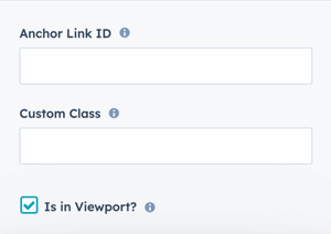
Anchor Link ID
Set an anchor link for the module. Can be used to create a link directly to that section on the page and/or to include in an on-page menu (like Sticky Sub-Menu) to allow users to jump to that section without scrolling.
Anchor link functionality:
- Direct links to section
- Jump navigation
- Table of contents links
- Sticky menu integration
- Smooth scrolling
Anchor link uses:
- Long-form content
- Jump to form
- Navigation menus
- Quick access
Easily add an anchor link to this section, for full instructions refer to Setting up Anchor Links.
Can I add custom CSS to the form module?
Custom Class
Ability to add a Custom Class to use in the child.css for individual customizations.
Custom class usage: Apply specific CSS styling via child theme.
Custom CSS workflow:
- Add custom class name
- Add CSS to child.css
- Target with
.your-class-name - Apply custom styles
Important recommendation: Use native features first before adding custom CSS.
See full instructions for setting a Custom Class for Section Modules.
What is the viewport performance setting?
Is in Viewport?
Performance setting to determine how the CSS is loaded for the module.
Viewport setting: Controls how CSS loads for the module.
If the module is at the top of the page and located within the viewport of the browser, check this option to ensure the CSS loads on page load.
Check if:
- Form at top of page
- Visible on page load
- Above the fold
- Critical content
If the module is outside of the viewport, especially on mobile, uncheck this box so the CSS loads asynchronously.
Uncheck if:
- Form below fold
- Not immediately visible
- Scrolled content
- Performance optimization
Performance impact: Proper configuration improves Core Web Vitals and page speed.
Learn more about this setting as it relates to Page Speed and Core Vitals.