The Sec CTA module creates dedicated call-to-action sections with multiple button options and supporting content.
How does the Sec CTA module affect page speed?
Low impact:
- Very minimal impact when used as a standard button
- Keeping the number of CTAs on a page low
- Using simple button configurations without tracking
- Using HubSpot CTAs increases page load speed
- HubSpot's tracking code adds extra code that must be loaded
- Multiple tracked CTAs on a single page
Performance Tips:
- Only use CTAs for actions that are part of your critical conversion path(s)
- Only use tracked CTAs for actions you are actively monitoring in campaigns
- Use standard buttons instead of HubSpot CTAs when tracking isn't needed
- Buttons can be styled to match any CTA style from your theme settings, including the 4 custom styles
Note: For more detailed performance advice, review the POWER Performance Guide!
Module Options
Title
The main heading for the section. This field is optional and can be left blank.
Title - Header Type
Choose the HTML heading level for SEO purposes:
- H1: Page title (use once per page)
- H2: Major sections
- H3: Subsections
- H4: Minor subsections
Important: This setting controls the HTML heading type for Google indexing, not the visual font size. To adjust font appearance, use Style → Title Size
Description
Add any amount of body text to support your CTA. Leave blank if no description is needed.
How do I add buttons or CTAs?
Button(s)
Add or remove multiple buttons, CTAs, or add blank spaces with a "none" choice.
Configuration options:
- Multiple buttons in a single section
- Mix of CTAs and standard buttons
- Primary and secondary button styling
- Flexible spacing and alignment
Tip: Limit to 2-3 buttons maximum to avoid decision paralysis. Use visual hierarchy to emphasize the primary action.

Button(s) → Button Type → CTA
When CTA is selected:
- Click Choose CTA to open the HubSpot CTA sidebar
- Select an existing CTA or create a new one
- CTA analytics will be tracked in HubSpot
Benefits of HubSpot CTAs:
- Track clicks and conversions
- A/B test different versions
- Personalize for different audiences
- View analytics in HubSpot dashboard
Use cases:
- Primary conversion actions (signups, demos, purchases)
- Campaign-specific tracking
- Smart content personalization
- Critical conversion path steps
Button(s) → Button Type → Button
When Button is selected, configure these settings:
Button(s) → Button → Button Title
The text that appears on the button.
Button(s) → Button → Button Link
Choose the link type:
- External: Link to external websites
- Content: Link to HubSpot pages
- File: Link to downloadable files
- Email Address: Create mailto links
- Blog: Link to blog posts
- Phone number: Create tel links
- Payment: Link to payment pages
- Pop-up CTA: Trigger a pop-up CTA
Based on your selection, add the URL, email address, phone number, or choose from HubSpot content.
Button(s) → Button → Open in New Window
Toggle to open links in a new window/tab.
Default: Opens in the same window/tab.
Tip: If your link leaves your website, it's recommended to open in a new window. Keep internal navigation in the same window.
Button(s) → Button → Link Type
Check "No Follow" to indicate the link is not associated with your website.
Important: This setting has SEO implications if used incorrectly. Only use for untrusted or paid links, never for your own conversion buttons.
Button(s) → Button → Use Internal URL instead
Use this for on-page anchor links to link to another part of your page.
Important: Adding an item here will overwrite any links chosen previously for this button.
How do I style individual buttons?
Button(s) → Style → CTA Style
Choose from button styles configured in your theme settings:
- Solid Primary
- Solid Regular
- Solid Regular for Primary Background
- Border Primary
- Border Regular
- Link
- Link Back
- Custom 01
- Custom 02
- Custom 03
- Custom 04
Visual hierarchy tips:
- Use Solid Primary for main action
- Use Border or Link for secondary actions
- Maintain consistency with site design
- Test contrast for accessibility
Button(s) → Style → CTA Size
Override the default button size:
- Regular: Standard button size
- Long: Extended width button
- Full Width: Button spans full container width
- Small: Compact button
- Large: Oversized button
Tip: Use Large size for primary CTAs to increase visibility. Use Full Width on mobile for easier tapping.
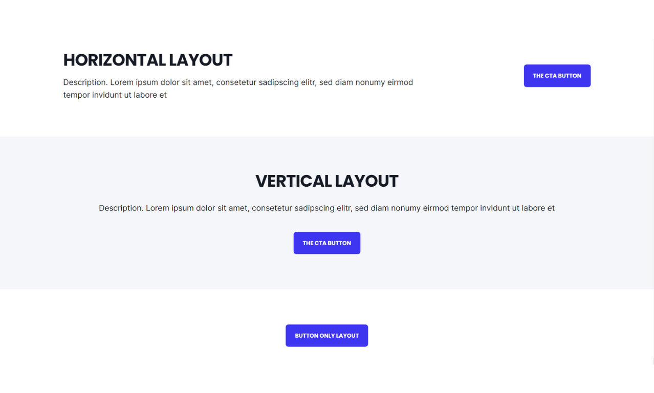
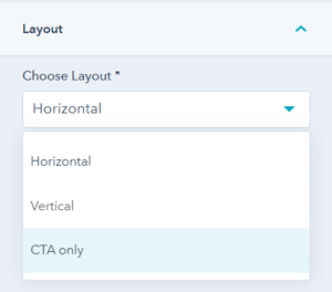
What layout options are available?
Layout → Choose Layout
Select from three layout options:
- Horizontal
- Vertical
- CTA-only
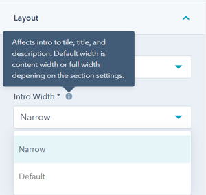
Layout → Intro Width
Control the width of section text:
- Narrow (default): Limits the width of title and description text
- Default: Text fills available module width based on Full Width/Content Width settings
Recommended: Narrow for better readability on wide screens.
Layout → Centered
Enable to center-align section text (title and description) and buttons.
Default: Left-aligned content.
Layout → Padding & Margin Top and Bottom
Select spacing options:
- Standard: Default theme spacing
- None: No spacing
- Small: Minimal spacing
- Medium: Moderate spacing
- Large: Maximum spacing
- First Section with Header: Special spacing for first page section
Recommended: Medium or Large padding for standalone CTA sections to create visual breathing room.
Refer to your theme settings for these for more information on this sizing.
How do I style the module?
Style → Color Scheme
Choose the base color scheme:
- Light: Light background with dark text
- Dark: Dark background with light text
- Primary: Your theme's primary brand color scheme
Important: When you change the module background color, toggle the color scheme to ensure text remains legible and maintains proper contrast.
Style → Title Style
Control main title appearance:
- Default: Inherits from Theme Settings based on color scheme
- Color: Override with custom color
- Gradient: Override with gradient effect
Tip: Use gradients sparingly for modern, eye-catching CTA titles.
Style → Title Size
Choose visual size for the title:
- Default: Matches Title Header-Type, (H1-H4)
- Override: Select H1, H2, H3, H4, H5, or H6 for styling based on Theme Settings
Important: This changes visual appearance only, not the SEO heading type.
Style → Background
Choose from multiple background types:
- Background Color: Solid color fill
- Background Image/Video: Media background
- Background Gradient: Color gradient effect
- Transparent: No background
Refer to Settings that apply to all Section Modules for more details about these choices.
Style → Shape Divider
Add optional shape dividers to the top or bottom of the module for visual separation between sections.
Refer to Settings for configuring Shape Dividers for more details about these choices.
How do I add animations to the module?
Animation
Enable or disable Animate on Scroll for the entire module.
Turning off here will only apply to this section.
Note: To turn animation off globally for all modules, refer to Theme Options for Animations.
Animation → Section
Set animation type and delay for the entire section container.
Animation → Title
Set animation type and delay specifically for the title.
Animation → Description
Set animation type and delay specifically for the description text.
Animation → Button/CTA
Set animation type and delay specifically for buttons/CTAs.
How can I preview animation changes?
When modifying animation settings for an individual section:
- Open the preview link in a separate browser tab
- Make animation changes in the editor
- Refresh the preview tab to see updates
- Repeat until satisfied with the animation
Tip: Use progressive delays (title: 0ms, description: 100ms, buttons: 200ms) for a cascading reveal effect. Keep CTA animations quick and subtle.
How do I control module visibility?
Visibility
Choose to hide your module on specific screen sizes:
- Hide on desktop only
- Hide on tablet only
- Hide on mobile only
- Show on all devices (default)
For more information see common module information.
How do I set up anchor links?
Anchor Link ID
Set an anchor link identifier for the module. Use anchor links to:
- Create direct links to specific sections
- Build on-page navigation menus (like Sticky Sub-Menu)
- Allow users to jump to sections without scrolling
Example: Set Anchor Link ID as "get-started" to create links like yoursite.com/page#get-started
For full instructions refer to Setting up Anchor Links.
How do I add custom CSS classes?
Custom Class
Add a Custom Class identifier to use in the child.css file for individual customizations.
This allows you to:
- Apply unique styling to specific CTA modules
- Override theme styles for particular instances
- Create reusable custom styles
- Implement advanced button effects
See full instructions for setting a Custom Class for Section Modules.
What is the "Is in Viewport" setting?
Is in Viewport?
This performance setting determines how CSS is loaded for the module.
When to check this box:
- Module is at the top of the page
- Module is located within the browser viewport on page load
- Ensures CSS loads immediately on page load
When to uncheck this box:
- Module is outside of the initial viewport
- Module is below the fold, especially on mobile
- Allows CSS to load asynchronously for better performance
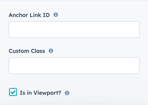
Important: This setting impacts Page Speed and Core Web Vitals scores.
Performance setting to determine how the CSS is loaded for the module.
Learn more about this setting as it relates to Page Speed and Core Vitals.
SEC CTA IMAGE BACKGROUND BLEND WITH SECTION BELOW

Layout → Choose Layout
Vertical
Layout → Padding Top and Padding Bottom
Standard
Style → Color Scheme
Dark
Style → CTA Style
Solid Regular for Primary Background
Style → Background
Background Image, 2560px x 1707px
Style → Background → Background Position
Center
Style → Background → Background Image Overlay
Gradient
Style → Background → Overlay Color
#1a1d17 set to 40%
Style → Background → Gradient Direciton
Vertical - Top to Bottom
Style → Background → Overlay Gradient Color 1
#171b25 set to 40%
Style → Background → Overlay Gradient Color 2
#171b25 set to 100%
The overlay gradient colors should match the color used for the footer or the section above or below the CTA section that you want to blend it with.