What is the Rich Text Module?
The Rich Text Module is a versatile content module that allows you to add and format text content in custom drag-and-drop layouts.
Module capabilities:
- Add formatted text content
- Create custom layouts
- Embed media and elements
- Style text inline
- Add links and CTAs
- Insert tables and lists
Common use cases:
- Body content sections
- Text blocks
- Formatted articles
- Custom content layouts
- Mixed media content
- Embedded elements

The Rich Text module can be used in the drag-and-drop editor to create custom section layouts.
Helpful Links: Settings for Theme Styles
Rich Text Content
The text can be edited directly from the module on the page or you can open it in an expanded view.

Edit in Expanded View

What is the Rich Text Toolbar?
Rich Text Toolbar
The WYSIWYG (what you see is what you get) toolbar includes options to format the text in the rich text editor.
WYSIWYG definition: Visual editor that shows formatting as it will appear on the published page.
Important note: Changing the text style here will take priority over any theme or module settings, these changes are applied as Inline Styles and overwrite any CSS included in the theme.
Inline styles priority: Toolbar formatting takes precedence over theme styling. Use carefully to maintain design consistency.
What text formatting options are available?
Text Formatting
You can change the following:
Text style (paragraph, heading 1, heading 2, etc.):
- Paragraph: Regular body text
- Heading 1: Largest heading (H1)
- Heading 2: Major section heading (H2)
- Heading 3: Subsection heading (H3)
- Heading 4-6: Smaller headings
Choose an alternate font:
- Select from available fonts
- Override theme font
- Specific text styling
- Brand font options
Change the font size:
- Adjust text size
- Override theme sizing
- Pixel or relative units
- Larger/smaller text
Add inline styles for Bold, Italics, and Underline:
- Bold: Emphasis, important text
- Italic: Emphasis, subtle highlight
- Underline: Use sparingly (can confuse with links)
Change the text color:
- Custom text colors
- Override theme colors
- Brand color options
- Color picker
Change the text background color (highlight):
- Text highlighting
- Background color behind text
- Emphasis tool
- Call attention to text
Best practices:
- Use heading hierarchy (don't skip levels)
- Bold for emphasis, not entire paragraphs
- Underline sparingly (confuses with links)
- Maintain color contrast (4.5:1 minimum)
- Consistent with brand colors
What alignment and list options are available?
Alignment and Lists
Change the content alignment (left, center, right, justified):
Alignment options:
- Left: Default, natural reading (most common)
- Center: Emphasis, short content, headings
- Right: Special layouts, directional content
- Justified: Even edges, formal documents
Add an unordered list (bullets) or ordered list (numbers):
List types:
- Unordered list: Bullet points, no specific order
- Ordered list: Numbered items, sequential order
List use cases:
- Features and benefits
- Step-by-step instructions
- Navigation items
- Key points
- Specifications
Adjust the line spacing:
- Single spacing
- 1.5 spacing
- Double spacing
- Custom spacing
- Improve readability
Decrease or increase the indent:
- Indent paragraphs
- Create nested lists
- Hierarchical content
- Visual structure
- Quote indentation
What style clearing options are available?
Style Management
Clear the styles:
- Remove all inline formatting
- Reset to theme defaults
- Clean up formatting
- Start fresh
- Fix formatting issues
When to clear styles:
- Inconsistent formatting
- Copy/paste from Word
- Too many inline styles
- Return to theme styling
- Formatting conflicts
Clear styles workflow:
- Select formatted text
- Click "Clear styles"
- Text returns to default
- Re-apply needed formatting
- Use theme styles when possible
What additional formatting options are available?
More Formatting Options
Click More to add Strikethrough, Superscript, Subscript, or format as a Code Block:
Additional formats:
Strikethrough:
- Crossed out text
- Show deletions/changes
- Compare versions
- Sale prices
Superscript:
- Text above baseline
- Footnote references¹
- Mathematical notation
- Trademark symbols™
Subscript:
- Text below baseline
- Chemical formulas (H₂O)
- Mathematical notation
- Technical content
Code Block:
- Monospace font
- Technical code display
- Command examples
- Preserve formatting
- Gray background
Code block usage:
- HTML/CSS/JavaScript examples
- Command line instructions
- Technical documentation
- Programming tutorials
How do I add links?
Adding Links
Add a link:
- Link text to URLs
- Internal page links
- External website links
- Email addresses
- File downloads
Link configuration:
- Link text (what users see)
- URL or page selection
- Open in new window option
- No follow setting (SEO)
- Title attribute
Link best practices:
- Descriptive link text (not "click here")
- Internal links: Same window
- External links: New window
- Use title for context
- Test all links
How do I add images?
Adding Images
Add an image:
- Insert images inline
- Upload new images
- Select from file manager
- Set image dimensions
- Add alt text
Image configuration:
- Image selection
- Alt text (required for accessibility)
- Dimensions (width/height)
- Alignment (left, center, right)
- Link image (optional)
Image best practices:
- Always add descriptive alt text
- Optimize before uploading
- Appropriate dimensions
- Compress file size
- Use WebP when possible
Image alignment:
- Left: Text wraps right
- Center: Full width, no wrap
- Right: Text wraps left
- Inline: Flows with text
Can I add emojis?
Add an emoji:
- Insert emoji picker
- Browse emoji categories
- Search for emojis
- Click to insert
- Use in moderation
Emoji usage:
- Add personality
- Visual emphasis
- Break up text
- Informal tone
- Social media style
Emoji considerations:
- Professional context
- Brand voice
- Accessibility (screen readers)
- Cross-platform display
- Cultural differences
Emoji best practices:
- Use sparingly
- Match brand tone
- Consider accessibility
- Test across devices
- Meaningful, not decorative
What can I insert using the Insert menu?
Insert Menu Options
Click Insert to add:
Call-to-action:
- HubSpot CTA tool
- Tracked buttons
- Conversion elements
- A/B testable
- Analytics integration
Embed:
- Embed external content
- Third-party widgets
- Social media posts
- Interactive elements
- Custom HTML/JavaScript
Video (HubSpot or Embed):
- HubSpot-hosted videos
- YouTube embeds
- Vimeo embeds
- Video players
- Autoplay options
Table:
- Data tables
- Comparison tables
- Pricing tables
- Structured information
- Rows and columns
Special Character:
- © Copyright
- ® Registered trademark
- ™ Trademark
- Currency symbols
- Mathematical symbols
Icon:
- FontAwesome icons
- Visual elements
- Inline icons
- Social icons
- Decorative elements
Anchor:
- Page anchor links
- Jump-to navigation
- Table of contents
- Section linking
- Smooth scrolling
Horizontal Line:
- Visual separator
- Section divider
- Break content
- Styling options
- Spacing control
Non-breaking space:
character- Prevent line breaks
- Keep words together
- Spacing control
- Typography tool
What personalization options are available?
Personalization
Click Personalize to add a Personalization Token:
Personalization tokens:
- Contact properties
- Company properties
- Custom properties
- Merge tags
- Dynamic content
Token examples:
- First name
- Company name
- Email address
- Custom fields
- Calculated values
Personalization use cases:
- Personalized greetings
- Custom content
- Account information
- User-specific data
- Dynamic messaging
Personalization best practices:
- Always include default values
- Test with and without data
- Privacy considerations
- Don't over-personalize
- Natural integration
What advanced options are available?
Advanced Options
Click Advanced to view the Source code or Show blocks:
Source code:
- View HTML
- Edit HTML directly
- Add custom code
- Fix formatting issues
- Advanced customization
Source code use cases:
- Custom HTML elements
- Add attributes
- Complex formatting
- Troubleshoot issues
- Advanced users only
Show blocks:
- Visual block indicators
- See content structure
- Identify elements
- Debug layout
- Understand hierarchy
Advanced usage warning: Editing source code requires HTML knowledge. Incorrect changes can break formatting.
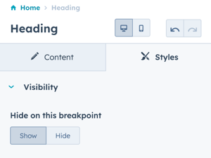
What styling options are available ?
Styles → Visibility
Option to Show or Hide on this breakpoint (based on desktop or mobile toggle selection).
Styles → Alignment and spacing
Option to configure the padding for the Top, Left, Right, and Bottom of the module, and the margin for the Top and Bottom.
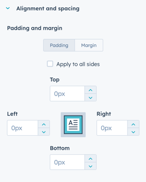
The padding and margin can be configured independently for the desktop and mobile breakpoints. Checking the box "Apply to all sides" will apply the same settings to all breakpoints and sides.