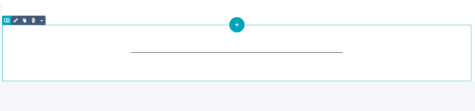
The Divider module creates horizontal lines to visually separate content sections in the drag-and-drop editor. Common use cases include:
- Visual separation between content sections
- Breaking up long-form content
- Creating visual breathing room
- Separating different topics or ideas
- Organizing page layouts
- Improving content scanability
Why is the color I picked for the Divider module not working?
The theme overwrites the color for the Horizontal Rule to be your primary brand color.
The Divider module can be used in the drag-and-drop editor to create custom section layouts.
Helpful Links: Settings for Theme Styles
How do I configure the divider ?
Height
Set the line weight in pixels.
Configuration:
- Add the height value in pixels (px)
- Higher numbers create thicker lines
- Lower numbers create thinner, more subtle lines
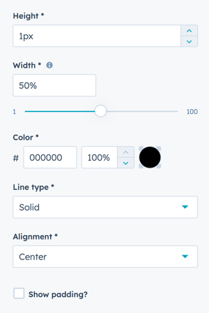
Width
Set the width as a percentage of the module width.
Configuration:
- Default is 50%
- Can be set from 1% to 100%
- Percentage is relative to the module/section width
Color
Customize the divider line color and opacity.
Configuration options:
- Add a Hex value for precise color selection
- Use the color picker to choose a color visually
- Adjust opacity percentage from 0% to 100%
Line Type
Choose the style of the divider line.
Available options:
Solid
- Continuous, unbroken line
- Most common and versatile option
- Clean, professional appearance
- Best for standard use cases
Dotted
- Series of dots forming a line
- Softer, more casual appearance
- Good for separating less critical content
- Creates visual texture
Dashed
- Series of dashes forming a line
- Slightly more formal than dotted
- Good for subtle separation
- Modern, clean aesthetic
Selection tips:
- Use Solid for most applications
- Use Dotted for casual or creative designs
- Use Dashed for modern, minimalist layouts
- Maintain consistency within a single page
Alignment
Choose how the divider is positioned horizontally.
Available options:
Left
- Divider aligned to the left edge
- Good for left-aligned content
- Follows natural reading flow
- Works well with left-aligned sections
Centered
- Divider centered in the module
- Most common and balanced option
- Works with any content alignment
- Classic, symmetrical appearance
Right
- Divider aligned to the right edge
- Good for right-aligned content
- Creates unique visual interest
- Less common, use strategically
Best practices:
- Center dividers for balanced designs
- Match alignment to surrounding content
- Use left alignment with left-aligned text
- Test different alignments for visual impact
Show padding?
Add optional vertical spacing above and below the divider.
Configuration:
- Check the box to enable padding
- Configure up to 20px above and below the divider
- Additional spacing beyond module margins
Use cases:
- Create more breathing room around dividers
- Separate dividers from content
- Fine-tune vertical spacing
- Adjust for specific design needs
How do I style the module?
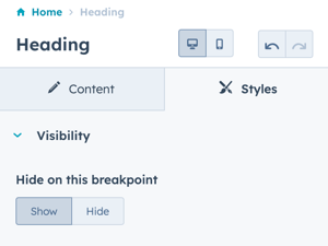
Styles → Visibility
Show or hide the divider on specific breakpoints.
Options:
- Show: Divider displays on this breakpoint
- Hide: Divider hidden on this breakpoint
Breakpoint options:
- Desktop: Large screens
- Mobile: Small screens and tablets
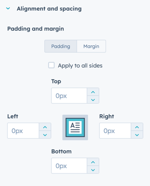
Styles → Alignment and spacing
Configure padding and margin for precise positioning.
Padding options: Configure spacing inside the module:
- Top: Space above the divider
- Right: Space to the right
- Bottom: Space below the divider
- Left: Space to the left
Margin options: Configure spacing outside the module:
- Top: Space above the module
- Bottom: Space below the module
Breakpoint configuration:
- Configure independently for desktop and mobile
- Desktop settings apply to larger screens
- Mobile settings apply to smaller screens
Apply to all sides:
- Check this box to apply the same settings to all breakpoints and sides
- Useful for consistent spacing
- Uncheck for custom spacing per side
Styles → Typography
This setting doesn't apply to the divider module since there is no text included.
Note: Typography settings are visible in the styles panel but have no effect on dividers as they contain no text elements.
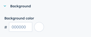
Styles → Background
Add a background color to the divider module container.
Configuration:
- Add Hex value for desired background color
- Or use the color picker to choose a color
Use cases:
- Create boxed divider effects
- Add visual emphasis
- Design custom separator styles
- Create colored section breaks
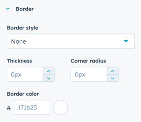
Styles → Border
Add a border to the divider module (applies to all four sides).
Important: Not recommended to use in combination with the Divider module.
Why borders aren't recommended:
- Creates visual confusion with the divider line
- Adds unnecessary visual complexity
- Can create unintended box effects
- The divider line itself is the primary visual element