Add a heading to a custom layout using the drag and drop editor in HubSpot.

Where can the Heading styles be updated?
All of the headings (H1, H2, H3, H4, H5, and H6) can be configured globally in Theme Settings.
To update heading styles globally:
- Navigate to Theme Settings
- Go to Fonts section
- Select Formatting
- Configure each heading level (H1-H6)
Benefits of global heading styles:
- Consistent typography across your site
- Easy bulk style updates
- Maintains brand consistency
- Simplifies design management
Important: Global theme settings take priority for consistent styling across your website.
Heading Content
Add the text for the heading here.
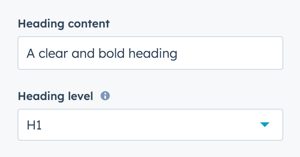
How do I set the heading level?
Heading Level
Choose from six heading level options:
- H1: Page title (use once per page)
- H2: Major sections
- H3: Subsections
- H4: Minor subsections
- H5: Detailed subsections
- H6: Smallest headings
SEO and accessibility importance:
- Proper heading hierarchy helps search engines understand content structure
- Screen readers use headings for navigation
- Skip only one level at most (don't jump from H2 to H5)
- Use H1 only once per page for the main title
Helpful Links: Settings for Theme Styles
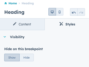
How do I control heading visibility?
Styles → Visibility
Show or hide the heading on specific breakpoints.
Options:
- Show: Heading displays on this breakpoint
- Hide: Heading hidden on this breakpoint
Breakpoint options:
- Desktop: Large screens
- Mobile: Small screens and tablets
Use cases:
- Hide long headings on mobile for space
- Display different heading text for different devices
- Simplify mobile layouts
- Create device-specific experiences
Tip: Always ensure alternative navigation or context exists if hiding headings on specific devices.
How do I configure alignment and spacing?
Styles → Alignment and spacing
Configure padding and margin for precise positioning.
Padding options: Configure spacing inside the module border:
- Top: Space above heading text
- Right: Space to the right of heading
- Bottom: Space below heading text
- Left: Space to the left of heading
Margin options: Configure spacing outside the module:
- Top: Space above the module
- Bottom: Space below the module
Breakpoint configuration:
- Configure independently for desktop and mobile
- Desktop settings apply to larger screens
- Mobile settings apply to smaller screens
Apply to all sides:
- Check this box to apply the same settings to all breakpoints and sides
- Useful for consistent spacing
- Uncheck for custom spacing per side
Tip: Use consistent spacing values (multiples of 4 or 8) for visual harmony.
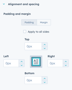
The padding and margin can be configured independently for the desktop and mobile breakpoints. Checking the box "Apply to all sides" will apply the same settings to all breakpoints and sides.
How do I customize typography?
Styles → Typography
Override the theme settings for the selected heading type.
Important: Changes apply only to this instance of the heading module, not globally.
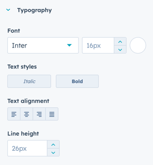
Only the Common Fonts are available in this dropdown. Once you change the dropdown from your default theme font (i.e. Inter) to a common font, it can't be reselected without using the undo option.
⚠️ We recommend not making changes to these settings to allow the Theme Settings for the corresponding header to take priority and keep your heading styles consistent.
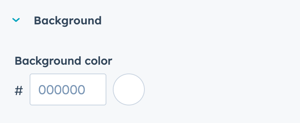
How do I add a background?
Styles → Background
Add a background color to the heading module.
Configuration:
- Add Hex value for desired background color
- Or use the color picker to choose a color
Use cases:
- Highlight important headings
- Create visual separation
- Add emphasis to section titles
- Design call-out boxes
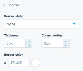
How do I add borders?
Styles → Border
Add a border to the Heading module.
Configuration:
- Border applies to all four sides
- Creates a boxed outline around the heading
- Configure border color, width, and style
Use cases:
- Create boxed heading designs
- Add visual separation
- Emphasize important headings
- Design custom heading styles