Theme Settings
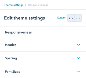
Navigate to: Theme Settings → Responsiveness
Available sections:
- Header (navigation breakpoint)
- Spacing (padding and margins)
- Font Sizes (text scaling)
Overview:
This design group provides options to modify the responsiveness configurations to further refine the UX on tablet and mobile.
Responsiveness
This design group provides options to modify the responsiveness configurations to further refine the UX on tablet and mobile.
Responsiveness → Header
Adjust the breakpoint for where the menu switches to the burger menu for tablet/mobile.
What is a breakpoint: The screen width at which your navigation changes from full desktop menu to mobile burger menu.
When this doesn't apply:
If your header is using burger only, this doesn't apply (burger menu is always displayed regardless of screen size).

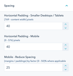
Responsiveness → Spacing
Modify the horizontal padding and reduce spacing on mobile.
Two spacing options:
Horizontal Padding
This controls the horizontal padding left and right of your content on smaller desktop and tablet devices as well as on mobile.
What it affects:
- Left and right page margins
- Content container padding
- Smaller desktop screens
- Tablet devices
- Mobile devices
Purpose: Controls how much space appears on the sides of your content, ensuring content doesn't touch screen edges while maximizing usable space.
Mobile – Reduce Spacing
All POWER modules reduce some of their paddings/margins for mobile devices. This factor controls how much those paddings/margins will be reduced by a percentage value.
What it affects:
- Top and bottom spacing between modules
- Internal module padding
- Section spacing
- Element margins
Default behavior: Modules automatically reduce spacing on mobile to maximize screen real estate and improve information density.
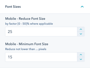
Responsiveness → Font Sizes
Font sizes in POWER theme are designed to be responsive based on a percentage of the desktop size.
Responsive font system: Fonts automatically scale down on smaller screens to maintain readability and balance.
Two font size settings:
Mobile – Reduce Font Size
All POWER modules reduce most of their font sizes for mobile devices. This factor controls how much those font sizes will be reduced by a percentage value.
How it works:
- Set as percentage reduction (e.g., 25%)
- Applies to most text elements
- Proportional scaling
- Maintains font hierarchy
- Automatic calculation
Example with 25% reduction:
- Desktop H1: 48px → Mobile H1: 36px
- Desktop body: 16px → Mobile body: 12px
- Desktop H2: 32px → Mobile H2: 24px