Theme Settings
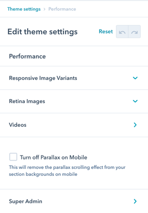
There are 4 sections in Theme Settings for Performance: Responsive Image Variants, Retina Images, Videos, and Super Admin as well as the setting to Turn off Parallax on Mobile.
What are Performance Settings?
Performance Settings control optimization features that affect page load speed and user experience. These settings help you:
- Optimize image loading for different devices
- Control parallax effects on mobile
- Manage video performance
- Configure retina image scaling
- Improve mobile performance
- Balance quality with speed
Benefits:
- Faster page load times
- Better mobile performance
- Improved user experience
- Higher SEO rankings
- Reduced bandwidth usage
- Optimized for all devices
Performance
How do I turn off the Parallax effect for images on mobile?
Disabling Mobile Parallax
There is a global setting to turn off parallax on mobile located in Theme Settings under Performance.
Quick disable: Navigate to Theme Settings → Performance → Turn off Parallax on Mobile
Why disable on mobile: Turning off the parallax on mobile reduces the calculations in the background, which can improve the scrolling performance on slower mobile phones.
What are Responsive Image Variants?
Performance → Responsive Image Variants
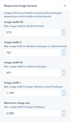
Images are lazy-loaded and dynamically exchanged depending on device width and pixel density.
How it works: POWER theme automatically adjusts the size of the images based on device width, adjustments to the various sizes can be made here.
Automatic optimization: The image widths you define here will be leveraged on respective device widths.
Given that your image was uploaded with a higher resolution, those smaller images will be automatically created and the ideal sizes will be used for the different devices.
Configuration options: Define image widths for different device breakpoints:
- Mobile (small screens)
- Tablet (medium screens)
- Desktop (large screens)
- Large desktop (extra-large screens)
Benefits:
- Smaller file sizes on mobile
- Faster page loads
- Reduced bandwidth usage
- Automatic optimization
- No manual resizing needed
You could reduce the image widths here, which would lead to smaller file sizes and faster page loads, but also to poorer image quality.
Generally, you should never upload images that are bigger than 4000 pixels in width or in height because for those the resize algorithm will not work and images will be loaded that are too big and will slow down your site.
What is Retina Image Scaling?
Performance → Retina Image Scaling
Images are automatically scaled for retina screens by a factor of 1.5 and can be adjusted here (you'll account for this when you create your images).
Understanding retina displays: High-resolution screens with 2x or 3x pixel density require larger images to appear sharp.
EXAMPLE:
Standard scenario: Let's say your image should display 640 pixels wide on your site. This is the size you would typically use to create the image to minimize the impact on page speed and keep file sizes down.
Retina requirement: With Retina displays your site visitors have a higher pixel density so you'll want to use an image that's 1280 pixels wide, which is what's referred to as "2x".
How it works: Essentially, you are doubling the pixel density by using an image that's double the size. The graphic will still display on the website at 640 pixels wide for non-retina screens.
POWER Pro recommendation: Based on extensive testing, we recommend using a factor of 1.5 (not 2) to achieve a better balance between image quality and page load times.
Why 1.5x instead of 2x:
Performance vs. Quality:
- 2x: Sharper images, much larger file sizes
- 1.5x: Nearly as sharp, significantly smaller files
- Best balance for web performance

How do I optimize video performance?
Performance → Videos
Improve performance for pages with video modules accessed via YouTube.
Video performance options:
- Pause Video - Video Focus
- Pause Video - Window Focus
- Disable Video on Mobile
Purpose: Reduce resource usage and improve performance on pages with embedded videos.

Performance → Videos → Pause Video - Video Focus
Pauses the video when it is not visible.
Performance → Videos → Pause Video - Window Focus
Pauses the video, when the window loose focus (switch tab, switch browser window).
Performance → Videos → Disable Video on Mobile
Disables the video on mobile devices.
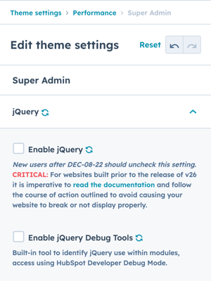
Performance → Super Admin → jQuery
If you purchased after December 08, 2022 (v26+), Support for jQuery and Enable jQuery Debug Tools must be unchecked.
For existing users, updating these settings without following the guidelines outlined for deactivating jQuery can cause your website to break.
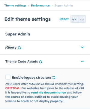
Performance → Super Admin → Theme Code Assets → Legacy Structure
If you purchased after March 23, 2023 (v28+), Support for Legacy Structure must be unchecked.
For existing users, updating these settings without following the guidelines outlined for disabling the legacy code structure can cause your website to break.