Theme Settings
What are Color Settings?
Color Settings control all colors used throughout your website. These settings help you:
- Define brand colors
- Configure light and dark color schemes
- Set colors for specific elements (buttons, forms, links)
- Ensure color accessibility
- Maintain consistent branding
- Create visual hierarchy
Benefits:
- Centralized color management
- Quick scheme switching (light/dark)
- Consistent brand colors site-wide
- No custom CSS required
- Accessible color combinations
- Professional appearance
Where are Color Settings located?
There are 3 sections in Theme Settings for Colors:
- Brand Colors
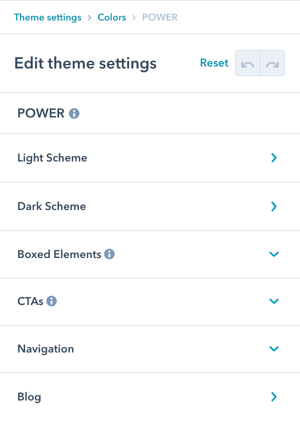
- POWER
- HubSpot Default
Navigate to: Theme Settings → Colors
Overview: Configure all color settings from brand foundation to element-specific colors.
There are 3 sections in Theme Settings for Colors: Brand Colors, POWER, and HubSpot Default.
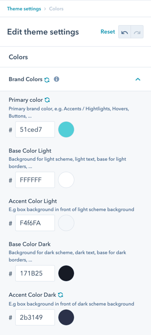
Colors → Brand Colors
The colors set here will define the default colors for your primary brand color as well as the necessary colors for light and dark schemes.
How do Light and Dark schemes work?
Scheme Switching
With POWER, you can switch between the light scheme and the dark scheme in a single click.
How scheme switching works:
- Modules can use light or dark scheme
- One-click toggle in module settings
- Entire section changes scheme
- Automatic color adjustments
Critical requirements:
For the light and dark schemes to work properly, both Light colors (Base and Accent) need to be light and both Dark colors (Base and Accent) need to be dark.
By default:
- Base Color Light is the text color for dark scheme
- Base Color Dark is the text color for light scheme
Important warning: Mixing light and dark colors within the same color scheme can cause legibility issues.
Scheme configuration rules:
Light Scheme:
- Base Light: Light color (e.g., white, light gray)
- Accent Light: Light color (e.g., light blue, cream)
- Used for: Text on dark backgrounds
Dark Scheme:
- Base Dark: Dark color (e.g., black, dark gray)
- Accent Dark: Dark color (e.g., navy, dark green)
- Used for: Text on light backgrounds
Colors → POWER
These settings allow you to further refine the colors used for each color scheme, as well as additional options to change the style of POWER modules further.
Refinement approach: We recommend using the Setup Guide template to preview your colors and coming back to the Theme Settings after configuring your first page to make further adjustments and refine the colors.
Module-level flexibility: Many modules also include the option to change the colors individually.
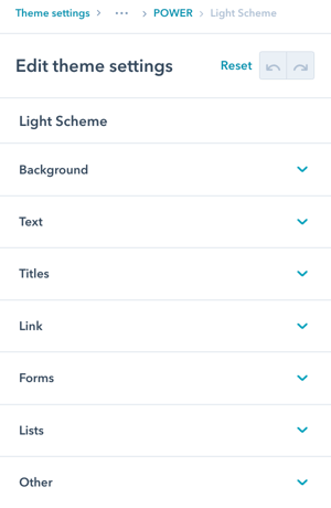
What Light Scheme settings are available?
Colors → POWER → Light Scheme
This is where you can overwrite the individual colors for use with light scheme.
Light Scheme categories:
- Background
- Text / Titles
- Link
- Forms
- Lists
- Other
Purpose: Fine-tune colors for modules using the light color scheme.
This is where you can overwrite the individual colors for use with light scheme.
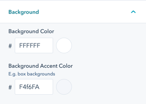
Colors → POWER → Light Scheme → Background
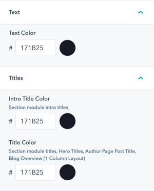
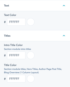
Colors → POWER → Light Scheme → Text / Titles
Additional customization can be made for Titles within the modules. Text can also be changed in the rich text editor.
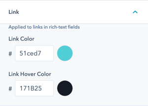
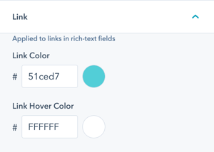
Colors → POWER → Light Scheme → Link
Link settings are for plain text links only.
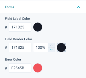
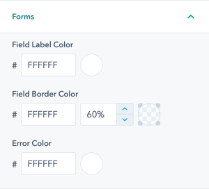
Colors → POWER → Light Scheme → Forms
The overwrites for Form colors were added by customer request, if there is an additional form property you would like to change from the default we're happy to help make the change via CSS and can include additional settings in a future release.
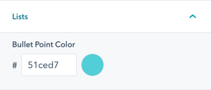
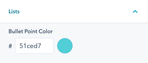
Colors → POWER → Light Scheme → Lists
The shape of the bullet point can be defined under Styling → Lists.
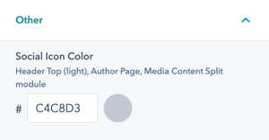
Colors → POWER → Light Scheme → Other
Option to change the default color for Social Icon Color for light scheme for all locations.
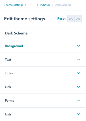
What Dark Scheme settings are available?
Colors → POWER → Dark Scheme
This is where you can overwrite the individual colors for use with dark scheme.
Dark Scheme categories:
- Background
- Text / Titles
- Link
- Forms
- Lists
Structure: Same options as Light Scheme, but for dark color scheme sections.
Configuration approach: Use contrasting colors (light text on dark backgrounds) for readability.
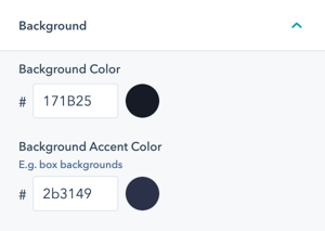
Colors → POWER → Dark Scheme → Background
Colors → POWER → Dark Scheme → Text / Titles
Additional customization can be made for Titles within the modules. Text can also be changed in the rich text editor.
Colors → POWER → Dark Scheme → Link
Link settings are for plain text links only.
Colors → POWER → Dark Scheme → Forms
The overwrites for Form colors were added by customer request, if there is an additional form property you would like to change from the default we're happy to help make the change via CSS and can include additional settings in a future release.
Colors → POWER → Dark Scheme → Lists
The shape of the bullet point can be defined under Styling → Lists.
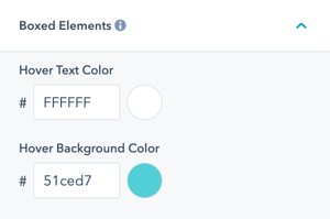
Colors → POWER → Boxed Elements
This color applies to all of the rectangular-shaped content elements used in various modules, such as the Image Boxes and Accordions.
Colors → POWER → CTAs
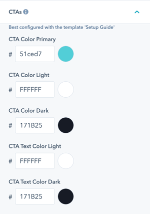
Modifying the colors for CTAs is best done using the Setup Guide template which includes each CTA style shown on light and dark schemes.

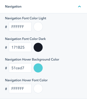
Colors → POWER → Navigation
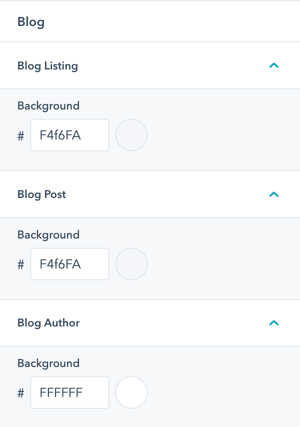
Colors → POWER → Blog
Option to change the color for the background on the Blog Listing, Blog Post, and Blog Author templates/pages.
Colors → POWER → System Pages → Email Templates
Option to change the here background color for email subscription templates (e.g. communication preferences template).
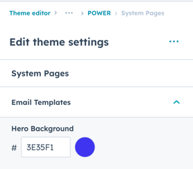
The default color is inherited from your primary color and the text color for the hero title and text is white, this option makes it easy to update the background color to ensure the text is legible (especially for light primary colors like yellow, gold, etc.)
Colors → HubSpot Default
These colors are applied to the default modules included with HubSpot, found in the Page Editor under "Common Modules" below the POWER theme modules.
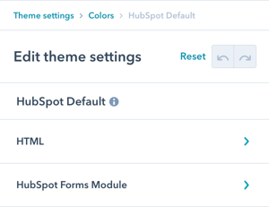
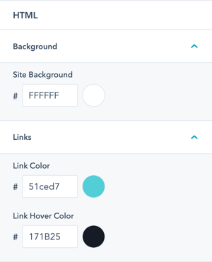
Colors → HubSpot Default → HTML
Option to change the Site Background, the part of your website visible outside of the page contents when not set to full width.
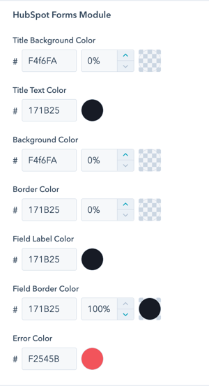
Colors → HubSpot Default → HubSpot Forms Module
These colors are applied to the default form module included with HubSpot and do not apply to the POWER Sec Forms module.
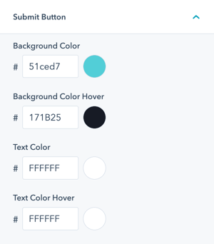
Colors → HubSpot Default → Submit Button
These colors are applied to the submit button for the default form module included with HubSpot and do not apply to the POWER Sec Forms module.