
How to Set Up Global Header
Page Editor → POWER Header
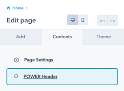
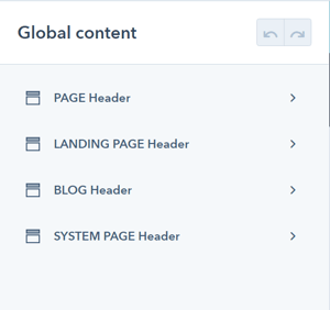
POWER Header → Global Content
Once you have accessed the global module, you will have the choice to set up 4 variations for the header.
We recommend configuring the header for all page types at the beginning, even if you don't plan on using one of them (i.e. blog or landing pages) so that you have a consistent starting point if anything changes.
It is also possible to override the default header for an individual page, so an unused header type could be styled for this situation.
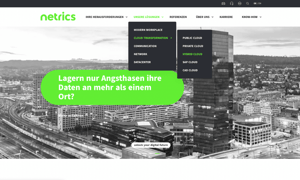
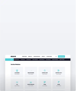
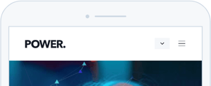
Header Types for POWER Theme
- PAGE header is the default for website pages
- LANDING PAGE header is the default for landing pages
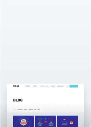
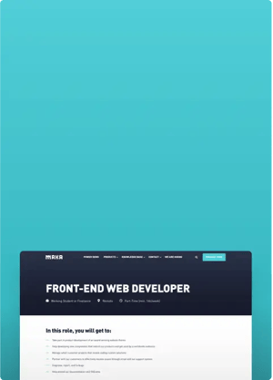
- BLOG header is the default for the Blog Listing and Blog Post templates
- SYSTEM PAGE header is the default for the 404, 500, and Search templates
While Subscription templates are system pages and they typically use the LANDING PAGE header, some accounts are using the PAGE header for these pages with no clear explanation from HubSpot.
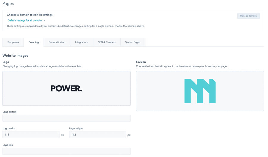
Add Logo to HubSpot Website
Settings → Website → Pages → Branding
The header uses the pre-configured global logo that you can add to the Website Images in the Branding for your Domain.
This is also where you can set the favicon for your website, which is visible in the tab of most browsers.
We recommend using an SVG-file logo for the best rendering across all devices and browsers. Additionally, you can adjust the default size of the logo here. A width of about 120 pixels works best in our theme.
Publishing the Global Header
When you're ready to publish the Global Header, you'll click the orange Publish to X Assets button in the upper right corner. The number of assets corresponds to the total number of assets using this specific child theme that contains any of the header types.

It is important to note that if you make a change to the BLOG Header, you'll have to publish the header to ALL assets, not just the blog assets. This is true for each Header Type, whether you are configuring every header or making a change to an individual setting - until you Publish to X Assets, your changes will not be visible on your preview pages and live site.
There are some settings that are only visible based on previous choices, if you do not see the option available, it does not work with the layout or selections you've already made.
These settings are available for each Header Type (Page, Landing Page, Blog, System Page). We recommend opening a second browser window once you have the PAGE Header configured to make it easier to apply the same settings for the other header types and modify as needed.
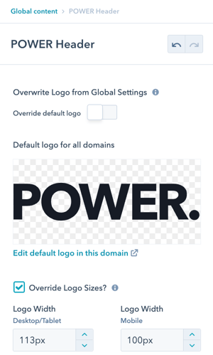
POWER Header → Logo
Option to Override default logo and Override Logo Sizes.
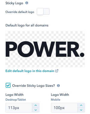
POWER Header → Sticky Logo
The Sticky Logo is the logo visible on scroll if you enable the setting for Fixed on Scroll in the Style settings. If you plan on changing the color scheme of the header from light to dark or dark to light on scroll, you'll want to override the default logo for the alternate color scheme to ensure the logo is visible.
Option to Override default logo and Override Logo Sizes.
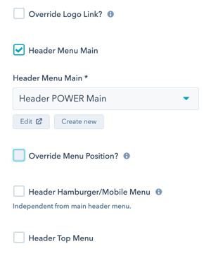
POWER Header → Menu
Option to Override Logo Link allows you to replace the preconfigured link from the global HubSpot settings.
Check Header Menu Main to select your primary navigation. Help with Navigation Menus.
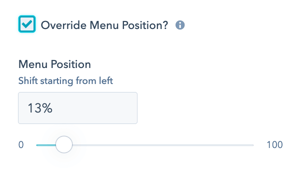
POWER Header → Menu → Override Menu Position?
Check Override Menu Position to shift the location of your menu from the left to remove any overlap with your logo.
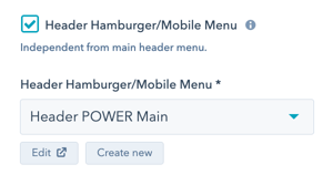
POWER Header → Menu → Header Hamburger/Mobile Menu
Check Header Hamburger/Mobile Menu to select an independent navigation which will be shown in the hamburger sidebar or on mobile. If not active, the main menu will be used for the hamburger and mobile menu. Only works in combination with the active main header navigation and is designed to allow you to create a mobile-friendly version of your navigation if needed.
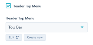
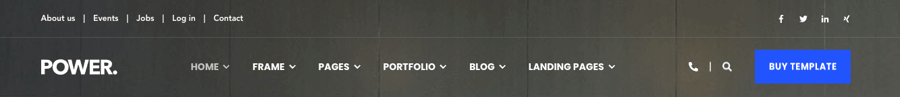
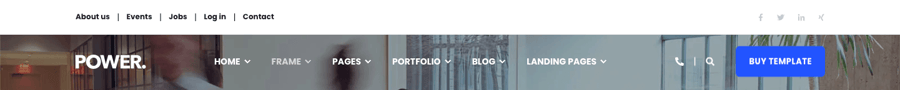
POWER Header → Menu → Header Top Menu
Check Header Top Menu to add a secondary menu bar above the header. This menu is not sticky on scroll and is often used for social icons and targeted menus.
The Top Menu does not display on desktop unless you check Top Header Desktop and on mobile unless you check Top Header Mobile in the checkbox under Layout → Choose Layout
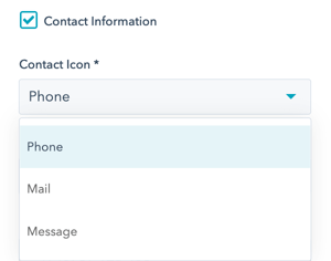
POWER Header → Contact Information
Check Contact Information to include contact information in the header.
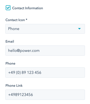
Phone Link must be configured with the "+" at the beginning with all other symbols and spaces removed.
POWER Header → Contact Information → Contact Icon
Choice of Phone, Mail, or Message icons for use in the header.
Preview of the Phone Icon
Preview of the Mail Icon
Preview of the Message Icon
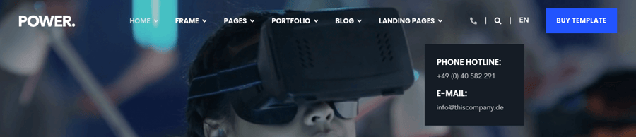
Hover over the Contact Icon in the header to reveal the Contact Information.
POWER Header → Login
Check Login to include the login icon in the header.
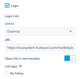
Click the Person Icon in the header to access the Membership page link configured in the settings.

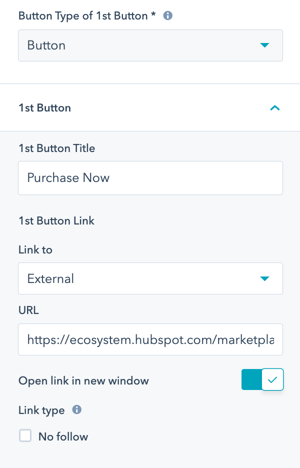
POWER Header → Button Type of 1st Button
Choice of Button, CTA, or None.
For Button, additional settings are included to configure the 1st Button Title and 1st Button Link.
For CTA, make sure the CTA chosen is configured as "Link (No Style)" to avoid style conflicts.
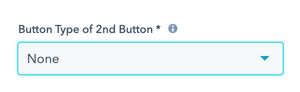
POWER Header → Button Type of 2nd Button
Choice of Button, CTA, or None. Same setting options are available as 1st Button.
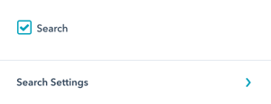
POWER Header → Search
Check Search to include search in the header.
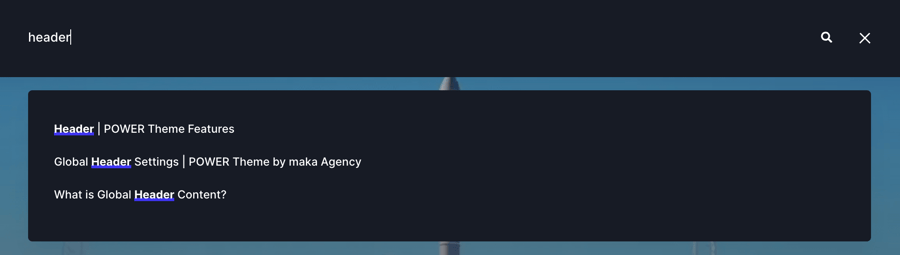
When the Search Icon is clicked, the search function expands from the Header (example is dark scheme).

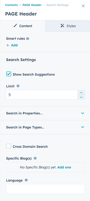
POWER Header → Search → Search Settings
Check Show Search Suggestions if you want the user to see suggested content before submitting the search query.
Example of search suggestions:
POWER Header → Search → Search Settings → Limit
Adjust Limit to determine how many results should display per search results page, the default value is 5 (five).
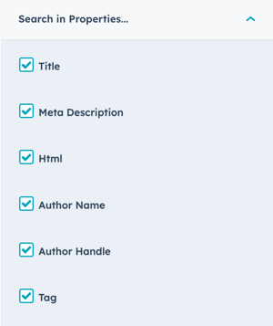
POWER Header → Search → Search Settings → Search in Properties
Check the property types that should be included in the search results. All properties are selected by default and can be modified independently per header type (Page, Landing Page, Blog, System Page).
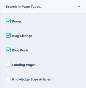
POWER Header → Search → Search Settings → Search in Page Types
Check the page types that should be included in the search results. The default selection includes Pages, Blog Listings, and Blog Posts with the option to also include Landing Pages and Knowledge Base Articles.
POWER Header → Search → Search Settings → Cross Domain Search
If you need Search to include multiple domains, you'll need to configure each domain in the Cross Domain Search settings.
If your website, blog, knowledge base, etc. are all on the same domain you don't need to configure your domain here.
Check the box to activate Cross Domain Search.
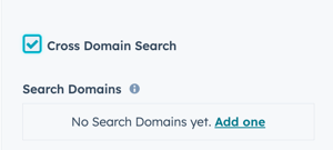
POWER Header → Search → Search Settings → Cross Domain Search → Search Domains
Click Add one to add the first domain, this should be your default/primary domain (it's not included automatically once you check the box).
Each domain should be added using the format subdomain.domain.extension, e.g. www.maka-agency.com.
POWER Header → Search → Search Settings → Specific Blog(s)
If you only have one blog or you want to include all of the live blogs in your account, this setting will remain blank.
Click Add one to add an individual blog if you want to limit the search to this blog only.
This setting is typically used for the Blog header variant when you want to limit the search to a specific blog (for example, if you have a blog for your blog/news, but also have a blog configured for another purpose to organize content on your website).
POWER Header → Search → Search Settings → Language
Specifies the language of content to be searched.
This parameter should obey the ISO639-1 format (e.g. es for Spanish).
The default is all languages, updating this setting is recommended when using multi-language content to limit the language per language variant in the header.
If you're building your website in multiple languages, we recommend fully configuring your header (including all four variants) before you create your multi-language variant to ensure the base settings are consistent across all languages.
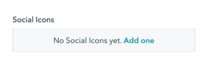
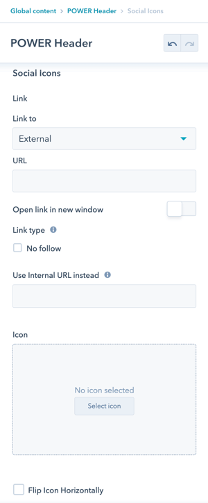
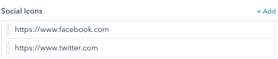
POWER Header → Social Icons
Click Add one to configure your first Social Icon for your header.
POWER Header → Social Icons → Icon Setup
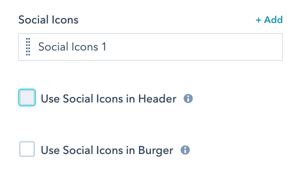
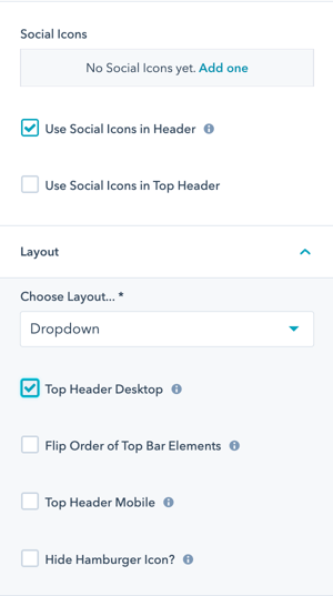
POWER Header → Social Icons → Use Social Icons in Header
Option to include the social icons in the desktop header. You will have to be careful how many settings you enable in the header as the social icons won't fit if you have too many options selected. There is also an option under Layout to move them to the Top Header.
POWER Header → Social Icons → Use Social Icons in Burger
The social media accounts are shown in the header bar for the layouts “Landing Page”, “Burger”, and “Burger Only” as well as in the burger menu on mobile.
Example of Social Icons on Landing Page header:

POWER Header Menu Layout Settings
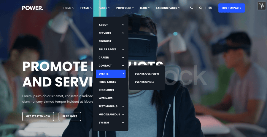
POWER Header → Advanced Mega Menu
Advanced Mega Menu for Desktop only, all other devices will use the existing menu as configured.
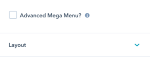
If you are using the Advanced Mega Menu the Layout needs to be set to Dropdown or one of the Mega Menu choices, it is not compatible with the Burger, Burger Only, or Landing Page.
Step-by-Step Instructions for the Advanced Mega Menu
POWER Header → Layout → Choose Layout
This is where you'll choose the format your menu will be in.
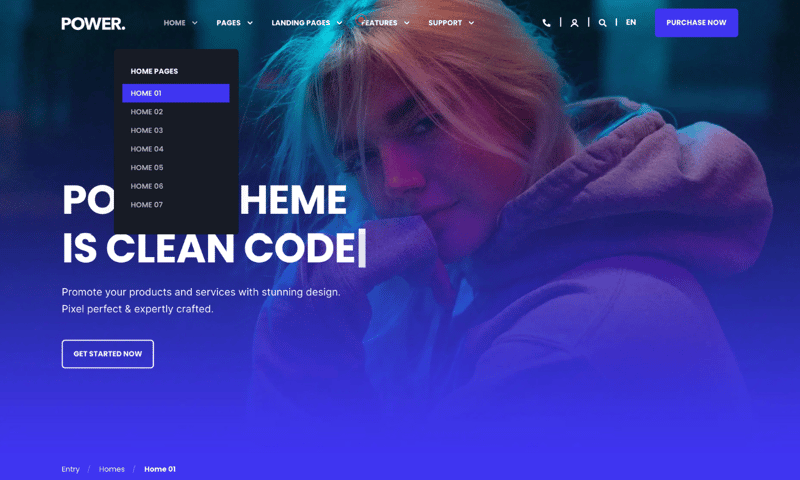
- Dropdown - classic dropdown menu where sub-menus fly out horizontally
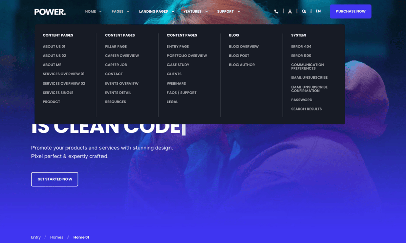
- Mega Menu - as wide as the menu content width
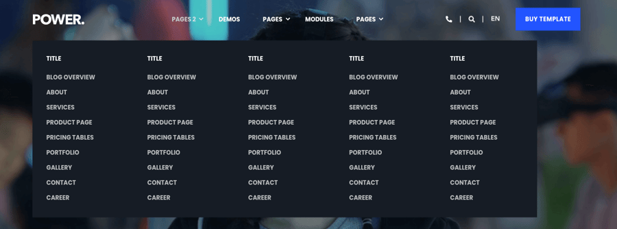
- Mega Menu Content Width - as wide as the content container width
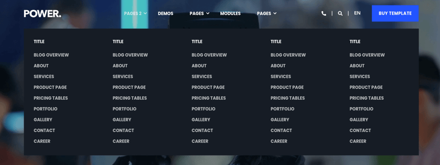
- Mega Menu Screen Width -stretches over the full width of the window/screen
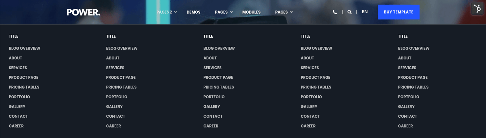
- Burger - reduces the menu to a hamburger icon which reveals the full menu in a sidebar

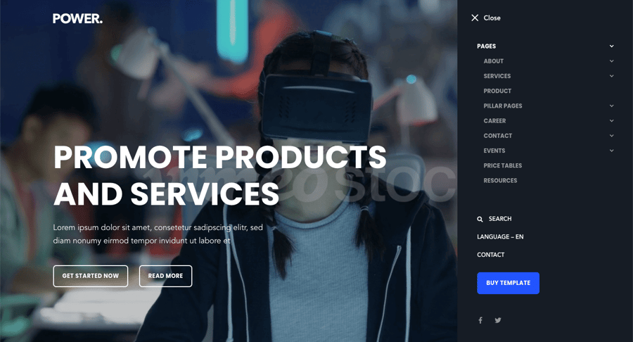
- Burger Only - shows all header elements in the sidebar only

- Landing Page - reduced menu to improve conversions. This layout shows social icons, but a simple top-level menu can also be added.

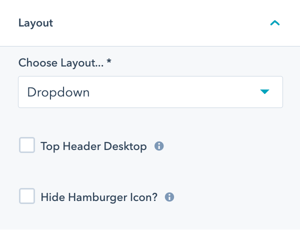
POWER Header → Layout → Top Header Desktop
Check Top Header Desktop to activate the top header bar above the main header. If you configured a menu under Menu → Top Header Menu, it will appear now.
Once checked, you will also see additional options under Social Icons for Use Social Icons in Header and Use Social Icons in Top Header.
Check Flip Order of Top Bar Elements if you want to move the top bar elements from the left to the right.
Check Top Header Mobile if you would like to add a button next to the burger on mobile for the Top Header.
Check Hide Hamburger Icon? to hide the hamburger even if there is content in the sidebar menu.
POWER Header Style Settings
POWER Header → Style
Set the Color Scheme for your Header elements.
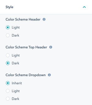
POWER Header → Style → Color Scheme Header
Choice of Light or Dark for the main header.
The light scheme shows a light background color and a dark font and the dark scheme shows a dark background color and a light font color as defined in the Theme Settings for your child theme.


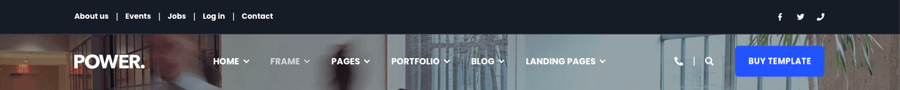
POWER Header → Style → Color Scheme Top Bar
Choice of Light or Dark for the top header.
The light scheme shows a light background color and a dark font and the dark scheme shows a dark background color and a light font color as defined in the Theme Settings for your child theme.
POWER Header → Style → Color Scheme Dropdown
Choice of Inherit, Light or Dark for the dropdown and mega menu(s).
Inherit will use the same color scheme as chosen for the main header.
The light scheme shows a light background color and a dark font and the dark scheme shows a dark background color and a light font color as defined in the Theme Settings for your child theme.
POWER Header → Style
Additional style settings for your header and top header.
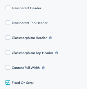
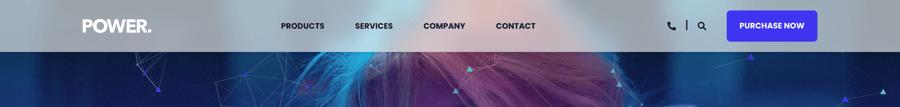
Check Transparent Header to remove the background from your header to see the page content behind.

Check Transparent Top Header to remove the background from your top header to see the page content behind.

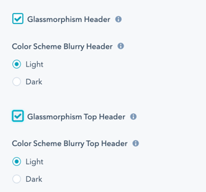
Check Glassmorphism Header to remove the background from your header to see the page content behind.
Additional settings are available to adjust the color scheme.
Social Icon color can be adjusted in Theme Settings → Color → POWER → Light Scheme → Other → Social
Check Glassmorphism Top Header to remove the background from your top header to see the page content behind.
Check Content Full Width to stretch the header content to the window borders instead of the container width (not recommended).

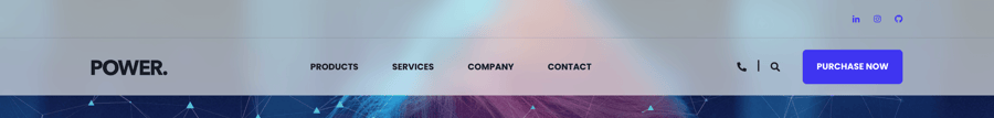
POWER Header → Style → Fixed on Scroll
Check Fixed on Scroll to make the main header sticky, so the header/navigation sticks to the top of the page as the user scrolls.
Option to change the Space between menu items to adjust how your menu fits in the header.
Choices are Normal (50px), Narrow (32px), and Narrow (24px).
With Fixed on Scroll activated, you'll see an option to set Color Scheme On Scroll to Light or Dark. If different choice from Color Scheme Header,make sure your sticky logo color works with the alternate color scheme.
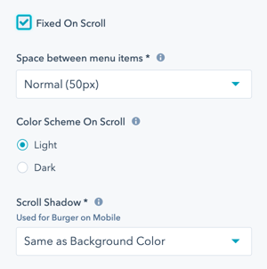
Option to set Scroll Shadow for use with Burger menu on mobile, if the container is filled with content, this provides an indicator to the user to scroll. Chocies are Same as Background Color or None.
POWER Header → Style → Language Switcher
Check Dropdown arrow for language selector to add an optional indicator to change the language for multi-language pages.
Creating translated pages will automatically show the language switcher in the header bar.
Without arrow (default - this displays automatically):
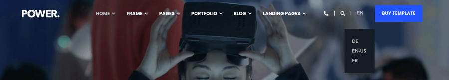
With arrow indicator enabled:

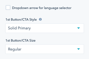
POWER Header → Style → Button/CTA
Option to configure the Button/CTA Style for each button.
Option to configure the Button/CTA Size for each button.
For a detailed explanation of options, refer to CTA settings.
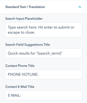
POWER Header → Standard Text/Translations
Option to change or translate the standard text used throughout the header.
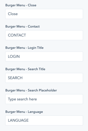
Option to change or translate the standard text used throughout the burger menu.
POWER Header → Custom Class
Here you can set a custom CSS class for your header. This allows you to target this specific element in any of your custom stylesheets.
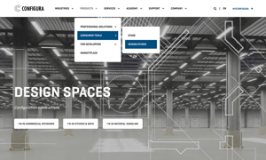
Layout > Choose Layout
Dropdown
Style > Transparent Header
Activated
Style > Color Scheme
Dark
Layout > Choose Layout
Mega Menu
Style > Transparent Header
Activated
Style > Color Scheme
Dark
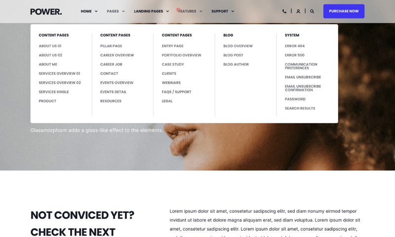
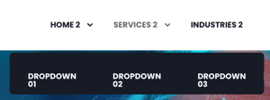
Layout > Choose Layout
Mega Menu
Style > Glassmorphism Header
Activated
Style > Color Scheme
Light